Neutral Sans Workhorse

Ransom Note Magazine + Godthem
Lets Ransom Note Magazine own the focal silhouette while handling secondary copy, sizing and subheads cleanly.
Inspect Godthem specimenDisclosure: MakerFileHub may earn a commission from qualifying purchases via paid links on this page. How our links work.
Full-color cut-paper magazine collage ransom font
Ransom Note Magazine is a colorful cut-out collage font placing mismatched serif, sans, and slab letters onto colorful torn magazine paper scraps.
Paid link
Get this fontProject & layout blueprintsAt-a-glance maker compatibility
Fine grain and micro-texture excel in 300 DPI print, sublimation, and screen print rather than small vinyl weeding.
Visual anatomy & craft review
A colour font shown on charcoal with red paint splatter: every character sits on its own tilted cut-paper rectangle in red, blue, yellow, green or cream, and the letters inside the tiles mix different typographic styles, so a word reads as a ransom note assembled from magazine scraps rather than as a typeface with a texture. Because the tiles vary in colour and angle, the sheet is a contact print rather than a specimen. The construction sets a low size floor, since each tile is solid, but the mixture of letter styles means the smallest practical size is where all of them still read as letters. Uses shown are editorial and party work.
Collage · Cut-out · Zine-punk
Two-font hierarchy recipes
Tested contrast partners — pairing Ransom Note Magazine with grounded secondary typography.
Ransom Note Magazine + Godthem
Lets Ransom Note Magazine own the focal silhouette while handling secondary copy, sizing and subheads cleanly.
Inspect Godthem specimen
Ransom Note Magazine + Papillon Serif – Elegant Modern Luxury
Grounds bold display lettering with classic typographic authority on posters, badges and apparel.
Inspect Papillon Serif – Elegant Modern Luxury specimenPractical applications
Concrete hierarchy, scale and production guidance tailored to Ransom Note Magazine’s stroke geometry.
A pre-coloured ransom face gives a zine or a podcast cover the scissor-and-glue collage that would otherwise take hours of cutting, and the mixed tiles keep the eye moving across the title instead of settling on one letterform.
Hierarchy & layout recipe
Set a two-to-four word headline at 54 to 96 pt over a dark grunge or halftone ground, stack it in two lines, and leave 12 mm of clear space at the foot for the issue number, since the tiles already fill the measure with colour.
Pre-production check
Colour paper-scrap artwork needs four-colour print, print-then-cut stickers, DTF or a screen; it cannot be cut in single-colour vinyl. Proof one cover at final size to confirm the smallest tile letters stay legible.
The mixed tiles match the two-thousands burn-book scrapbook register that a teen party is aiming at, and the colour variety means one display face carries a whole invitation without a second graphic or an illustration.
Hierarchy & layout recipe
Set the greeting at 30 pt on an A6 card, add +6 tracking so adjacent tilted tiles never cover a neighbouring letter, and keep 15 mm margins with 12 mm at the foot for the address and the time.
Pre-production check
Confirm colour-font support in the app you are using before layout, since OpenType-SVG faces fall back to a single colour in some editors. Print a test at home resolution to check the tile edges stay crisp.
A ransom construction is the visual language of a threatening note, so it does a mystery or a whodunnit theme without a drop of blood, and the bright tiles keep the register playful rather than genuinely grim for a mixed audience.
Hierarchy & layout recipe
Set the venue name at 40 mm cap height on an A3 poster, run one line of plain 18 mm sans beneath for the details, and keep 26 mm margins so the tilted tiles have room to sit without touching the trim.
Pre-production check
Check the poster at three metres, where the smallest interior letters can merge into a mass. Confirm the details line keeps a 4.5:1 contrast against the ground and that no tile crosses the safe margin.
Technical & licence verification
Confirm included OTF/TTF/WOFF formats, full glyph tables and licence coverage on the live store page before batch production.
Closest visual alternatives
Matched across letterform anatomy, stroke behaviour and craft applications.
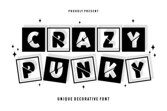
Tilted 3D shadow-boxed ransom tile display
Crazy Punky is a high-contrast monochrome ransom-tile display font placing bold mismatched capitals inside tilted black squares with 3D offset borders.
Ideas for this font
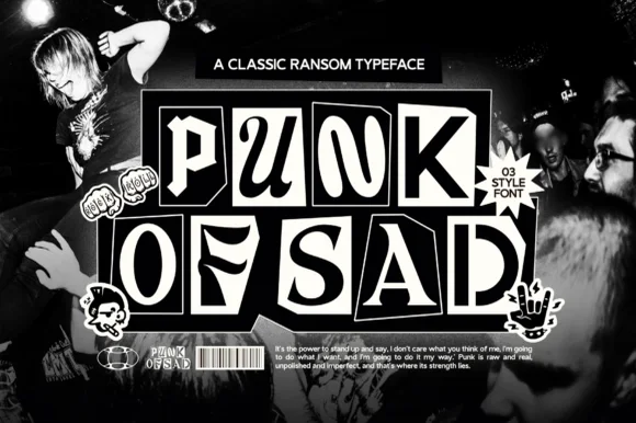
3-style monochrome punk-zine cut-paper ransom font
Punk of Sad is a classic black-and-white punk-zine ransom typeface (3 styles) setting gritty serif/sans letters inside uneven cut-newspaper tiles.
Ideas for this font
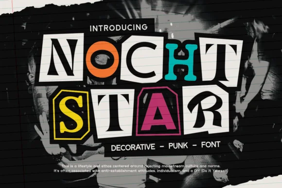
Classic cut-magazine-clipping DIY punk zine ransom font
Nocht Star is an authentic cut-magazine-clipping punk ransom font placing mismatched serif, sans, and stencil letters inside scissor-cut collage boxes!
Ideas for this font
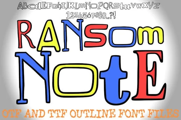
Colorable hand-drawn outline mixed-style ransom alphabet
Ransom Note (by squeebcreative) is an installable hand-drawn outline ransom font mixing mismatched serif, slab, and block letters ready to color.
Ideas for this font
Same independent foundry
Allow optional Google Analytics to measure visits and catalogue actions. Your search words and notes are not included. Privacy & storage