Neutral Sans Workhorse

Ransom Note + Base Edge
Lets Ransom Note own the focal silhouette while handling secondary copy, sizing and subheads cleanly.
Inspect Base Edge specimenDisclosure: MakerFileHub may earn a commission from qualifying purchases via paid links on this page. How our links work.
Colorable hand-drawn outline mixed-style ransom alphabet
Ransom Note (by squeebcreative) is an installable hand-drawn outline ransom font mixing mismatched serif, slab, and block letters ready to color.
Paid link
Get this fontProject & layout blueprintsAt-a-glance maker compatibility
Fine grain and micro-texture excel in 300 DPI print, sublimation, and screen print rather than small vinyl weeding.
Visual anatomy & craft review
Ransom Note is a hand-drawn ransom alphabet in which every letter is cut from a different source: mixed serif and sans shapes, uneven plate sizes, torn edges, taped corners and outline-only variants. The outlines are open, so the face can be coloured, and the mixing is deliberate, which means a word cannot be aligned or tracked normally. It needs roughly 28 mm for the torn edge and the plate joins to read, and it is best in flat black on newsprint, or coloured in with two crayon-bright inks on cheap white stock.
Hand-drawn · Colorable · Eclectic
Two-font hierarchy recipes
Tested contrast partners — pairing Ransom Note with grounded secondary typography.
Ransom Note + Base Edge
Lets Ransom Note own the focal silhouette while handling secondary copy, sizing and subheads cleanly.
Inspect Base Edge specimen
Ransom Note + Things
Grounds bold display lettering with classic typographic authority on posters, badges and apparel.
Inspect Things specimenPractical applications
Concrete hierarchy, scale and production guidance tailored to Ransom Note’s stroke geometry.
A hand-drawn ransom alphabet reads as a paste-up made in a hurry, which is the right argument for an issue about protest printing. The mixed sources give the opener visible disorder at 72 pt, and the outline variants let captions take a second colour without new artwork.
Hierarchy & layout recipe
Opener 210 x 297 mm, title 72 pt with 8 mm torn-edge clearance, standfirst 11/15 pt, body 9/13 pt, 18 mm margins. Caption plates 90 x 30 mm, word 12 pt. Pull quote 40 pt.
Pre-production check
At 12 pt on a caption plate the torn edges merge and the word reads as a printing fault rather than a style. Keep the face to 30 pt and above, set captions in a plain sans, and proof one spread at 1:1.
Cut-paper ransom lettering reads as a threat assembled by hand, which is the tone a neighbourhood haunt wants rather than a cartoon pumpkin. The mixed plates give the flyer menace at 110 mm, and flat black on cheap stock prints the flyer, the tickets and the jar labels in one pass.
Hierarchy & layout recipe
Flyer A4, word 110 mm with 12 mm torn-edge clearance, times 30 mm, 15 mm margins. Ticket 100 x 50 mm, word 14 mm, 4 mm perforation. Jar label 70 x 50 mm, word 12 mm, 4 mm margins.
Pre-production check
A 70 x 50 mm jar label at 12 mm collapses the plate joins and the word reads as a smudge behind glass. Use one letter per jar instead or raise the word to 18 mm, and label one jar before the batch.
A ransom alphabet gives a small label the look of a record assembled from clippings, which is what a noise or punk imprint sells. The mixed plates stay distinct at 30 mm on a sleeve, and one black pass prints the tape, the sleeve and the insert on cheap stock with no registration risk.
Hierarchy & layout recipe
Sleeve 300 x 300 mm, word 60 mm with 10 mm plate clearance, 20 mm margins. Tape 50 mm wide, word 14 mm along the run. Insert 148 x 210 mm, header 30 mm, credits 8/11 pt.
Pre-production check
A 50 mm tape at 14 mm crosses the roll seam and the tallest plate clips on the wrap. Keep the word inside a 30 mm band with 6 mm clear of each edge, and test one roll before ordering.
Technical & licence verification
Confirm included OTF/TTF/WOFF formats, full glyph tables and licence coverage on the live store page before batch production.
Closest visual alternatives
Matched across letterform anatomy, stroke behaviour and craft applications.
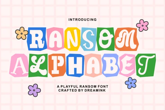
Cute pastel scrapbook & groovy ransom-tile font
Ransom Alphabet is a cheerful, kid-friendly ransom-cutout font pairing groovy 70s, serif, and bubble letters inside colorful rounded paper tiles.
Ideas for this font
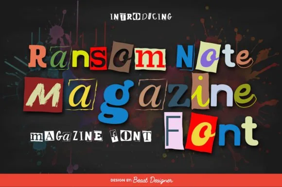
Full-color cut-paper magazine collage ransom font
Ransom Note Magazine is a colorful cut-out collage font placing mismatched serif, sans, and slab letters onto colorful torn magazine paper scraps.
Ideas for this font
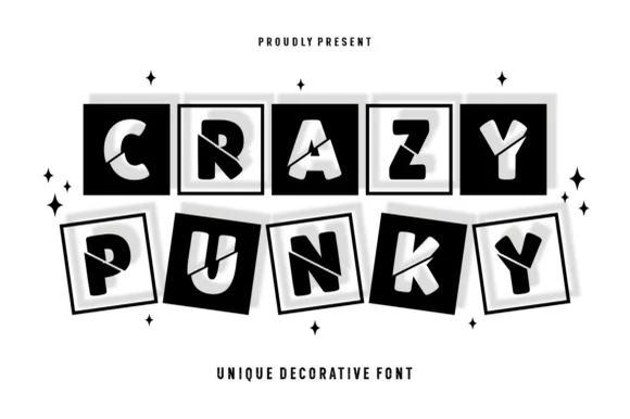
Tilted 3D shadow-boxed ransom tile display
Crazy Punky is a high-contrast monochrome ransom-tile display font placing bold mismatched capitals inside tilted black squares with 3D offset borders.
Ideas for this font
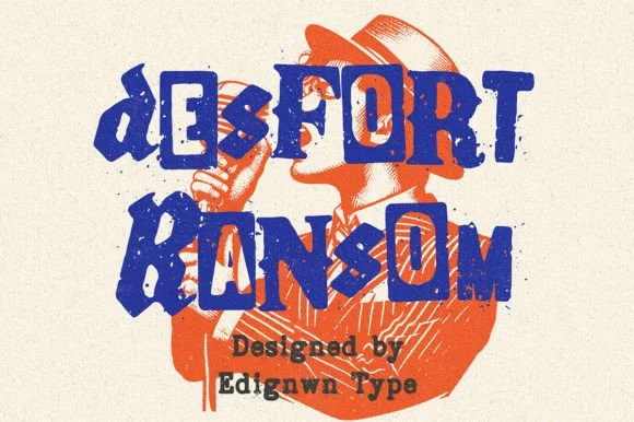
Gritty stamp-distressed mixed-typeface ransom-note font
Desfort Ransom is a rugged, ink-stamped ransom-note typeface mixing serif, sans, and reverse-tile characters with weathered woodblock grit!
Ideas for this font
Same independent foundry
Allow optional Google Analytics to measure visits and catalogue actions. Your search words and notes are not included. Privacy & storage