Neutral Sans Workhorse

Punk of Sad + Headline
Lets Punk of Sad own the focal silhouette while handling secondary copy, sizing and subheads cleanly.
Inspect Headline specimenDisclosure: MakerFileHub may earn a commission from qualifying purchases via paid links on this page. How our links work.
3-style monochrome punk-zine cut-paper ransom font
Punk of Sad is a classic black-and-white punk-zine ransom typeface (3 styles) setting gritty serif/sans letters inside uneven cut-newspaper tiles.
Paid link
Get this fontProject & layout blueprintsAt-a-glance maker compatibility
Cut solid base, outline, and shadow layers in separate vinyl colors and align on registration marks.
Visual anatomy & craft review
Punk of Sad is a monochrome punk-zine ransom face in three styles, setting serif and sans letters inside uneven cut-newspaper tiles with alternating black-on-white and white-on-black blocks, so a word reads as a ransom note assembled on a photocopier. The three styles let a designer alternate tiles for rhythm, and the tiles are large, which means the face needs size before the clipping edges read. It needs roughly 24 mm for the tile edges to hold, and it is best in pure black and white with no grey, on newsprint or matte paper.
Anarcho-punk · Zine-cutout · Gritty
Two-font hierarchy recipes
Tested contrast partners — pairing Punk of Sad with grounded secondary typography.
Punk of Sad + Headline
Lets Punk of Sad own the focal silhouette while handling secondary copy, sizing and subheads cleanly.
Inspect Headline specimen
Punk of Sad + The Simple Editorial
Grounds bold display lettering with classic typographic authority on posters, badges and apparel.
Inspect The Simple Editorial specimenPractical applications
Concrete hierarchy, scale and production guidance tailored to Punk of Sad’s stroke geometry.
Clipped monochrome tiles read as a page laid out by hand on a copier, which is what a punk zine is. Alternating the three styles gives the headline rhythm, and the black-and-white palette prints on the cheapest machine.
Hierarchy & layout recipe
Cover 148 x 210 mm, title 60 mm, cover lines 8/11 pt, 12 mm margins. Spread 420 x 297 mm, headline 110 mm, body 9/13 pt. Flyer A5, title 60 mm, lineup 8/11 pt.
Pre-production check
Mixing black tiles and white tiles on one line makes the baseline jump, and a 60 mm title looks like two rows. Set the tile height consistently and check one printed proof at final size before the run.
Ransom tiles read as a label that cuts its own artwork, which is what a small punk imprint sells. The high contrast survives a one-colour screen print on a garment, and the three styles keep a short name from repeating identically.
Hierarchy & layout recipe
Tee print 260 x 140 mm, word 55 mm, 40 mm margins. Sticker 80 x 50 mm, word 16 mm, 3 mm die margin and 4 mm clear of the cut. Insert 148 x 105 mm, word 30 mm, 12 mm margins.
Pre-production check
A 16 mm sticker cuts a white tile edge on the die line and the tile loses its border. Keep the artwork 4 mm inside the cut, and pull one sticker before the sheet.
Ransom clipping reads as a threat pinned to a door, which is what a punk Halloween night prints. The monochrome tiles hold under coloured light at 260 mm, and the alternation gives the poster its noise without a photograph.
Hierarchy & layout recipe
Poster A2, word 260 mm, times 22/28 pt, 30 mm margins and 20 mm trim. Card 105 x 148 mm, word 26 mm, details 8/11 pt. Sign 600 x 400 mm, word 120 mm, 40 mm margins.
Pre-production check
A white tile printed on a dark poster turns grey under warm lamps and the word loses its clipping edges. Print tiles as solid white ink with a keyline, and check one card under the venue lighting.
Technical & licence verification
Confirm included OTF/TTF/WOFF formats, full glyph tables and licence coverage on the live store page before batch production.
Closest visual alternatives
Matched across letterform anatomy, stroke behaviour and craft applications.
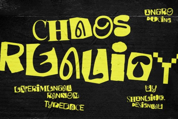
Experimental warped & mismatched-case brutalist ransom display
Chaos Reality is an experimental brutalist ransom display font mixing chunky blocks, coiled spirals, and warped mixed-weight letterforms.
Ideas for this font
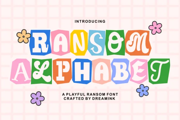
Cute pastel scrapbook & groovy ransom-tile font
Ransom Alphabet is a cheerful, kid-friendly ransom-cutout font pairing groovy 70s, serif, and bubble letters inside colorful rounded paper tiles.
Ideas for this font
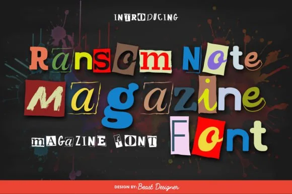
Full-color cut-paper magazine collage ransom font
Ransom Note Magazine is a colorful cut-out collage font placing mismatched serif, sans, and slab letters onto colorful torn magazine paper scraps.
Ideas for this font
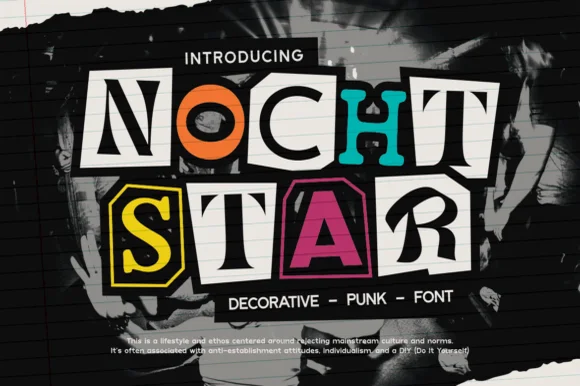
Classic cut-magazine-clipping DIY punk zine ransom font
Nocht Star is an authentic cut-magazine-clipping punk ransom font placing mismatched serif, sans, and stencil letters inside scissor-cut collage boxes!
Ideas for this font
Same independent foundry
Allow optional Google Analytics to measure visits and catalogue actions. Your search words and notes are not included. Privacy & storage