Neutral Sans Workhorse

Polka Dot Duo + Inkora
Lets Polka Dot Duo own the focal silhouette while handling secondary copy, sizing and subheads cleanly.
Inspect Inkora specimenDisclosure: MakerFileHub may earn a commission from qualifying purchases via paid links on this page. How our links work.
Angular slab-serif capitals alternating solid dotted and hollow dotted treatments
Polka Dot draws its capitals as octagons with the corners cut straight off, then punches a scatter of round holes through the fill so every letter looks like a punched paper tag.
Paid link
Get this fontProject & layout blueprintsAt-a-glance maker compatibility
Sturdy stroke walls and open counters weed cleanly on adhesive vinyl, HTV apparel film, and cut cardstock.
Visual anatomy & craft review
POLKA runs in smaller octagons and DOT in very large ones, both in magenta pink with white dots of two sizes arranged without a strict grid, which is what stops the pattern from reading as a machine mesh. The cuts at the corners make the letters feel cut from card, and the counters stay square. The pair is sold as a duo, so one weight is for a headline and the other for a smaller line, and the caption at the foot names it that way. Because the holes are part of the glyph, the face has to print large enough for each dot to survive, and a two-colour print inverts the whole idea.
Angular slab-serif capitals alternating solid dotted and hollow dotted treatments
Two-font hierarchy recipes
Tested contrast partners — pairing Polka Dot Duo with grounded secondary typography.
Polka Dot Duo + Inkora
Lets Polka Dot Duo own the focal silhouette while handling secondary copy, sizing and subheads cleanly.
Inspect Inkora specimen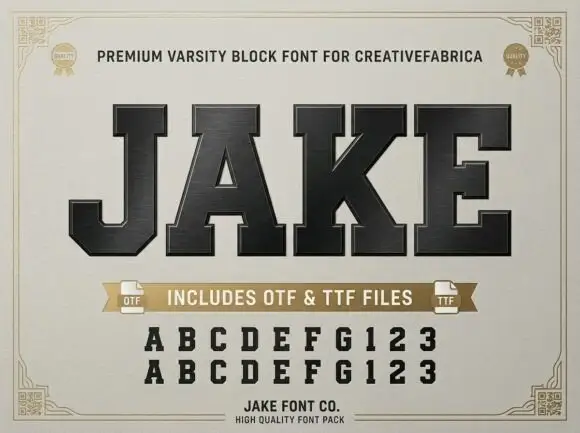
Polka Dot Duo + Jake
Grounds bold display lettering with classic typographic authority on posters, badges and apparel.
Inspect Jake specimenPractical applications
Concrete hierarchy, scale and production guidance tailored to Polka Dot Duo’s stroke geometry.
The punched dots and the cut corners give a party banner its pattern without hanging anything else, and one heavy word fills a wide strip.
Hierarchy & layout recipe
Print a 1000 by 300 mm banner: set the name at 120 pt on one row, keep 28 mm of clear ground beneath before the age line at 20 pt, and keep 30 mm of border so the octagon corners stay whole.
Pre-production check
Holes close up in cheap banner printing; check a physical proof before the banner order is placed.
The wide letters read at a glance on a small label, and the pattern makes a plain classroom tray look deliberate rather than improvised.
Hierarchy & layout recipe
Print a 60 by 25 mm label: set the name at 15 pt on one row, keep 4 mm of clear ground beneath, and keep 4 mm of margin so the cut corners are not trimmed off.
Pre-production check
Dots merge at tiny sizes; check the printed label before producing a full drawer set for the class.
The heavy octagons stay legible in bright light where thin scripts wash out, and the dot pattern suits a playful summer stand.
Hierarchy & layout recipe
Print a 600 by 400 mm panel: set the heading at 70 pt on one row, keep 22 mm of clear ground beneath before the prices at 18 pt, and keep 24 mm of border all round the frame.
Pre-production check
Colour is part of the file; check the separations before booking a two-colour print of the panel.
Technical & licence verification
Confirm included OTF/TTF/WOFF formats, full glyph tables and licence coverage on the live store page before batch production.
Closest visual alternatives
Matched across letterform anatomy, stroke behaviour and craft applications.
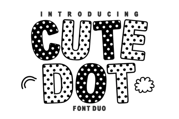
Soft uneven block capitals alternating filled white-dot and hollow dark-dot bodies
Cute Dot is a two-face set in black and white: fat rounded caps packed with dots on a white ground, and a matching face where the dots invert to white on black, both with a hatched shadow.
Ideas for this font
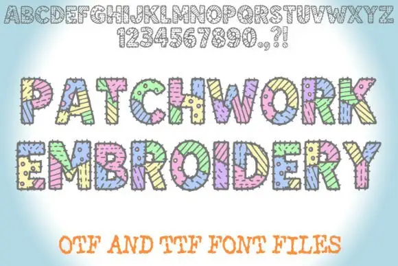
Patched block display with stitches
Patchwork Embroidery is a block display on a soft blue ground: fat capitals divided into patterned patches with short stitch marks along the joins, shown first as a full alphabet and numeral row in outline at the top and then twice at display size in pastel colours, with a plain line beneath that names the formats.
Ideas for this font
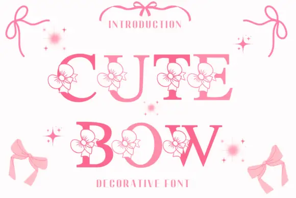
High-contrast serif capitals interrupted by outlined flower-like ribbon motifs
Cute Bow is a high-contrast serif display face in pink, with a drawn ribbon bow attached to each letter and small sparkles scattered around the word.
Ideas for this font
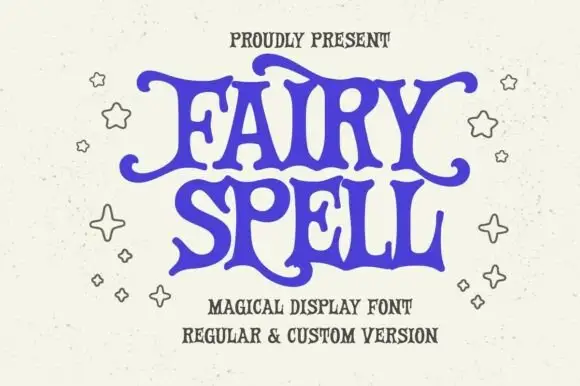
Heavy storybook capitals with wavy arms and curled tips
Fairy Spell shows purple capitals with thick curved strokes, broad pointed feet and irregular wavy horizontal arms, where the F and Y extend outward into curled tips and the R leg sweeps below the following letter.
Same independent foundry
Allow optional Google Analytics to measure visits and catalogue actions. Your search words and notes are not included. Privacy & storage