Neutral Sans Workhorse

Sienna + Noar
Lets Sienna own the focal silhouette while handling secondary copy, sizing and subheads cleanly.
Inspect Noar specimenDisclosure: MakerFileHub may earn a commission from qualifying purchases via paid links on this page. How our links work.
Groovy 1970s bottom-heavy bell-bottom outline display
Sienna is a breezy 1970s psychedelic outline font tracing pear-shaped, bottom-heavy groovy letters in a clean monoline contour.
Paid link
Get this fontProject & layout blueprintsAt-a-glance maker compatibility
Cut solid base, outline, and shadow layers in separate vinyl colors and align on registration marks.
Visual anatomy & craft review
Sienna is a nineteen-seventies bell-bottom outline display: each letter is drawn as a contour that flares at the foot, the outline weight is even and the bottoms sweep outward into a small kick. Because the letter is hollow, the interior stays open, and the flare is what breaks the word box at the base. It needs roughly 30 mm for the outline weight and the kick to read, and it is best in one saturated ink on white, or a single pastel on cream where the hollow interior lets the paper show.
70s-outline · Bottom-heavy · Desert-boho
Two-font hierarchy recipes
Tested contrast partners — pairing Sienna with grounded secondary typography.
Sienna + Noar
Lets Sienna own the focal silhouette while handling secondary copy, sizing and subheads cleanly.
Inspect Noar specimen
Sienna + Rosemode
Grounds bold display lettering with classic typographic authority on posters, badges and apparel.
Inspect Rosemode specimenPractical applications
Concrete hierarchy, scale and production guidance tailored to Sienna’s stroke geometry.
A hollow bell-bottom display reads as a painted pool sign rather than a printed menu, which is what a summer bar wants. The kick holds at 120 mm, and one saturated ink prints the poster and the menu in a single pass.
Hierarchy & layout recipe
Poster A2, word 120 mm with 15 mm kick clearance, details 36 mm, 20 mm margins. Menu 150 x 300 mm, header 44 mm, drinks 12 mm. Towel tag 60 x 90 mm, word 14 mm with a 4 mm hole and 8 mm clear.
Pre-production check
On a 60 x 90 mm towel tag at 14 mm the outline thins to a hairline and the word disappears against a bright towel. Raise tags to 20 mm, and print one tag on the loop card before the batch.
A bell-bottom outline reads as a hand-painted studio sign rather than a modern logo. The hollow construction keeps the name light on a narrow door strip at 60 mm, and one ink prints the strip and the card from one file.
Hierarchy & layout recipe
Door strip 60 x 700 mm, word 100 mm with 12 mm kick clearance, 10 mm margins. Card 85 x 55 mm, word 16 mm, 5 mm margins. Poster 210 x 297 mm, word 60 pt, 18 mm margins.
Pre-production check
On an 85 x 55 mm card the flare merges with the baseline and the name reads as a smudged rule. Keep the card word at 22 mm on a straight segment, and check one card before the order.
A seventies outline display reads as a printed record-fair bill rather than a digital flyer, which is what a small fair wants on its tables. The flare holds at 100 mm on a poster, and one ink prints the crate cards and the tote from the same separation.
Hierarchy & layout recipe
Poster A3, word 100 mm with 12 mm kick clearance, details 28 mm, 18 mm margins. Crate card 120 x 80 mm, word 26 mm, 8 mm margins. Tote print 300 x 300 mm, word 70 mm, 25 mm margins.
Pre-production check
Screen printed on a tote at 70 mm the hollow outline bridges into a solid stroke after one wash. Use the filled cut on fabric, and wash one sample before the order.
Technical & licence verification
Confirm included OTF/TTF/WOFF formats, full glyph tables and licence coverage on the live store page before batch production.
Closest visual alternatives
Matched across letterform anatomy, stroke behaviour and craft applications.
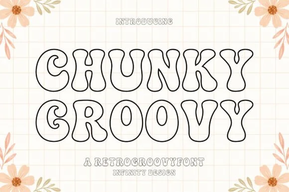
Clean flat monoline 1970s groovy outline display
Chunky Groovy is a crisp, flat monoline 1970s outline display font (shadow-free!) tracing bell-bottom retro curves in an even black contour.
Ideas for this font
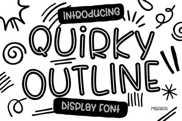
Tall funky hand-drawn tubular outline display
Quirky Outline Font is a tall, lively hand-drawn outline display font with double-walled tubular strokes and playful dancing rhythm.
Ideas for this font
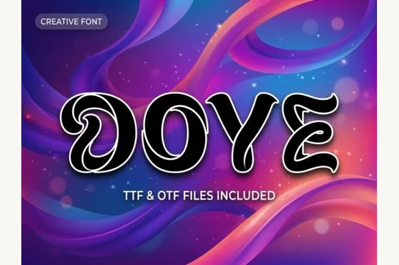
Liquid-ribbon curled monoline display with white outline
Dove is a fluid, ribbon-like decorative display font featuring coiled inward spiral bowls and continuous neon-sign outline framing.
Ideas for this font
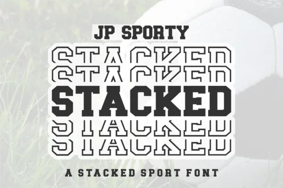
Dual-case solid + sliced-echo stacked sport sans (Uppercase + Lowercase!)
Jp Sporty Stacked is a clever 2-in-1 crafter sport sans: type UPPERCASE for solid athletic blocks and LOWERCASE for half-sliced outlined repeat echoes!
Ideas for this font
Same independent foundry
Allow optional Google Analytics to measure visits and catalogue actions. Your search words and notes are not included. Privacy & storage