Neutral Sans Workhorse

Chunky Groovy + Cenura
Lets Chunky Groovy own the focal silhouette while handling secondary copy, sizing and subheads cleanly.
Inspect Cenura specimenDisclosure: MakerFileHub may earn a commission from qualifying purchases via paid links on this page. How our links work.
Clean flat monoline 1970s groovy outline display
Chunky Groovy is a crisp, flat monoline 1970s outline display font (shadow-free!) tracing bell-bottom retro curves in an even black contour.
Paid link
Get this fontProject & layout blueprintsAt-a-glance maker compatibility
Sturdy stroke walls and open counters weed cleanly on adhesive vinyl, HTV apparel film, and cut cardstock.
Visual anatomy & craft review
Chunky Groovy is a clean flat monoline display from the nineteen-seventies: fat outline letters of even weight with no shading, rounded corners that overrun the stem joints and a slight italic slant that leans the whole word. Because the letter is a monoline outline, the interior stays empty and the line weight is the same everywhere, so the face prints honestly at any size in one ink. It needs roughly 30 mm for the outline weight and the rounded corner to read, and it is best in one bright ink on white, or a single pastel on cream where the empty interior lets the paper show.
Flat-groovy-outline · Clean-monoline · Boho-grid
Two-font hierarchy recipes
Tested contrast partners — pairing Chunky Groovy with grounded secondary typography.
Chunky Groovy + Cenura
Lets Chunky Groovy own the focal silhouette while handling secondary copy, sizing and subheads cleanly.
Inspect Cenura specimen
Chunky Groovy + Brenco
Grounds bold display lettering with classic typographic authority on posters, badges and apparel.
Inspect Brenco specimenPractical applications
Concrete hierarchy, scale and production guidance tailored to Chunky Groovy’s stroke geometry.
A flat groovy monoline reads as a nineteen-seventies poster rather than a modern masthead, which is what a design-history issue wants on the cover. The empty outline keeps the title light over a coloured ground at 80 pt, and one ink prints the cover and the section band without a second plate.
Hierarchy & layout recipe
Cover 210 x 297 mm, title 80 pt with 10 mm outline clearance, cover lines 10/14 pt, 18 mm margins. Feature opener 60 pt, standfirst 11/15 pt. Section band 210 x 60 mm, word 44 pt.
Pre-production check
At 44 pt on the section band the interior closes optically on a coloured background and the word reads as a solid fat serif. Keep the band on white or knock out the interior, and proof one cover at 1:1.
A groovy monoline is the lettering a rink already has on its wall, so an identity in it reads as the venue rather than a rebrand. The even line catches light across a panel at 90 mm, and one colour prints the panel, the sticker and the card from the same file.
Hierarchy & layout recipe
Sign panel 1200 x 400 mm, word 120 mm with 15 mm outline clearance, 30 mm margins. Skate sticker 100 x 60 mm, word 28 mm, 5 mm die margin. Card 85 x 55 mm, word 16 mm, 5 mm margins.
Pre-production check
A 100 x 60 mm sticker at 28 mm leaves the 1 mm outline at the corner unsupported and the blade tears it during weeding. Widen the die margin to 5 mm or print the sticker as a square, and weed one sheet before the batch.
A flat groovy monoline suits a summer pool bar because the outline reads as a painted sign in bright sun. The slant gives the word movement at 140 mm on a poster, and one bright ink prints the poster, the menu and the towel tags in a single pass.
Hierarchy & layout recipe
Poster A2, word 140 mm with 18 mm outline clearance, details 40 mm, 20 mm margins. Menu 150 x 300 mm, header 44 mm, drinks 12 mm. Towel tag 60 x 90 mm, word 14 mm with a 4 mm hole and 8 mm clear.
Pre-production check
On a 60 x 90 mm towel tag at 14 mm the monoline thins to a hairline and the word disappears against a bright towel. Keep tags at 20 mm, and print one tag on the actual loop card before the batch.
Technical & licence verification
Confirm included OTF/TTF/WOFF formats, full glyph tables and licence coverage on the live store page before batch production.
Closest visual alternatives
Matched across letterform anatomy, stroke behaviour and craft applications.
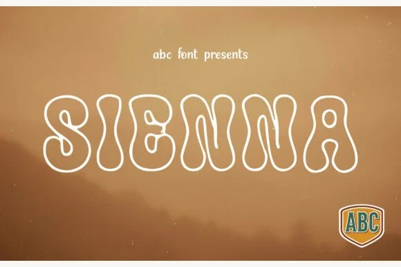
Groovy 1970s bottom-heavy bell-bottom outline display
Sienna is a breezy 1970s psychedelic outline font tracing pear-shaped, bottom-heavy groovy letters in a clean monoline contour.
Ideas for this font
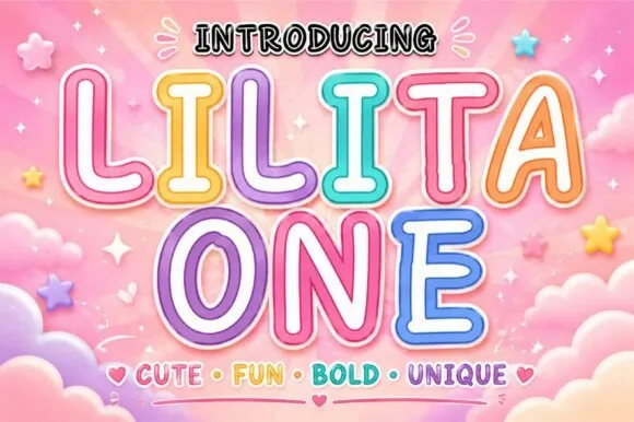
Rounded retro-candy outline & inline kids' display
Lilita One (by creativelabstd) is a plump, rounded display typeface shown with playful double candy-cane border styling and soft tubular terminals.
Ideas for this font
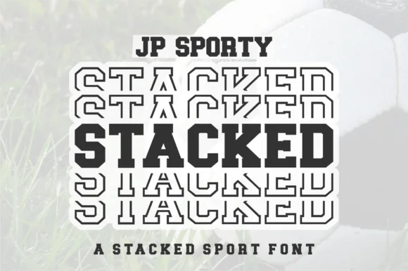
Dual-case solid + sliced-echo stacked sport sans (Uppercase + Lowercase!)
Jp Sporty Stacked is a clever 2-in-1 crafter sport sans: type UPPERCASE for solid athletic blocks and LOWERCASE for half-sliced outlined repeat echoes!
Ideas for this font
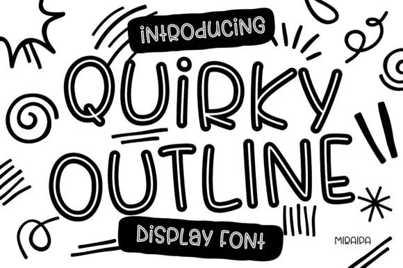
Tall funky hand-drawn tubular outline display
Quirky Outline Font is a tall, lively hand-drawn outline display font with double-walled tubular strokes and playful dancing rhythm.
Ideas for this font
Same independent foundry
Allow optional Google Analytics to measure visits and catalogue actions. Your search words and notes are not included. Privacy & storage