Neutral Sans Workhorse

Leopard Varsity + Olline
Lets Leopard Varsity own the focal silhouette while handling secondary copy, sizing and subheads cleanly.
Inspect Olline specimenDisclosure: MakerFileHub may earn a commission from qualifying purchases via paid links on this page. How our links work.
Angular varsity slab capitals filled with irregular leopard-like spots inside a dark border
Leopard Varsity wraps heavy varsity slabs in a dark border and fills the interior with irregular leopard spots, so a block letter looks like animal print cut out and outlined in ink.
Paid link
Get this fontProject & layout blueprintsAt-a-glance maker compatibility
Sturdy stroke walls and open counters weed cleanly on adhesive vinyl, HTV apparel film, and cut cardstock.
Visual anatomy & craft review
The cover shows a single enormous A carrying the spot field, then the words LEOPARD VARSITY in the same build, then the full alphabet, digits and punctuation at a smaller size so the coverage is visible. Serifs stay square and wide, the corners angular, and the counters open enough that the spots do not swallow them. The spot pattern is irregular by design, so neighbouring letters never repeat the same arrangement, and the border keeps its thickness across sizes. A coloured strip at the foot lists the file formats. The layered build, border plus fill plus spots, is what a cutting-file user needs to check, because a spot touching the border merges the two shapes.
Angular varsity slab capitals filled with irregular leopard-like spots inside a dark border
Two-font hierarchy recipes
Tested contrast partners — pairing Leopard Varsity with grounded secondary typography.
Leopard Varsity + Olline
Lets Leopard Varsity own the focal silhouette while handling secondary copy, sizing and subheads cleanly.
Inspect Olline specimen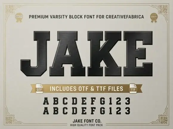
Leopard Varsity + Jake
Grounds bold display lettering with classic typographic authority on posters, badges and apparel.
Inspect Jake specimenPractical applications
Concrete hierarchy, scale and production guidance tailored to Leopard Varsity’s stroke geometry.
The varsity slabs read across a field, and the animal fill gives a school team a nickname mark that a plain athletic block would not carry.
Hierarchy & layout recipe
Print a 1200 by 600 mm banner: set the team name at 160 pt on one row, keep 32 mm of clear ground beneath before the event line at 24 pt, and keep 40 mm of border so no letter is clipped.
Pre-production check
Spots touch the outline in places; check the cut file before sending a vinyl banner to a printer.
The hybrid of athletic slab and animal print suits a fashion cover, and the heavy weight survives a masthead printed over a photograph.
Hierarchy & layout recipe
Print a 210 by 280 mm cover: set the cover line at 96 pt across one row, keep 22 mm of clear ground beneath before the standfirst at 11 pt, and keep 18 mm of margin from the trim.
Pre-production check
The spots read as noise under 40 pt; check the printed cover proof before shrinking the masthead.
The spot field gives a small clothing label a print detail that matches the fabric, and the varsity weight keeps a short brand readable on a tag.
Hierarchy & layout recipe
Print a 40 by 80 mm tag: set the brand at 14 pt on one row, keep 6 mm of clear ground beneath before the size at 5 pt, and keep 4 mm from the lettering to the punch hole.
Pre-production check
Fine spots vanish at tag size; check the printed label before committing a full run of tags.
Technical & licence verification
Confirm included OTF/TTF/WOFF formats, full glyph tables and licence coverage on the live store page before batch production.
Closest visual alternatives
Matched across letterform anatomy, stroke behaviour and craft applications.
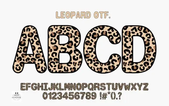
Rounded upright capitals densely filled with leopard-like rosettes
Am Leopard fills fat rounded capitals with a leopard print — a cream ground, brown rosettes with dark centres and small dashes between them — and outlines each letter heavily so a word looks like a row of spots cut out.
Ideas for this font
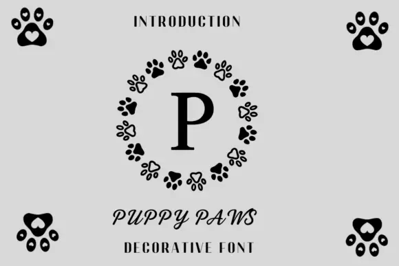
Paw-ring monogram design
Puppy Paws is a monogram design in black on pale grey: a serif capital P inside a ring of alternating solid and outlined paw prints, with four paw clusters at the corners, a small tracked line above and two plain lines at the foot.
Ideas for this font
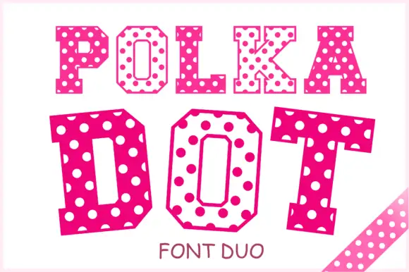
Angular slab-serif capitals alternating solid dotted and hollow dotted treatments
Polka Dot draws its capitals as octagons with the corners cut straight off, then punches a scatter of round holes through the fill so every letter looks like a punched paper tag.
Ideas for this font
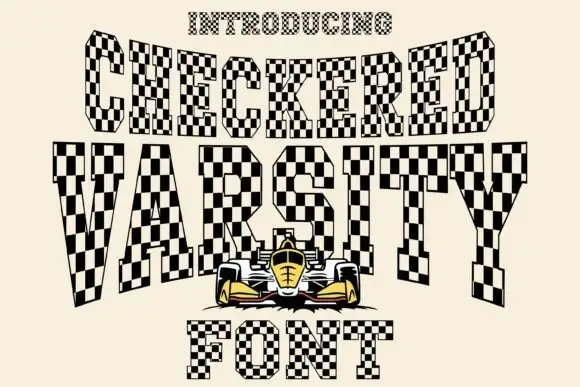
Clipped slab capitals filled with alternating black and pale checkerboard squares
Checkered Varsity sets tall italic capitals whose strokes are filled with a black and cream racing chequer, so every letter looks cut from a flag and the whole word leans forward.
Ideas for this font
Same independent foundry
Allow optional Google Analytics to measure visits and catalogue actions. Your search words and notes are not included. Privacy & storage