Neutral Sans Workhorse

Subway Graffiti + Corven
Lets Subway Graffiti own the focal silhouette while handling secondary copy, sizing and subheads cleanly.
Inspect Corven specimenDisclosure: MakerFileHub may earn a commission from qualifying purchases via paid links on this page. How our links work.
Dripping NYC subway-wall urban marker graffiti font
Subway Graffiti is a lively mixed-case street-art display font featuring flared marker terminals and vertical wet-paint drips.
Paid link
Get this fontProject & layout blueprintsAt-a-glance maker compatibility
Sturdy stroke walls and open counters weed cleanly on adhesive vinyl, HTV apparel film, and cut cardstock.
Visual anatomy & craft review
Subway Graffiti is a mixed-case marker display with flared terminals and long vertical wet-paint drips, drawn to sit on a brick wall or a subway panel. The core letters are chunky and readable, the flares give a tag rhythm, and the drips extend below the baseline so the layout needs foot room. It needs roughly 25 mm for the drips to read as paint rather than as a printing fault, and it works best in two inks on a mid-tone ground, with a second offset shadow in a light colour.
NYC-subway · Dripping · Gritty
Two-font hierarchy recipes
Tested contrast partners — pairing Subway Graffiti with grounded secondary typography.
Subway Graffiti + Corven
Lets Subway Graffiti own the focal silhouette while handling secondary copy, sizing and subheads cleanly.
Inspect Corven specimen
Subway Graffiti + Cronelo
Grounds bold display lettering with classic typographic authority on posters, badges and apparel.
Inspect Cronelo specimenPractical applications
Concrete hierarchy, scale and production guidance tailored to Subway Graffiti’s stroke geometry.
Flared tags with drips read as a wall piece, which suits an urban release. The solid core keeps a title legible at thumbnail size.
Hierarchy & layout recipe
Poster A2, word 280 mm with 25 mm drip allowance, details 22/28 pt, 30 mm margins. Cover 312 x 312 mm, word 200 mm, credits 7 pt. Zine A5, header 50 mm.
Pre-production check
Drips extend the artwork box and a printer fitting the file will crop them. Declare the full box, and check one printed poster for a cut drip before hanging.
A tag look gives a skate shop the credibility of the wall it sells against. Heavy strokes survive a one-colour screen print on a dark garment.
Hierarchy & layout recipe
Deck 210 x 810 mm, word 120 mm on a 200 mm centre panel. Hoodie print 300 x 320 mm, word 200 mm. Window decal 400 x 250 mm, word 90 mm, 15 mm cut margin.
Pre-production check
Vinyl drips under 2 mm tear during weeding, and a deck graphic is sanded under a clear coat. Keep drips at 3 mm, and check one deck after the coating step.
Street lettering sets a theme a teenager will accept, and the drips make the invite look hand-made. Heavy forms hold on a small A6 at 18 mm.
Hierarchy & layout recipe
Invite A6, name 18 mm with 8 mm drip allowance, details 4.5 mm, 10 mm margins. Cup wrap 200 x 90 mm, word 20 mm, 10 mm from the rim. Prop 300 x 200 mm on 5 mm foamex, word 90 mm.
Pre-production check
A photo prop is held at chest height and photographed close, so an 8 mm drip allowance is not enough at 90 mm. Check one prop at camera distance before the party.
Technical & licence verification
Confirm included OTF/TTF/WOFF formats, full glyph tables and licence coverage on the live store page before batch production.
Closest visual alternatives
Matched across letterform anatomy, stroke behaviour and craft applications.
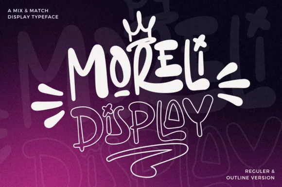
Street-art bubble & outline graffiti display duo
Moreli is a playful mix-and-match street-bubble display typeface shipped in both solid Regular and matching hollow Outline versions.
Ideas for this font

Heavy graffiti bubble caps with rough edges and paint splatter
Street Blaze is a heavy graffiti capital alphabet in which the letters swell into bubbles, the contours chip and the stems carry a rough inner edge, so a two-word title reads as something sprayed on a wall.
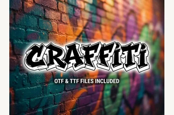
Explosive wildstyle arrow-bar urban graffiti display (OTF & TTF)
Graffiti (by clipartguru) is an energetic wildstyle street-art font armed with interlocking arrow extensions, sharp bevels, and OTF/TTF files.
Ideas for this font
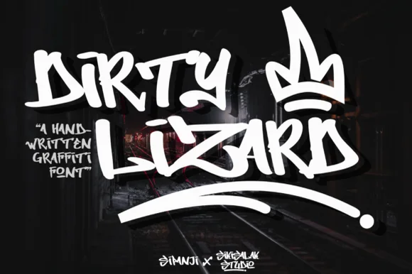
Raw street-marker handstyle tag graffiti font
Dirty Lizard Graffiti is an authentic chisel-marker street-tag font with sharp angular kicks, raw handstyle rhythm, and graffiti-crown swagger.
Ideas for this font
Same independent foundry
Allow optional Google Analytics to measure visits and catalogue actions. Your search words and notes are not included. Privacy & storage



