Editorial Serif Anchor

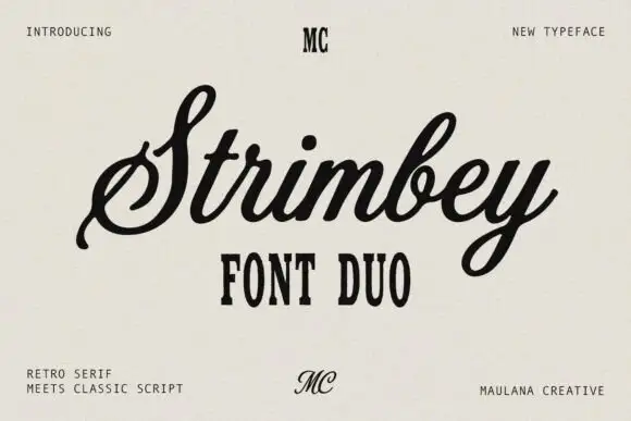
Grestanic + Brenco
Anchors Grestanic's fluid strokes with crisp Roman proportions on wedding suites, headers and packaging.
Inspect Brenco specimenDisclosure: MakerFileHub may earn a commission from qualifying purchases via paid links on this page. How our links work.
Sharp slanted marker capitals
Grestanic sets narrow marker capitals at a hard slant, with terminals that taper to sharp points, uneven tops and edges that break rather than curve.
Paid link
Get this fontProject & layout blueprintsAt-a-glance maker compatibility
Sturdy stroke walls and open counters weed cleanly on adhesive vinyl, HTV apparel film, and cut cardstock.
Visual anatomy & craft review
Every stem is cut fast: terminals taper to points, the arms of the E sit at steep angles, and the A opens into a narrow triangular counter that barely survives at small sizes. Spacing is tight and uneven, which produces the hand-scrawled rhythm, and the tops of the letters form a ragged edge instead of a clean line. There is no lower-case in the sample, so this is an uppercase-only display voice. The cyan brush strokes behind the word are artwork; the typeface is white and flat, and it depends on a dark ground for its contrast. The thin pointed ends are the first thing to fail in any reproduction, whether printed or cut.
Sharp · Slanted · Rough-edged
Two-font hierarchy recipes
Tested contrast partners — pairing Grestanic with grounded secondary typography.
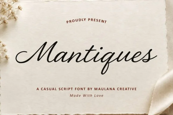
Grestanic + Brenco
Anchors Grestanic's fluid strokes with crisp Roman proportions on wedding suites, headers and packaging.
Inspect Brenco specimen
Grestanic + Homies
Keeps small-scale dates, URLs, nutrition facts and care instructions crisp and legible below script titles.
Inspect Homies specimenPractical applications
Concrete hierarchy, scale and production guidance tailored to Grestanic’s stroke geometry.
Sharp marker capitals carry aggression at distance, and the rough edges survive cheap large-format printing better than a clean face would.
Hierarchy & layout recipe
Set the phrase at 20 cm width on a 2 m banner over a dark ground, keep one colour only, and hold the pointed ends at least 3 cm inside the trim on every side.
Pre-production check
Rough pointed ends get lost in vinyl cutting, so if this becomes a decal rather than a printed banner, test a sample stroke first.
The slant reads as speed and the ragged top edge gives a poster its handmade energy without any added texture or halftone.
Hierarchy & layout recipe
Print the headline at 100 pt on A2, stack it in two lines with manual spacing, and keep the venue detail in a small grotesque at 12 pt under the second word.
Pre-production check
Check the A and N gaps after spacing manually, because the narrow counters close if you tighten the pair too far.
Uppercase-only marker forms read fast from a moving board, which is exactly what a skate-park sign needs at the junctions where riders approach.
Hierarchy & layout recipe
Keep three words maximum at 4-inch cap height on a painted panel, add an arrow in a plain geometric shape, and leave 10 cm of clearance around the text.
Pre-production check
Proof the thinnest pointed tips at viewing distance, because from ten metres they are the first detail to disappear.
Technical & licence verification
Confirm included OTF/TTF/WOFF formats, full glyph tables and licence coverage on the live store page before batch production.
Closest visual alternatives
Matched across letterform anatomy, stroke behaviour and craft applications.
Heavy condensed display sans
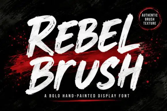
Rebel is a heavy condensed display sans in bright blue on black: tall narrow caps with flat terminals, cut corners on the diagonals, a high waist and closed counters, set as one stacked block with a second word in outline and small tracked notes at the sides.
Ideas for this font
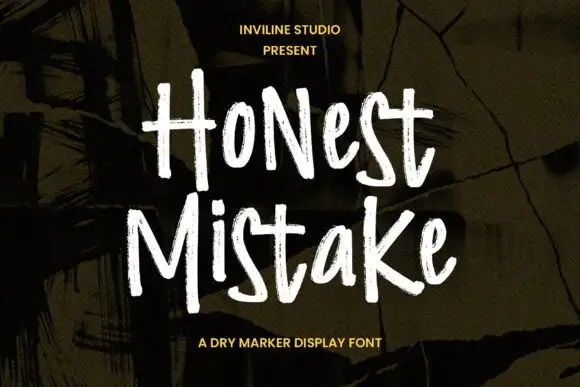
Rough narrow mixed-case marker forms with dry edges and uneven height
Honest Mistake is a narrow mixed-case marker face in which the strokes carry a dry edge, the heights shift and the crossbars sit unevenly, so a word reads as something written quickly on a wall of plywood.
Ideas for this font

Slanted brush capitals with torn ends
Temur Amorak Urban Bold Brush Font sets two rows of heavy white capitals that lean hard to the right, with torn ragged stroke ends, long diagonal cuts through the thick stems and a small green brush subtitle underneath on a dark grainy field.
Ideas for this font
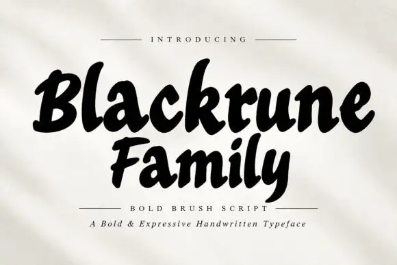
Heavy rounded brush lettering with loose fit and a soft forward lean
Blackrune Family is heavy rounded brush lettering with a soft forward lean, thick strokes that swell through the middle and a fit loose enough to keep each letter distinct.
Ideas for this font
Same independent foundry
Allow optional Google Analytics to measure visits and catalogue actions. Your search words and notes are not included. Privacy & storage