Neutral Sans Workhorse

Back Wild + Godthem
Lets Back Wild own the focal silhouette while handling secondary copy, sizing and subheads cleanly.
Inspect Godthem specimenDisclosure: MakerFileHub may earn a commission from qualifying purchases via paid links on this page. How our links work.
Puffy throw-up bubble graffiti
Back Wild delivers puffy throw-up street bubble graffiti, where the white letters inflate into overlapping blobs with a dark outline and a soft glow, a drip runs from the final letter and a thick rounded underline bar sits below on a dark garage photograph.
Paid link
Get this fontProject & layout blueprintsAt-a-glance maker compatibility
Sturdy stroke walls and open counters weed cleanly on adhesive vinyl, HTV apparel film, and cut cardstock.
Visual anatomy & craft review
The letters stay fat and rounded, they overlap rather than sit apart, the outline carries the shape and one drip pulls the eye down. That overlap is the character: the word reads as a painted throw-up rather than a font setting, which is why the sample shows a two-word stack on a dark ground. The green banner and the small studio marks belong to the cover. Check whether the outline and the glow are included styles, keep 44 pt so the outlines stay separate and print on a matte surface where the soft edge does not smear.
Chubby · Throw-up · Street-pop
Two-font hierarchy recipes
Tested contrast partners — pairing Back Wild with grounded secondary typography.
Back Wild + Godthem
Lets Back Wild own the focal silhouette while handling secondary copy, sizing and subheads cleanly.
Inspect Godthem specimen
Back Wild + Majestic Letters
Grounds bold display lettering with classic typographic authority on posters, badges and apparel.
Inspect Majestic Letters specimenPractical applications
Concrete hierarchy, scale and production guidance tailored to Back Wild’s stroke geometry.
The bubble forms read at a glance on a small sticker and the drip gives the mark a hand-painted story without an illustrator.
Hierarchy & layout recipe
Print a 70 by 70 mm die-cut sticker: set the shop name at 30 pt on one row, keep 6 mm of clear space around the letters for the outline, keep 7 mm to the die line, and allow 4 mm extra under the last letter for the drip.
Pre-production check
Die lines can cross the drip; check the cut template, keep 7 mm to the die and add 4 mm under the last letter.
The inflated letters hold a party poster and the overlapping stack fills a wall at short notice, which is how this style is normally used.
Hierarchy & layout recipe
Print a 420 by 594 mm poster: set the party name at 120 pt over two overlapping rows with 40 mm between baselines, keep 30 mm of clear ground beneath for the underline bar, and keep 25 mm of border.
Pre-production check
Overlapping rows at this size need the outline to stay distinct; check a scaled proof first.
The graffiti weight suits a teenage invitation, and the puffy letters keep the card playful without tipping into childish.
Hierarchy & layout recipe
Print a 120 by 170 mm card: set the greeting at 40 pt on one row, keep 18 mm of clear ground beneath for the darker field, and keep 15 mm of margin so the glow does not touch the trim.
Pre-production check
The glow needs paper that holds a soft edge; check a proof on uncoated card before ordering.
Technical & licence verification
Confirm included OTF/TTF/WOFF formats, full glyph tables and licence coverage on the live store page before batch production.
Closest visual alternatives
Matched across letterform anatomy, stroke behaviour and craft applications.
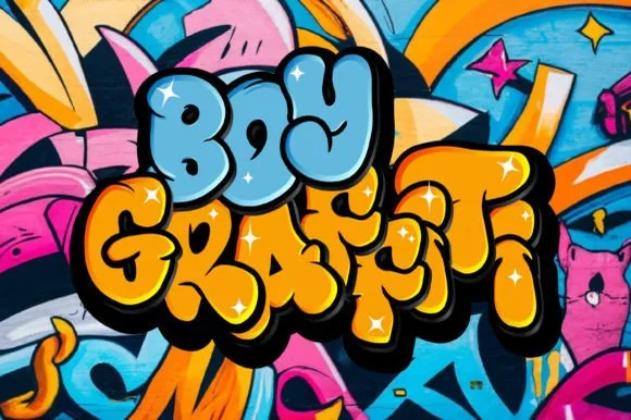
Puffy rounded 90s bubble throw-up graffiti font
Boy Graffiti is a plump, bubbly street-throwup display font with inflated comic-cushion letters and tiny slit counters.
Ideas for this font
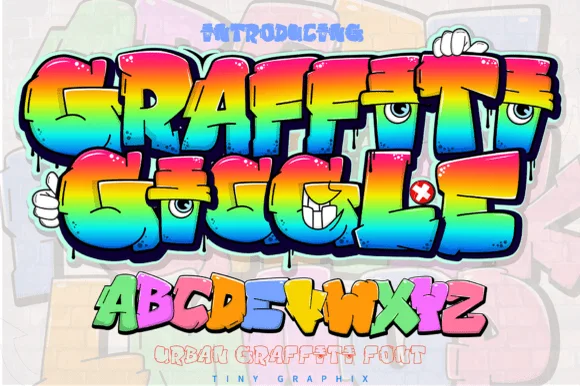
Cartoon character-eye bubble graffiti display
Graffiti Giggle is a playful cartoon street-graffiti font featuring chunky overlapping bubble letters and cheeky character-eye details.
Ideas for this font
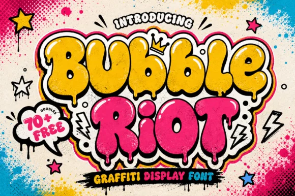
Dripping street-art throw-up bubble graffiti display
Bubble Riot is a bold, overlapping throw-up graffiti bubble font accented by interior shine marks, paint-drip bottoms, and 70+ bonus street doodles.
Ideas for this font
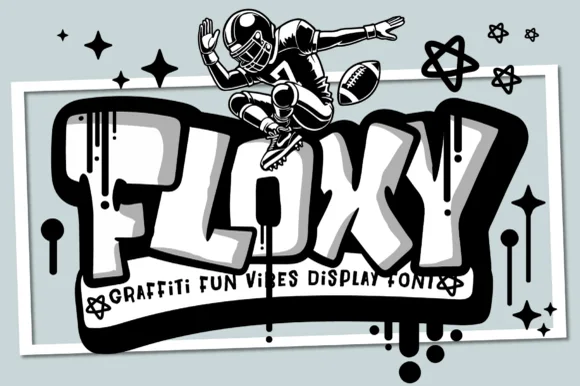
Tubular rounded 3D-block street graffiti with drips
Floxy is a chunky, rounded-rectangle street graffiti font accented with subtle paint drips and heavy cartoon 3D block depth.
Ideas for this font
Same independent foundry
Allow optional Google Analytics to measure visits and catalogue actions. Your search words and notes are not included. Privacy & storage