Neutral Sans Workhorse

Sideways + Base Edge
Lets Sideways own the focal silhouette while handling secondary copy, sizing and subheads cleanly.
Inspect Base Edge specimenDisclosure: MakerFileHub may earn a commission from qualifying purchases via paid links on this page. How our links work.
Rounded graffiti blocks with cyan-to-magenta shading and black depth
Sideways is a graffiti colour face in which the letters are fat, tilted blocks with a heavy black outline, a magenta-to-cyan gradient and a soft highlight, presented on a brick wall with sprayed drips.
Paid link
Get this fontProject & layout blueprintsAt-a-glance maker compatibility
Sturdy stroke walls and open counters weed cleanly on adhesive vinyl, HTV apparel film, and cut cardstock.
Visual anatomy & craft review
SIDE over WAYS fills the card at a strong tilt, and each letter is a thick graffiti shape with a gradient that runs from magenta at the bottom to cyan at the top, a black contour with a soft drop shadow and a highlight along one edge. The tilt increases across the word, so the whole piece looks sprayed rather than set, and small drips and dots sit around the letters. A caption at the top names the set, one at the foot credits the designer, and a small crown and a pair of characters sit in the corners. The construction is a colour font built for large format: at poster size the gradient and the highlight read as spray paint, and at label size they read as mush, which is the practical limit to keep in mind.
Rounded graffiti blocks with cyan-to-magenta shading and black depth
Two-font hierarchy recipes
Tested contrast partners — pairing Sideways with grounded secondary typography.
Sideways + Base Edge
Lets Sideways own the focal silhouette while handling secondary copy, sizing and subheads cleanly.
Inspect Base Edge specimen
Sideways + The Avenue Editorial
Grounds bold display lettering with classic typographic authority on posters, badges and apparel.
Inspect The Avenue Editorial specimenPractical applications
Concrete hierarchy, scale and production guidance tailored to Sideways’s stroke geometry.
The tilt and the gradient do the work of a painted wall, so a promoter can print one sheet instead of commissioning a mural, and the style speaks to the crowd directly.
Hierarchy & layout recipe
Print an A2 poster: set the contest name at 150 pt across two rows, keep 36 mm of clear ground beneath before the schedule at 13 pt, and hold 28 mm of margin so the tilt does not run off the sheet.
Pre-production check
Gradients band on a cheap press; print one poster at the final size and check the transition before the run.
The face gives a party for an older child a look that a pastel design cannot, and a two-word banner reads across a room without decoration.
Hierarchy & layout recipe
Print a 1000 by 400 mm banner: set the greeting at 200 pt across two rows, keep 40 mm of clear ground beneath before the name at 30 pt, and hold 30 mm of border on all four sides.
Pre-production check
Large gradients look flat on vinyl from a distance; print one banner and check it across the room before the order.
The lettering reads as street graphics rather than as a brand, and a sticker on a window gives a small shop a mark that works without commissioning a logo.
Hierarchy & layout recipe
Print a 90 mm round sticker: set the shop name at 26 pt on one row, keep 6 mm of clear ground between the contour and the rim, and hold 8 mm of space beneath for the street at 6 pt.
Pre-production check
Fine highlights vanish on a small vinyl sticker; print one at the real size and check the cut before the batch.
Technical & licence verification
Confirm included OTF/TTF/WOFF formats, full glyph tables and licence coverage on the live store page before batch production.
Closest visual alternatives
Matched across letterform anatomy, stroke behaviour and craft applications.
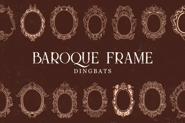
Intricate oval baroque frames with curling crowns and fine inner rings
Baroque Frame Dingbats is a set of oval cartouche frames drawn with acanthus scrolls, shell crests and bead mouldings, each one a typable character that can be dropped around a name.
Ideas for this font
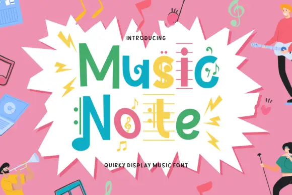
Music-note display
Music Note is a quirky display in green, teal, pink and yellow inside a white burst on a pink ground: mixed case whose letters carry note heads, staff-like bars and a clef, with small figures playing instruments around the edge and a plain line beneath naming the style.
Ideas for this font
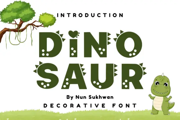
Heavy rounded capitals with small triangular spines and pale spot clusters
Dinosaur Nun Sukhwan sets heavy olive block capitals, gives several letters a row of triangular spikes along the top and fills the counters with pale spots, with a heart standing in for the dot of the i.
Ideas for this font
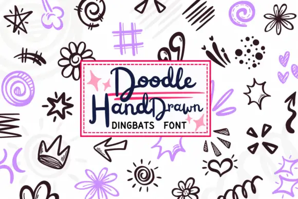
Loose black and lavender doodles with crowns, spirals and sketched bursts
Doodle Hand Drawn is a typable set of loose sketch marks — stars, spirals, flowers, crowns, arrows, lightning, hearts, dashed frames, scribbles — drawn in a quick hand and supplied in black and a soft lilac.
Ideas for this font
Same independent foundry
Allow optional Google Analytics to measure visits and catalogue actions. Your search words and notes are not included. Privacy & storage