Neutral Sans Workhorse

Graffiti Splash + Prime Nordic
Lets Graffiti Splash own the focal silhouette while handling secondary copy, sizing and subheads cleanly.
Inspect Prime Nordic specimenDisclosure: MakerFileHub may earn a commission from qualifying purchases via paid links on this page. How our links work.
Heavy dripping monster-spray urban graffiti font
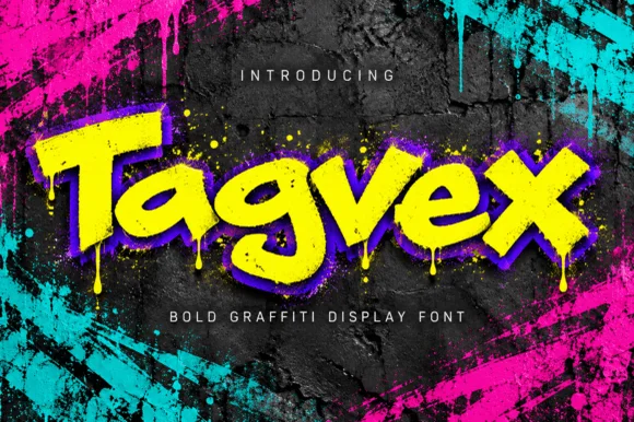
Graffiti Splash is a bold, heavy mixed-case street display font dripping long vertical paint runs from chunky comic-slab letters.
Paid link
Get this fontProject & layout blueprintsAt-a-glance maker compatibility
Sturdy stroke walls and open counters weed cleanly on adhesive vinyl, HTV apparel film, and cut cardstock.
Visual anatomy & craft review
Graffiti Splash is a heavy mixed-case street display with chunky comic-slab letters and long paint runs dripping from the baseline, plus a built-in extrusion shadow in some styles. The letters are wide and bouncy, the counters are large enough to stay readable with the drips attached, and the drips demand vertical room below the baseline — cropping close severs them. It needs roughly 30 mm for the drips to read as paint rather than as noise, and it is at its best in two flat colours on a wall or garment.
Splash-drip · Heavy-chunky · Neon-street
Two-font hierarchy recipes
Tested contrast partners — pairing Graffiti Splash with grounded secondary typography.
Graffiti Splash + Prime Nordic
Lets Graffiti Splash own the focal silhouette while handling secondary copy, sizing and subheads cleanly.
Inspect Prime Nordic specimen
Graffiti Splash + Gorga
Grounds bold display lettering with classic typographic authority on posters, badges and apparel.
Inspect Gorga specimenPractical applications
Concrete hierarchy, scale and production guidance tailored to Graffiti Splash’s stroke geometry.
Dripping letterforms set the theme in one word, which saves a party from licensed graphics. Heavy slabs survive a vinyl cut on a curved cup where thin novelty faces lift.
Hierarchy & layout recipe
Banner 900 x 300 mm, word 110 mm with 30 mm below the baseline for drips, 40 mm margins. Cup wrap 200 x 90 mm, word 20 mm, 10 mm from the rim. Shirt print 240 x 160 mm, word 55 mm.
Pre-production check
Vinyl drips under 2 mm tear at the tip during weeding, and a banner printed with no drip allowance gets cropped. Declare 30 mm below the baseline, keep drips at 3 mm or more, and check one cut cup before the party.
Dripping paint reads as fresh spray on a shutter, which is the urban register a street party wants over a cartoon ghost. Heavy slabs stay legible at a distance in poor light.
Hierarchy & layout recipe
Poster A2, word 260 mm with 60 mm drip allowance, times 24/30 pt, 30 mm margins. Flyer A5, word 90 mm, lineup 9/12 pt. Sign 900 x 400 mm, word 200 mm, 60 mm margins.
Pre-production check
Posters pasted outdoors curl in damp air and a heavy dark fill shows the curl as a shadow. Use 170 gsm with a matt laminate or mount on board, and check one poster after a damp evening.
Spray drips read as a summer street event rather than a sponsored festival, which is the tone a skate jam wants. The two-colour build keeps a banner affordable at full size.
Hierarchy & layout recipe
Banner 2000 x 600 mm, word 340 mm, 120 mm margins, eyelets every 500 mm. Kiosk sign 600 x 300 mm, word 110 mm. Wristband 250 x 25 mm, word 7 mm, 3 mm fold clearance.
Pre-production check
Woven wristbands stretch about 8 percent and a drip at the die edge turns into a ragged thread. Keep 4 mm of dead space inside the die, and test one band on a wrist before ordering the event batch.
Technical & licence verification
Confirm included OTF/TTF/WOFF formats, full glyph tables and licence coverage on the live store page before batch production.
Closest visual alternatives
Matched across letterform anatomy, stroke behaviour and craft applications.
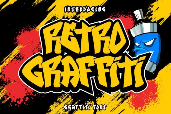
Angular graffiti display with a heavy outline
Retro Graffiti is an angular graffiti display in yellow on black: blocky letters with cut corners and a thick white-then-black outline, set at a tilt over spray strokes, with a spray can character at the side.
Ideas for this font
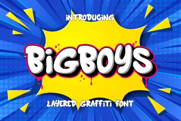
Layered 3D street-art bubble graffiti display
Bigboys is a chunky, layered 3D bubble-graffiti display font built for bold street-art titles, stickers, and youth apparel.
Ideas for this font
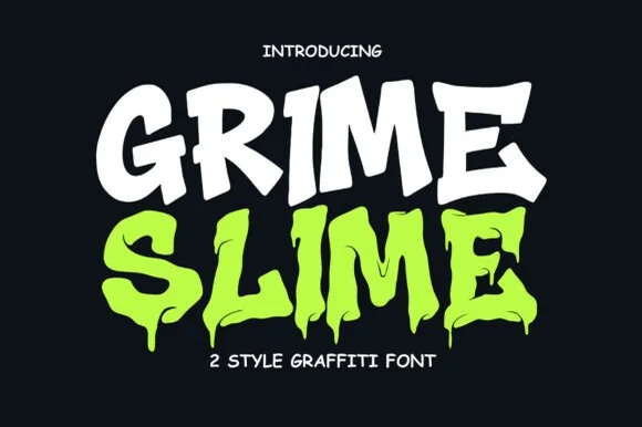
2-style solid & melting-slime urban graffiti family
Grime Slime is a dual-cut 2-style graffiti display family pairing a clean solid street-block style with a matching melting-ooze drip version!
Ideas for this font
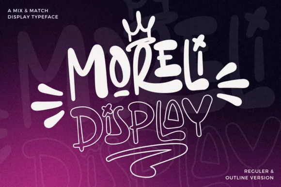
Street-art bubble & outline graffiti display duo
Moreli is a playful mix-and-match street-bubble display typeface shipped in both solid Regular and matching hollow Outline versions.
Ideas for this font
Same independent foundry
Allow optional Google Analytics to measure visits and catalogue actions. Your search words and notes are not included. Privacy & storage