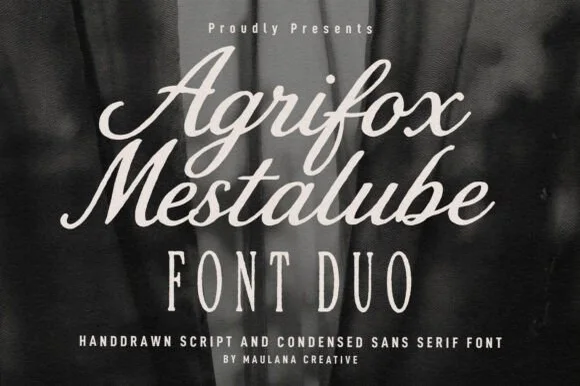
Temur Amorak Urban Bold Brush Font + Wolles Elegant Modern Serif
Anchors Temur Amorak Urban Bold Brush Font's fluid strokes with crisp Roman proportions on wedding suites, headers and packaging.
Inspect Wolles Elegant Modern Serif specimenDisclosure: MakerFileHub may earn a commission from qualifying purchases via paid links on this page. How our links work.

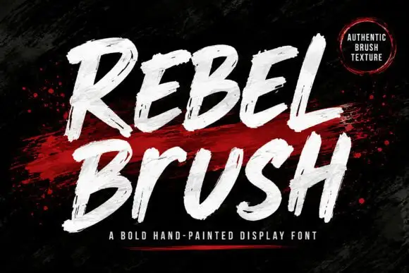
Slanted brush capitals with torn ends
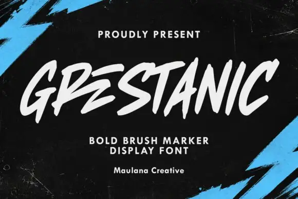
Temur Amorak Urban Bold Brush Font sets two rows of heavy white capitals that lean hard to the right, with torn ragged stroke ends, long diagonal cuts through the thick stems and a small green brush subtitle underneath on a dark grainy field.
Paid link
Get this fontProject & layout blueprintsAt-a-glance maker compatibility
Sturdy stroke walls and open counters weed cleanly on adhesive vinyl, HTV apparel film, and cut cardstock.
Visual anatomy & craft review
The stems stay thick, the lean stays constant, the ends tear into spikes and the joins between strokes break rather than close. That torn edge is the character: the word reads as a fast tag painted with a wide flat brush, which is why the sample sits on a dark textured ground with nothing else in the frame. Uppercase only in the sample, with ligatures advertised in the small caps footer, so check whether your file carries lowercase and the alternates. Keep 34 pt or above so the tears stay separate, and print on matte stock where the ragged edges survive.
Slanted brush capitals with torn ends
Two-font hierarchy recipes
Tested contrast partners — pairing Temur Amorak Urban Bold Brush Font with grounded secondary typography.

Temur Amorak Urban Bold Brush Font + Wolles Elegant Modern Serif
Anchors Temur Amorak Urban Bold Brush Font's fluid strokes with crisp Roman proportions on wedding suites, headers and packaging.
Inspect Wolles Elegant Modern Serif specimen
Temur Amorak Urban Bold Brush Font + Bargain Condensed
Keeps small-scale dates, URLs, nutrition facts and care instructions crisp and legible below script titles.
Inspect Bargain Condensed specimenPractical applications
Concrete hierarchy, scale and production guidance tailored to Temur Amorak Urban Bold Brush Font’s stroke geometry.
The torn caps give a label the speed of a painted tag, which suits a small clothing drop where the word is the whole design and no second element is needed.
Hierarchy & layout recipe
Print a 50 by 50 mm woven label: set the drop name at 18 pt on one row, keep 4 mm of clear ground all round so the torn ends are not clipped by the stitch line, and keep one colour so the tears stay sharp.
Pre-production check
Woven labels round off torn edges; check the mill proof and switch to a printed label if the tears matter.
The heavy lean carries across a street poster and the torn ends survive at distance, which is what a contest flyer needs when it is read from a wall.
Hierarchy & layout recipe
Print an A1 poster: set the contest name at 90 pt over two slanted rows with 30 mm between baselines, keep 30 mm of clear ground above the date bar, and keep 25 mm of border so the diagonal cuts stay whole.
Pre-production check
The lean pushes the last letter out of the trim; check the layout and pull the block 15 mm left before platemaking.
The brushed weight sets a cover with movement and the ragged edges hold at coated press sizes, so a short feature title reads as loud without illustration.
Hierarchy & layout recipe
Print a 210 by 280 mm cover: set the title at 72 pt on one row across the upper third, keep 26 mm of clear ground beneath before the cover lines at 9 pt, and keep the ground dark so the pale strokes read.
Pre-production check
The broken joins fill at small sizes; check the cover proof and keep the title at 54 pt or above.
Technical & licence verification
Confirm included OTF/TTF/WOFF formats, full glyph tables and licence coverage on the live store page before batch production.
Same independent foundry
Allow optional Google Analytics to measure visits and catalogue actions. Your search words and notes are not included. Privacy & storage