Neutral Sans Workhorse

Boy Graffiti + Limited Coffee
Lets Boy Graffiti own the focal silhouette while handling secondary copy, sizing and subheads cleanly.
Inspect Limited Coffee specimenDisclosure: MakerFileHub may earn a commission from qualifying purchases via paid links on this page. How our links work.
Puffy rounded 90s bubble throw-up graffiti font
Boy Graffiti is a plump, bubbly street-throwup display font with inflated comic-cushion letters and tiny slit counters.
Paid link
Get this fontProject & layout blueprintsAt-a-glance maker compatibility
Sturdy stroke walls and open counters weed cleanly on adhesive vinyl, HTV apparel film, and cut cardstock.
Visual anatomy & craft review
Boy Graffiti is a puffy bubble throw-up face with inflated cushion-shaped letters, tiny slit counters and a heavy cartoon outline drawn as part of the glyph. The letters overlap slightly, which is what makes a word read as a painted throw-up rather than typed bubbles, and the outline gives it a sticker edge. Because the counters are slits, the face needs roughly 30 mm for legibility and is at its best as a two-letter or short word on a wall, garment or sticker. It is a street-culture display, not a text face.
Bubble-throwup · Puffy · Playful-urban
Two-font hierarchy recipes
Tested contrast partners — pairing Boy Graffiti with grounded secondary typography.
Boy Graffiti + Limited Coffee
Lets Boy Graffiti own the focal silhouette while handling secondary copy, sizing and subheads cleanly.
Inspect Limited Coffee specimen
Boy Graffiti + Stanza
Grounds bold display lettering with classic typographic authority on posters, badges and apparel.
Inspect Stanza specimenPractical applications
Concrete hierarchy, scale and production guidance tailored to Boy Graffiti’s stroke geometry.
Overlapping cushions read as a painted throw-up, which is the reference a street-culture publication wants. The heavy outline holds over a photographic mural without a scrim.
Hierarchy & layout recipe
Sleeve 312 x 312 mm plus 3 mm bleed, word 220 mm, credits 7 pt. Poster A2, word 300 mm, details 22/28 pt, 30 mm margins. Title card 1920 x 1080, word 800 px, safe margin 6 percent.
Pre-production check
An outline under 2 mm at 220 mm closes on a digital press and the bubble looks like a solid shape. Check one 1:1 proof, and open the outline rather than reducing the word.
Bubble throw-up reads as a graffiti mark, which is the register a skate or streetwear brand is buying. Heavy outlines survive vinyl and a coarse screen.
Hierarchy & layout recipe
Chest print 260 x 200 mm, word 120 mm, 40 mm margins. Sticker 90 x 70 mm, word 50 mm, 3 mm die margin. Cap 100 x 45 mm, word 20 mm, 3 mm stitch border.
Pre-production check
Cap embroidery at 20 mm fills the slit counters and the word becomes a bar. Keep the bubble face off caps or emboss a single initial instead, and verify with a sew-out first.
Puffy throw-up letters set a graffiti theme in a word, which a teenager's party can carry without props. The heavy outline cuts cleanly as a topper at 45 mm.
Hierarchy & layout recipe
Invite A6, name 18 mm, details 4.5 mm, 10 mm margins. Topper 150 x 120 mm, name 55 mm, 8 mm stick slot. Banner 900 x 300 mm, word 120 mm, 40 mm margins.
Pre-production check
A topper pushed into icing can transfer ink near the stick, and a heavy black outline is the worst offender. Keep the artwork above the 8 mm slot line, print single-sided, and check one assembled topper.
Technical & licence verification
Confirm included OTF/TTF/WOFF formats, full glyph tables and licence coverage on the live store page before batch production.
Closest visual alternatives
Matched across letterform anatomy, stroke behaviour and craft applications.
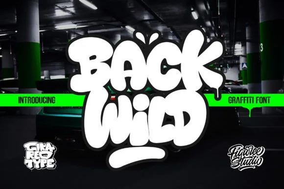
Puffy throw-up bubble graffiti
Back Wild delivers puffy throw-up street bubble graffiti, where the white letters inflate into overlapping blobs with a dark outline and a soft glow, a drip runs from the final letter and a thick rounded underline bar sits below on a dark garage photograph.
Ideas for this font
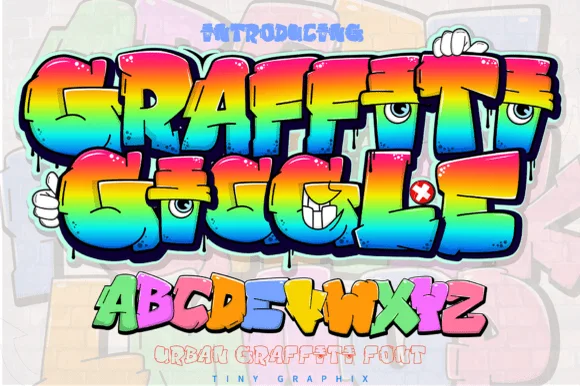
Cartoon character-eye bubble graffiti display
Graffiti Giggle is a playful cartoon street-graffiti font featuring chunky overlapping bubble letters and cheeky character-eye details.
Ideas for this font
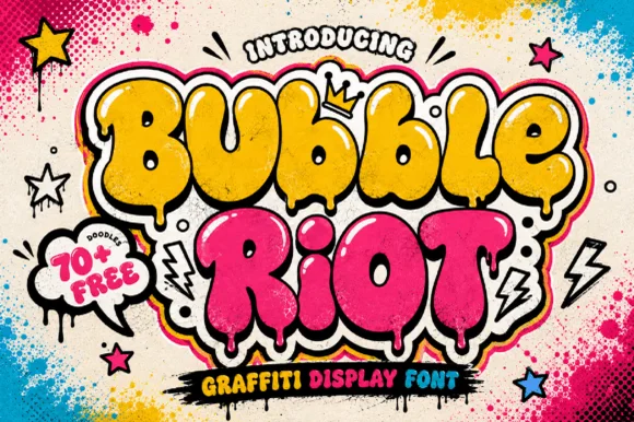
Dripping street-art throw-up bubble graffiti display
Bubble Riot is a bold, overlapping throw-up graffiti bubble font accented by interior shine marks, paint-drip bottoms, and 70+ bonus street doodles.
Ideas for this font
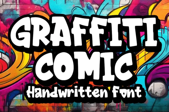
Bold 90s cartoon-street comic graffiti font
Graffiti Comic is a crisp, ultra-readable cartoon-graffiti display font with chunky flared serifs/bars and bouncy comic-book energy.
Ideas for this font
Allow optional Google Analytics to measure visits and catalogue actions. Your search words and notes are not included. Privacy & storage