Editorial Serif Anchor

Graffiti Impact + Kernova
Anchors Graffiti Impact's fluid strokes with crisp Roman proportions on wedding suites, headers and packaging.
Inspect Kernova specimenDisclosure: MakerFileHub may earn a commission from qualifying purchases via paid links on this page. How our links work.
Slanted urban dry-brush & spray-can graffiti script
Graffiti Impact is a fast, forward-slanted urban brush script combining connected marker flow with gritty spray-splatter energy.
Paid link
Get this fontProject & layout blueprintsAt-a-glance maker compatibility
Fine grain and micro-texture excel in 300 DPI print, sublimation, and screen print rather than small vinyl weeding.
Visual anatomy & craft review
A slanted urban dry-brush script slashed in stark white across a spray-painted red and black wall: thick slanted strokes with dry bristle edges, so the word reads as a tag painted in a hurry rather than as a script with a grain overlay. The slant and the weight are the character, and the dry breaks sit where a brush lifts rather than randomly, which is what makes it repeatable. Because the strokes are bold, the face holds on posters and apparel but clogs at small sizes. The wall behind is staging. Uses are streetwear, gym and energy branding, fight posters and fitness content where speed is the message.
Street-brush · Slanted · Raw-impact
Two-font hierarchy recipes
Tested contrast partners — pairing Graffiti Impact with grounded secondary typography.
Graffiti Impact + Kernova
Anchors Graffiti Impact's fluid strokes with crisp Roman proportions on wedding suites, headers and packaging.
Inspect Kernova specimen
Graffiti Impact + Hermano
Keeps small-scale dates, URLs, nutrition facts and care instructions crisp and legible below script titles.
Inspect Hermano specimenPractical applications
Concrete hierarchy, scale and production guidance tailored to Graffiti Impact’s stroke geometry.
A dry-brush tag reads as streetwear rather than as gym merch, and the bold slanted strokes survive a screen print on a hoodie where a neat script would look like a team order instead of a brand.
Hierarchy & layout recipe
Print a 260 mm chest graphic: the word at 60 mm x-height, the tagline in a 14 mm sans, and two inks on a dark hoodie. Keep the smallest dry break at 4 mm and place the graphic 85 mm below the collar.
Pre-production check
Check the screen at actual mesh, where a 4 mm break can fill; simplify rather than shrink. Wash-test one hoodie and confirm the feathered edges stay ragged after five cycles.
A slanted tag reads at thumbnail size where a clean sans looks generic, and the speed of the brush matches the energy a training video is selling in the first second of a feed.
Hierarchy & layout recipe
Render 1280 by 720 px: the hook at 140 px x-height, the subject in a 44 px sans, and two colours on a dark image with a 30 percent scrim. Keep 60 px safe margins and keep the drips inside the title-safe area.
Pre-production check
Check the thumbnail at phone size, where the dry breaks can turn into noise; simplify the texture at that scale. Confirm the hook reads in a crowded feed and that the scrim keeps a 4.5:1 contrast.
A tag script names a skate contest in its own visual language, and the bold strokes cut cleanly on the large stickers that get slapped on ramps and helmets where a thin script would peel at the edges.
Hierarchy & layout recipe
Print a 120 by 60 mm die-cut sticker: the event at 30 mm x-height, the date at 10 mm, and two colours on white vinyl. Keep 4 mm bleed and keep the smallest dry break above 1.5 mm.
Pre-production check
Check the die at 30 mm, where a break can tear on weeding; keep it above 1.5 mm. Confirm the sticker survives outdoor use for a season and that the adhesive holds on a painted ramp.
Technical & licence verification
Confirm included OTF/TTF/WOFF formats, full glyph tables and licence coverage on the live store page before batch production.
Closest visual alternatives
Matched across letterform anatomy, stroke behaviour and craft applications.

Heavy graffiti bubble caps with rough edges and paint splatter
Street Blaze is a heavy graffiti capital alphabet in which the letters swell into bubbles, the contours chip and the stems carry a rough inner edge, so a two-word title reads as something sprayed on a wall.
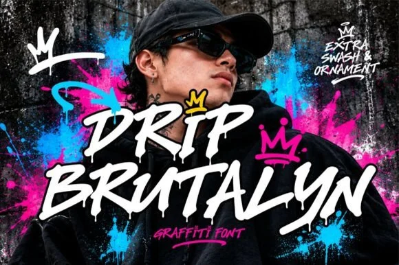
Dripping marker-slash street font with rough edges and ragged tails
Drip Brutalyn is a street brush alphabet in which the strokes are cut with slashes, the edges are rough and the tails run down as drips, so a word reads as lettering sprayed on a wall that has not dried.
Ideas for this font
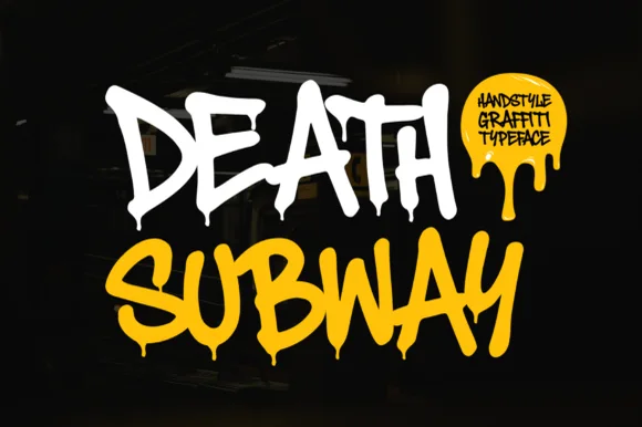
Dripping spray-tag street graffiti
Death Subway Graffiti captures a raw underground marker-and-spray handstyle, where angular street slashes meet organic drip terminals that hang below the letters for skate decks, streetwear and flyers.
Ideas for this font
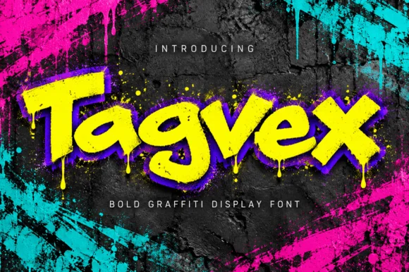
Dripping chisel-tip marker street-graffiti font
Tagvex is a chunky mixed-case graffiti display font combining wide chisel-marker strokes with hanging wet-paint drips.
Ideas for this font
Same independent foundry
Allow optional Google Analytics to measure visits and catalogue actions. Your search words and notes are not included. Privacy & storage



