Modern Grotesque Body

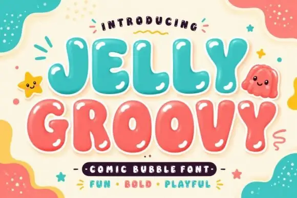
University Baseball + Homies
Creates crisp high-hierarchy contrast beneath University Baseball headlines across menus, websites and labels.
Inspect Homies specimenDisclosure: MakerFileHub may earn a commission from qualifying purchases via paid links on this page. How our links work.
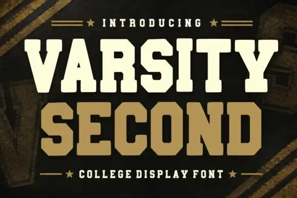
Wide heavy collegiate championship slab serif
University Baseball is a wide, ultra-sturdy collegiate slab serif with thick bracketed blocks and zero-nonsense varsity punch.
Paid link
Get this fontProject & layout blueprintsAt-a-glance maker compatibility
Sturdy stroke walls and open counters weed cleanly on adhesive vinyl, HTV apparel film, and cut cardstock.
Visual anatomy & craft review
University Baseball is a wide heavy collegiate championship slab serif: extended block letters with thick unbracketed slabs, a low crossbar on the A, a uniform weight that nearly fills the letter and a small inward notch on some terminals. The width makes a word long, and the near-solid weight closes the counters early. It needs roughly 30 mm for the slab and the notch to read, and it is best in one dark ink on cream and heather grey, or a two-colour build where the slab edge carries a highlight.
Heavy-college · Wide-slab · Commanding
Two-font hierarchy recipes
Tested contrast partners — pairing University Baseball with grounded secondary typography.
University Baseball + Homies
Creates crisp high-hierarchy contrast beneath University Baseball headlines across menus, websites and labels.
Inspect Homies specimen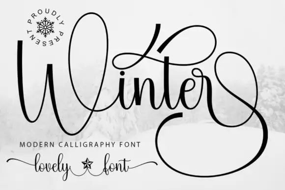
University Baseball + Winter
Adds a warm human signature touch for 1-to-3-word callouts without competing against structured serif capitals.
Inspect Winter specimenPractical applications
Concrete hierarchy, scale and production guidance tailored to University Baseball’s stroke geometry.
A wide collegiate slab reads as a championship banner rather than an event flyer, which is what a school wants in the gym. The heavy slabs hold at 150 mm across a banner, and one thread colour covers the patch while the same artwork prints the cover.
Hierarchy & layout recipe
Banner 2000 x 600 mm, word 180 mm with 15 mm slab clearance, 40 mm safe edge. Jacket patch 90 x 60 mm, word 22 mm, 4 mm edge margin. Yearbook cover 170 x 240 mm, title 44 pt, 15 mm margins.
Pre-production check
At 22 mm on an embroidered patch the slabs and the counter merge into one block. Keep patch lettering at 32 mm or above, and approve one sample before the order.
A wide championship slab reads as a campus-supply label rather than a fashion brand, which is what a college shop wants on its tags. The heavy stems hold at 24 mm on a cap, and one ink prints the sign and the card from one file.
Hierarchy & layout recipe
Cap mark 60 mm wide, word 20 mm with 5 mm slab clearance, 5 mm margin. Woven tag 50 x 25 mm, word 10 mm, 2 mm margin. Shop sign 900 x 400 mm, word 120 mm, 25 mm margins.
Pre-production check
A 50 x 25 mm woven tag at 10 mm closes the counters and the word stitches as a solid bar. Use a printed tag or a monogram at 14 mm, and check one sample before the run.
A wide collegiate slab reads as a league that has been running for years, which is what a summer competition wants at its boundary. The wide letters hold at 160 mm on a banner, and one ink prints the shirt and the fixture cards in one order.
Hierarchy & layout recipe
Field banner 2000 x 600 mm, word 160 mm with 12 mm slab clearance, 40 mm safe edge. Shirt back 300 x 400 mm, word 90 mm, 20 mm margins. Fixture card 148 x 105 mm, header 24 mm, fixtures 9 mm.
Pre-production check
A 148 x 105 mm fixture card at 9 mm loses the slabs and the dates read as a grey band. Set the card in a plain slab and keep the face for fabric, then print one card before the batch.
Technical & licence verification
Confirm included OTF/TTF/WOFF formats, full glyph tables and licence coverage on the live store page before batch production.
Closest visual alternatives
Matched across letterform anatomy, stroke behaviour and craft applications.
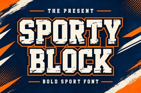
Heavy chamfered collegiate varsity block slab
Sporty Block is a classic heavy collegiate athletic slab serif built for 2- and 3-color layered jersey outlines, banners, and spirit wear.
Ideas for this font
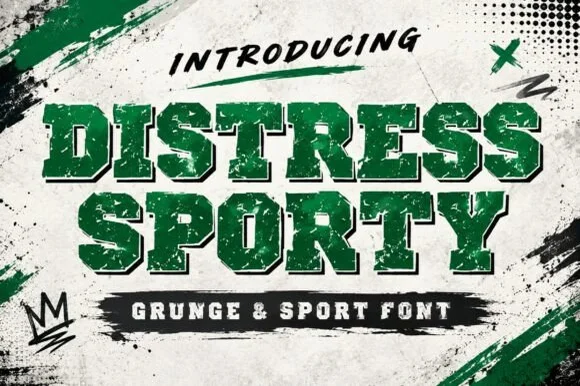
Heavy cracked-plastisol grunge varsity slab serif
Distress Sporty is a rugged collegiate varsity slab serif pre-weathered with cracked plastisol-ink splits and rough turf grit.
Ideas for this font
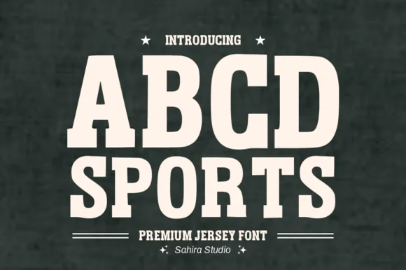
Softly rounded vintage collegiate fleece slab serif
Abcd Sports is a clean, softly rounded athletic slab serif channeling 1980s Russell/Champion reverse-weave sweatshirt lettering.
Ideas for this font
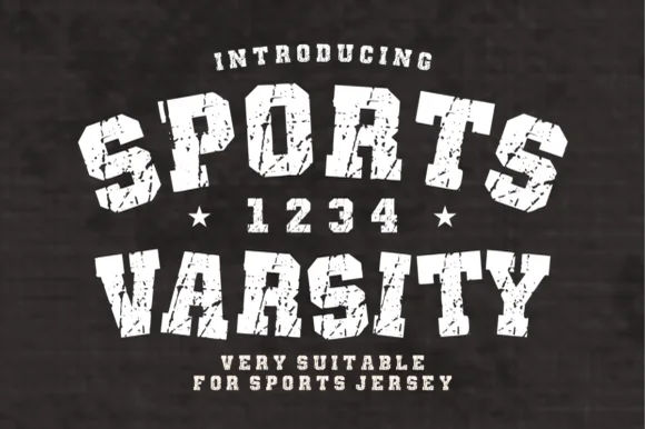
Arched distressed varsity & jersey-number slab serif
Sports Varsity is a bold, grunge-textured collegiate slab serif with matching athletic numerals ('1 2 3 4') built for vintage arched team shirts.
Ideas for this font
Same independent foundry
Allow optional Google Analytics to measure visits and catalogue actions. Your search words and notes are not included. Privacy & storage