High-Contrast Display Serif

Frestype Atlethic Duo + The Bilstein Editorial
Pairs sculptural editorial warmth with Frestype Atlethic Duo's clean modern geometry.
Inspect The Bilstein Editorial specimenDisclosure: MakerFileHub may earn a commission from qualifying purchases via paid links on this page. How our links work.
Outlined collegiate slabs paired with a thick connected script
Frestype Atlethic Duo pairs orange slab capitals with a cream connected script, where the slab row arches and carries a fine edge and the script below joins roundly, opens a broad sweeping A and flows loosely through a final c.
Paid link
Get this fontProject & layout blueprintsAt-a-glance maker compatibility
Weld or Unite overlapping script joins into one continuous vector path before sending to the blade.
Visual anatomy & craft review
The slabs stay heavy with a thin outline, the arch lifts the upper row, the script joins broadly and two letters stretch beyond the rest. The contest between an outlined slab and a thick script is the character: one row reads as a jersey, the other as a signature, which is why the cover splits them across two lines. The listing name and the specimen spelling differ, so keep the saved identity and do not rewrite it; the ligature and multilingual captions are source claims rather than demonstrated coverage.
Duo · Outlined slabs · Connected script
Two-font hierarchy recipes
Tested contrast partners — pairing Frestype Atlethic Duo with grounded secondary typography.
Frestype Atlethic Duo + The Bilstein Editorial
Pairs sculptural editorial warmth with Frestype Atlethic Duo's clean modern geometry.
Inspect The Bilstein Editorial specimen
Frestype Atlethic Duo + Simple Handwriting
Introduces organic movement on pull-quotes, signatures and gift tags.
Inspect Simple Handwriting specimenPractical applications
Concrete hierarchy, scale and production guidance tailored to Frestype Atlethic Duo’s stroke geometry.
The outlined slabs suit a club jersey, and the two rows hold at 90 mm and 60 mm on a printed transfer in two colours, where the fine outline survives at that scale.
Hierarchy & layout recipe
Print a 280 mm transfer: set the club word at 90 mm in arched slabs, set the motto at 60 mm in the script beneath with 18 mm of clear ground, and keep 20 mm of clear edge around both rows.
Pre-production check
A thin outline over a heavy slab fills in when printed small; check the transfer proof at half size.
The jersey row and signature row make a party card lively, and both fit at 34 pt and 24 pt on an A6 sheet, with the arch dropped so the two rows stay apart.
Hierarchy & layout recipe
Print an A6 card: set the age word at 34 pt in the slabs, set the invitation at 24 pt in the script beneath with 14 mm of clear ground, and keep 12 mm of margin so the sweeping A stays inside.
Pre-production check
The arch and the script headline compete on a small card; check the card and keep the upper row straight.
The outlined slabs carry a feature title, and the pairing holds a two-word heading at 50 pt on a printed page, leaving a clean deck line in the script beneath.
Hierarchy & layout recipe
Print a 210 mm page: set the heading at 50 pt in the slabs, set the deck line at 20 pt in the script beneath with 16 mm of clear ground, and keep 20 mm beneath for the standfirst at 10 pt.
Pre-production check
Two display rows above a standfirst can crowd the top; check the page and open the space under the deck line.
Technical & licence verification
Confirm included OTF/TTF/WOFF formats, full glyph tables and licence coverage on the live store page before batch production.
Closest visual alternatives
Matched across letterform anatomy, stroke behaviour and craft applications.
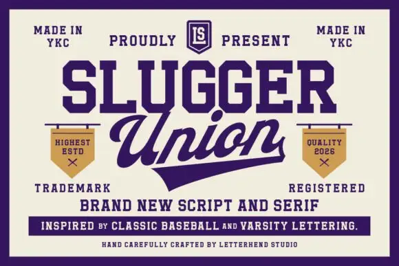
Script and varsity serif pair
Slugger Union is a duo in deep purple on cream: a bold connected baseball script with a long underscore tail, paired with a heavy block serif for the supporting lines, framed by small pennants, a crest and two tracked corner notes.
Ideas for this font
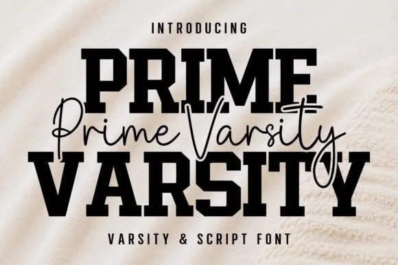
Varsity slab crossed by a thin script
Prime Varsity is a varsity and script pair in black on cream: heavy condensed slab capitals for the two big words and a thin monoline script written across them in a single flowing line, sold together as one duo.
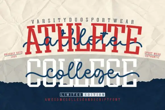
Varsity and script combination layered into one lockup
Athlete College is a combination family in which heavy varsity capitals sit behind a flowing script line that crosses the whole word, so a design reads as a team name with a written banner over it.
Ideas for this font
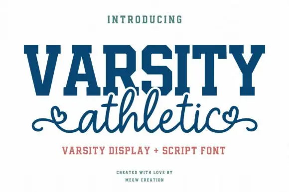
Solid varsity slab caps paired with a looping script with heart ends
Varsity Athletic pairs a solid collegiate slab capital alphabet with a looping script whose ends curl into small hearts, so a two-line design can carry both a team voice and a friendly one.
Ideas for this font
Same independent foundry
Allow optional Google Analytics to measure visits and catalogue actions. Your search words and notes are not included. Privacy & storage