Neutral Sans Workhorse

Mochi Soda + Monure
Lets Mochi Soda own the focal silhouette while handling secondary copy, sizing and subheads cleanly.
Inspect Monure specimenDisclosure: MakerFileHub may earn a commission from qualifying purchases via paid links on this page. How our links work.
Ultra-soft pillowy Japanese-snack & mochi bubble lowercase
Mochi Soda is a super-plump, marshmallow-soft rounded bubble font with squishy organic lowercase and plump circular i-dots.
Paid link
Get this fontProject & layout blueprintsAt-a-glance maker compatibility
Sturdy stroke walls and open counters weed cleanly on adhesive vinyl, HTV apparel film, and cut cardstock.
Visual anatomy & craft review
Mochi Soda is an ultra-soft pillowy lowercase display built like a Japanese snack mascot: fully rounded letters with almost no straight edges, tight counters and a squash that makes each form look pressed. The soft forms close their counters at small sizes and the lowercase-only set limits how a word can start. It needs roughly 28 mm for the pillowy edge and the counter to read, and it is best in two soft inks on white, or one ink plus a paper highlight on a pale ground.
Squishy · Kawaii · Cozy-pop
Two-font hierarchy recipes
Tested contrast partners — pairing Mochi Soda with grounded secondary typography.
Mochi Soda + Monure
Lets Mochi Soda own the focal silhouette while handling secondary copy, sizing and subheads cleanly.
Inspect Monure specimen
Mochi Soda + Stanza
Grounds bold display lettering with classic typographic authority on posters, badges and apparel.
Inspect Stanza specimenPractical applications
Concrete hierarchy, scale and production guidance tailored to Mochi Soda’s stroke geometry.
A pillowy lowercase reads as the product itself rather than a printed logo, which is what a mochi or snack maker wants on a box. The squash holds at 30 mm, and two soft inks print the box and the sticker in one order.
Hierarchy & layout recipe
Box print 200 x 200 mm, word 50 mm with 8 mm edge clearance, 20 mm margins. Sticker 60 x 60 mm, word 18 mm, 4 mm die margin. Card 85 x 55 mm, word 14 mm, 5 mm margins.
Pre-production check
A 60 x 60 mm sticker at 18 mm closes the pillowy counters into one blob and the name reads as a disc. Raise the sticker word to 26 mm, and check one sheet before the run.
A soft pillowy display announces a cute theme in the lettering, so the invite needs no licensed character. The squash holds at 44 mm on a topper, and two soft inks print the invite and the labels as one set.
Hierarchy & layout recipe
Invite A6, word 44 mm with 8 mm edge clearance, details 8/11 pt, 12 mm margins. Topper 130 x 110 mm, word 48 mm with a 6 mm stick slot and 12 mm clear. Bag label 80 x 50 mm, word 14 mm, 5 mm margins.
Pre-production check
A 130 mm topper cut through a squashed counter leaves a 1 mm web that snaps on the stick. Cut toppers with a 2 mm bridge, and test one before the party.
A soft pillowy display reads as a painted summer sign rather than a printed menu. The squash holds at 60 mm on a sign, and two soft inks print the sign and the cups in one order.
Hierarchy & layout recipe
Sign 600 x 900 mm, word 100 mm with 12 mm edge clearance, items 26 mm, 30 mm margins. Cup print 70 x 50 mm, word 16 mm, 5 mm margins. Sticker 90 x 60 mm, word 30 mm, 5 mm die margin.
Pre-production check
A 70 x 50 mm cup panel at 16 mm fills the counters and the name reads as a soft bar. Raise cup type to 22 mm, and check one printed cup before the order.
Technical & licence verification
Confirm included OTF/TTF/WOFF formats, full glyph tables and licence coverage on the live store page before batch production.
Closest visual alternatives
Matched across letterform anatomy, stroke behaviour and craft applications.
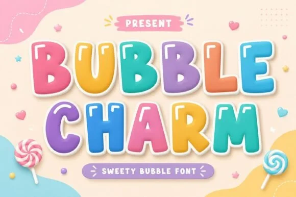
Candy-coated pastel marshmallow cartoon bubble display
Bubble Charm is a sweet, evenly proportioned cartoon bubble font built for multi-colored candy fills, specular highlights, and sticker offsets.
Ideas for this font
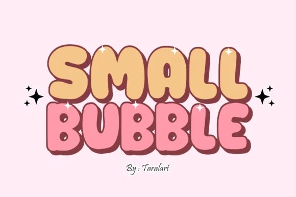
Cute hand-outlined comic-pop bubble display
Small Bubble is a cozy, hand-drawn cartoon bubble display font with chubby rounded capitals and sweet comic-sticker personality.
Ideas for this font
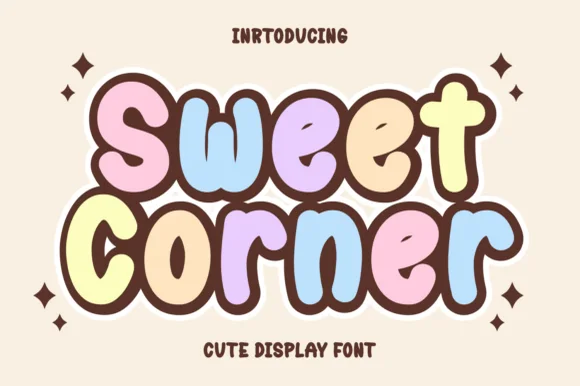
Chubby chocolate-outlined pastel bakery & kawaii bubble sans
Sweet Corner is a cozy, ultra-plump cartoon bubble font pairing wide open counters with soft marshmallow-pastel comic appeal.
Ideas for this font
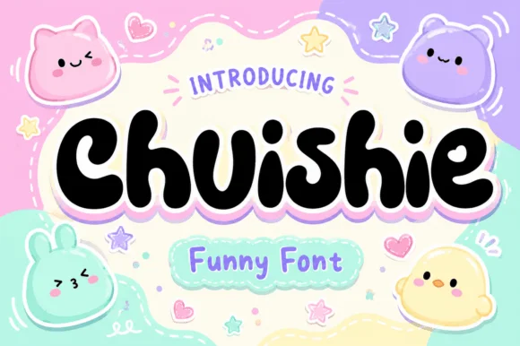
Squishy plushie-blob kawaii cartoon display
Chuishie is a squishy, mochi-soft kawaii bubble font featuring adorable scalloped plushie toes on 'u', 'h', and 'n'!
Ideas for this font
Allow optional Google Analytics to measure visits and catalogue actions. Your search words and notes are not included. Privacy & storage