Neutral Sans Workhorse

Gum Drop Pop + Prime Nordic
Lets Gum Drop Pop own the focal silhouette while handling secondary copy, sizing and subheads cleanly.
Inspect Prime Nordic specimenDisclosure: MakerFileHub may earn a commission from qualifying purchases via paid links on this page. How our links work.
Glossy jellybean & candy-drop upright bubble display
Gum Drop Pop is a tall, bouncy candy-drop bubble font accented with tiny white shine highlights on every colorful character.
Paid link
Get this fontProject & layout blueprintsAt-a-glance maker compatibility
Sturdy stroke walls and open counters weed cleanly on adhesive vinyl, HTV apparel film, and cut cardstock.
Visual anatomy & craft review
Gum Drop Pop is a glossy jellybean bubble display: fat oval letters, a highlight swoosh drawn inside the upper stroke and a soft second outline that gives the sweet a glassy coat. The highlight is bare paper rather than a lighter ink, so it disappears on tinted stock, and the fat ovals close their counters early. It needs roughly 30 mm for the highlight and the outline to read, and it is best in two bright inks on white, or one ink plus the knocked-out swoosh on coloured card.
Sugary · Shiny · Candy-bright
Two-font hierarchy recipes
Tested contrast partners — pairing Gum Drop Pop with grounded secondary typography.
Gum Drop Pop + Prime Nordic
Lets Gum Drop Pop own the focal silhouette while handling secondary copy, sizing and subheads cleanly.
Inspect Prime Nordic specimen
Gum Drop Pop + Vanielst Elegant Serif Display Stylistic
Grounds bold display lettering with classic typographic authority on posters, badges and apparel.
Inspect Vanielst Elegant Serif Display Stylistic specimenPractical applications
Concrete hierarchy, scale and production guidance tailored to Gum Drop Pop’s stroke geometry.
A jellybean display reads as confectionery rather than a typeset invitation, which is what a young child's birthday sends. The highlight gives the word its gloss at 40 mm, and two bright inks print the invite and the bag labels in a single pass.
Hierarchy & layout recipe
Invite A6, word 40 mm with 8 mm outline clearance, details 8/11 pt, 12 mm margins. Topper 130 x 110 mm, word 44 mm with a 6 mm stick slot and 12 mm clear. Bag label 80 x 50 mm, word 14 mm, 5 mm margins.
Pre-production check
A 130 mm laser-cut topper cut through the highlight swoosh leaves a 1 mm island that falls out in the machine. Cut toppers from the plain oval, and test one on a stick before the set.
A glossy jellybean display reads as a tin of sweets rather than a seasonal promotion, which is what a small confectioner wants in December. The fat ovals give the name weight at 34 mm on a lid, and two inks print the lid labels and the tags in one order.
Hierarchy & layout recipe
Box lid 200 x 200 mm, word 34 mm with 8 mm outline clearance, 20 mm margins. Jar label 70 x 45 mm, word 14 mm, 4 mm die margin. Tag 50 x 90 mm, word 12 mm with a 5 mm hole and 8 mm clear.
Pre-production check
A 70 x 45 mm jar label at 14 mm closes the oval counters and the name reads as a bright lozenge. Raise the label word to 20 mm, and check one jar in the fridge light before the batch.
A jellybean display gives a sweets feature the look of the product itself rather than a styled headline. The glossy highlight holds at 44 pt on a header, and two inks print the header and the recipe cards as one set.
Hierarchy & layout recipe
Header 44 pt with 8 mm outline clearance, body 10/14 pt, 18 mm margins. Recipe card 105 x 148 mm, header 20 pt, steps 8/11 pt. Cover flash 90 x 60 mm, word 32 pt, 6 mm margins.
Pre-production check
At 32 pt on the cover flash the highlight swoosh fills and the letters read as plain ovals. Keep the face at 40 pt and above, and proof one cover at 1:1.
Technical & licence verification
Confirm included OTF/TTF/WOFF formats, full glyph tables and licence coverage on the live store page before batch production.
Closest visual alternatives
Matched across letterform anatomy, stroke behaviour and craft applications.
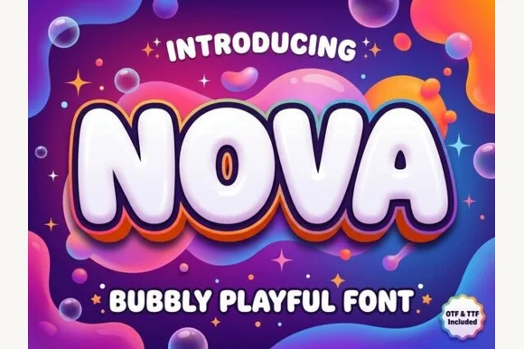
Inflated bubbly display with layered depth
Nova is an inflated display in glossy white on a psychedelic gradient: rounded, blown-up letters with a thick outline and two offset layers behind them in orange and violet, so the word looks like a balloon sign lit from above.
Ideas for this font
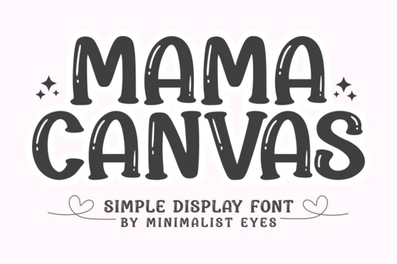
Bold brush display with inline highlights
Mama Canvas is a bold brush display in charcoal on cream: fat rounded capitals with a slight lean, thin highlight streaks left inside each stroke, and small sparkles beside the words, so the pair reads as brush lettering on a card rather than as constructed type.
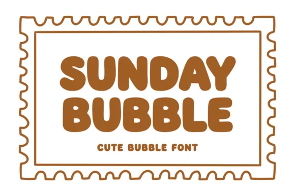
Warm chubby zero-counter-clutter retro bubble sans
Sunday Bubble is a warm, ultra-plump rounded bubble display font with soft cozy strokes and super-fast Cricut weeding.

Heavy rounded chunky bubble display
Bouncy Block Deluxe is a thick, solid-filled bubble display font with pillowy rounded terminals, playful tilt, and tiny counter pinholes.
Ideas for this font
Same independent foundry
Allow optional Google Analytics to measure visits and catalogue actions. Your search words and notes are not included. Privacy & storage