Editorial Serif Anchor

Depthsy + The Bilstein Editorial
Anchors Depthsy's fluid strokes with crisp Roman proportions on wedding suites, headers and packaging.
Inspect The Bilstein Editorial specimenDisclosure: MakerFileHub may earn a commission from qualifying purchases via paid links on this page. How our links work.
Neat rounded monoline classroom & journal print sans (NOT a serif!)
Depthsy is actually a clean, friendly monoline handwritten print sans (zero typewriter serifs despite seller copy!) built for everyday legibility.
Paid link
Get this fontProject & layout blueprintsAt-a-glance maker compatibility
Weld or Unite overlapping script joins into one continuous vector path before sending to the blade.
Visual anatomy & craft review
Depthsy is a neat rounded monoline print alphabet in mixed case, upright and disconnected, with open counters and a warm, even weight that reads as careful handwriting rather than a typewriter. Because the stroke never varies, it prints cleanly from a school copier, cuts in vinyl and holds at 8 mm on a small label, while the open counters keep a long word legible at 40 mm on a badge. It is a functional hand for journals, labels and everyday signage, not a display face.
Neat-print · Rounded-monoline · Down-to-earth
Two-font hierarchy recipes
Tested contrast partners — pairing Depthsy with grounded secondary typography.
Depthsy + The Bilstein Editorial
Anchors Depthsy's fluid strokes with crisp Roman proportions on wedding suites, headers and packaging.
Inspect The Bilstein Editorial specimen
Depthsy + Olline
Keeps small-scale dates, URLs, nutrition facts and care instructions crisp and legible below script titles.
Inspect Olline specimenPractical applications
Concrete hierarchy, scale and production guidance tailored to Depthsy’s stroke geometry.
A neat monoline hand reads as a teacher's own handwriting, which is what a classroom label should feel like. The even stroke survives lamination and a copier.
Hierarchy & layout recipe
Journal header 10 mm on a 5 mm grid, 15 mm margins. Name tag 80 x 30 mm, name 8 mm, 3 mm border, 4 mm corner radius. Label 70 x 30 mm, word 8 mm, 3 mm border and 2 mm from the trim edge.
Pre-production check
Classroom labels are laminated and a 0.3 mm monoline behind glossy film produces glare that hides the stroke. Use a matt laminate for anything at a child's eye level, and check one label under classroom light.
Neat handwriting reads as a maker's own note rather than a corporate label, which is what a small studio wants. Uniform weight prints predictably on uncoated stock.
Hierarchy & layout recipe
Card 85 x 55 mm, name 8 mm, role 5.5 pt, 6 mm margins. Label 70 x 40 mm, name 7 mm, 3 mm border and 3 mm die margin. Insert 105 x 148 mm, message 9/13 pt on a 5 mm leading, 14 mm margins.
Pre-production check
Inserts are printed on thin uncoated paper that shows ink through from the reverse. Use 120 gsm or print single-sided, and check one duplex proof for show-through before the run.
An upright print stays legible at 8 mm inside a badge, which is where a decorative face fails. The face carries a name and a role on one small card.
Hierarchy & layout recipe
Badge 80 x 110 mm, name 10 mm, role 5 mm, clip slot 10 mm with 8 mm clearance. Bag label 80 x 40 mm, name 8 mm, 3 mm border. Caption 12/16 pt on a 90 mm measure.
Pre-production check
Badges are worn on a lanyard and the corners round off within a day. Specify 400 gsm with a 5 mm corner radius, and check one worn badge at the end of the party.
Technical & licence verification
Confirm included OTF/TTF/WOFF formats, full glyph tables and licence coverage on the live store page before batch production.
Closest visual alternatives
Matched across letterform anatomy, stroke behaviour and craft applications.
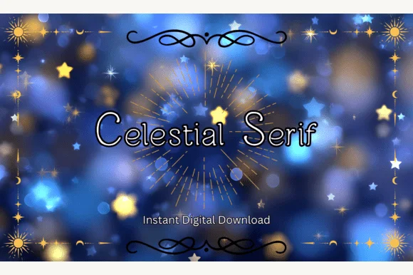
Clean rounded monoline print sans (ZERO serifs despite 'Serif' in the title!)
Heads-up: despite its title, Celestial Serif has ZERO serifs—it is actually a neat, rounded monoline print sans!
Ideas for this font
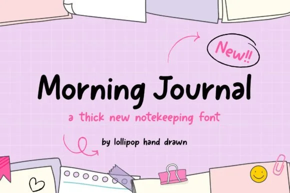
Thick casual notekeeping handwriting
Morning Journal is a thick casual handwriting face in black on a pink grid: rounded strokes of even weight, open bowls, a straight-tailed y and a small bounce, presented with pencil arrows and sticky-note illustrations, so the phrase reads as notes written quickly in a journal.
Ideas for this font
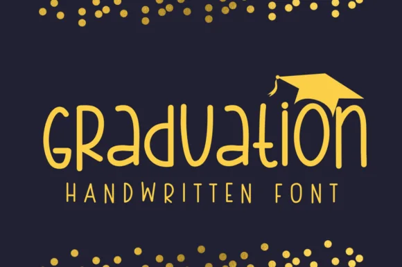
Geometric circular-bowl monoline classroom print sans
Graduation (by Sirinart) is a clean geometric monoline handwritten sans mixing circular lowercase 'a/d/o' bowls into sleek celebratory titles!
Ideas for this font
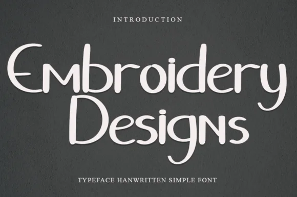
Quirky mixed-case handwritten print with curled descenders
Embroidery Designs is a neat, whimsical handwritten print font pairing clean disconnected bowls with playful curled 'y', 'g', and 's' hooks.
Ideas for this font
Allow optional Google Analytics to measure visits and catalogue actions. Your search words and notes are not included. Privacy & storage