Editorial Serif Anchor

Simplify Notation + Marquis - Elegant Modern Serif
Anchors Simplify Notation's fluid strokes with crisp Roman proportions on wedding suites, headers and packaging.
Inspect Marquis - Elegant Modern Serif specimenDisclosure: MakerFileHub may earn a commission from qualifying purchases via paid links on this page. How our links work.
Single-line hairline sans drawn as a technical wireframe
Simplify Notation is a single-line sans in which every letter is drawn as one even hairline with open joins, so a word reads as a wireframe sketch rather than as printed type.
Paid link
Get this fontProject & layout blueprintsAt-a-glance maker compatibility
Set Cricut or Silhouette operation to Pen, Foil Quill, or Laser Score — not Basic Blade Cut.
Visual anatomy & craft review
The S keeps a shallow spine, the i carries a floating dot, the m turns two even shoulders, the p drops a hairline stem, the l rises as a plain line and the y splays two hairlines, all at one unchanging weight with joins left slightly open. The single line is the character: there is no thick stroke anywhere, which is why the sample sets a two-word title inside a drawn window frame with no other decoration. Because the line is very fine, the face needs 30 pt upward and a smooth ground, and it disappears at caption sizes. The blue ground, the drawn browser window, the wavy borders and the caption beneath are presentation; the hairline words are the face.
Hairline · Single line · Technical
Two-font hierarchy recipes
Tested contrast partners — pairing Simplify Notation with grounded secondary typography.
Simplify Notation + Marquis - Elegant Modern Serif
Anchors Simplify Notation's fluid strokes with crisp Roman proportions on wedding suites, headers and packaging.
Inspect Marquis - Elegant Modern Serif specimen
Simplify Notation + Montreal
Keeps small-scale dates, URLs, nutrition facts and care instructions crisp and legible below script titles.
Inspect Montreal specimenPractical applications
Concrete hierarchy, scale and production guidance tailored to Simplify Notation’s stroke geometry.
The wireframe line gives a technical book a cover that looks drawn rather than typeset, and the even stroke holds a title at 50 pt on a smooth cover.
Hierarchy & layout recipe
Print an A5 cover: set the title at 50 pt on two lines with 1.5 line spacing, set the subtitle in a 9 pt hairline sans beneath, and keep 18 mm of margin so the fine strokes are not trimmed.
Pre-production check
A hairline under 0.15 mm drops out on an uncoated cover; check the proof and specify a smooth stock or raise the size.
The wireframe register suits a technical studio, and the open joins keep a two-word name readable at 20 pt on a thick card.
Hierarchy & layout recipe
Print an 85 by 55 mm card: set the studio name at 20 pt, set the contact block in a 6 pt sans at the foot, and keep 10 mm of white so the hairline has air around it.
Pre-production check
A single-line sans printed over a textured card breaks at the joins; check one card and keep the area behind the name plain.
The technical wireframe line suits a coding club worksheet, and the open counters photocopy cleanly at 28 pt without filling in.
Hierarchy & layout recipe
Print an A4 worksheet: set the header at 28 pt across the top, set the tasks in a 12 pt sans beneath, and keep 18 mm of margin so the fine strokes sit inside the printable area.
Pre-production check
A school copier thickens a hairline unevenly; check the copy and keep the header at 28 pt or above.
Technical & licence verification
Confirm included OTF/TTF/WOFF formats, full glyph tables and licence coverage on the live store page before batch production.
Closest visual alternatives
Matched across letterform anatomy, stroke behaviour and craft applications.
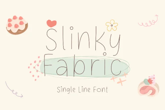
Playful curly-hooked thin monoline pen & plotter font
Slinky Fabric is an airy, playful ultra-thin monoline print font accented with cute curled hooks on capitals and ascenders.
Ideas for this font
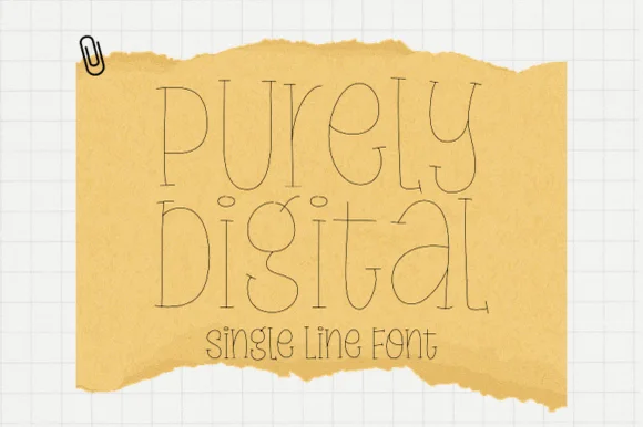
Single-line hairline display with doubled strokes
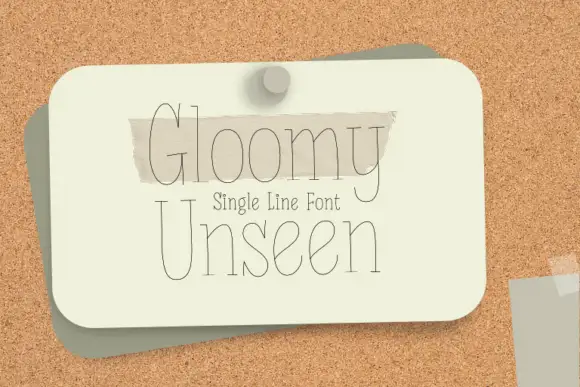
Purely Digital is a single-line display in ink on tan torn paper: letters drawn as a hairline contour with a second line inside them, very tall and narrow, with open counters and no fill anywhere.
Ideas for this font
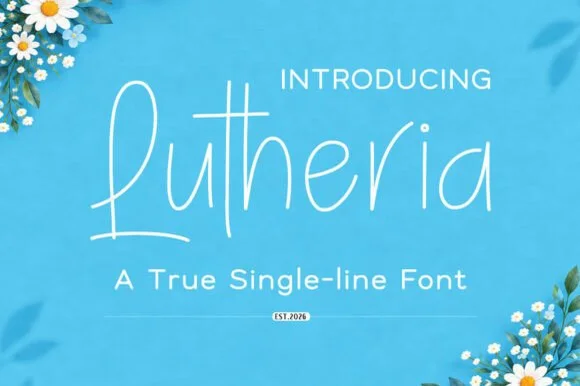
Upright single-line casual script with a very light even stroke
Lutheria is a true single-line script in which the stroke never thickens, the letters stay upright and the joins are open, so a word reads as something written with a fine pen at an even pace.
Ideas for this font
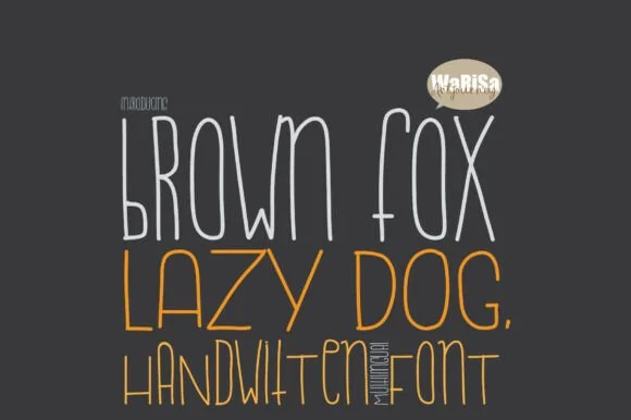
Tall condensed Cricut-Draw & plotter single-line print font
Brown Fox Lazy Dog is a tall, condensed hairline sketch font purpose-built for Cricut Draw pens, Foil Quill, and engraving plotters.
Ideas for this font
Same independent foundry
Allow optional Google Analytics to measure visits and catalogue actions. Your search words and notes are not included. Privacy & storage