Editorial Serif Anchor

Digital Planner + Orvelia
Anchors Digital Planner's fluid strokes with crisp Roman proportions on wedding suites, headers and packaging.
Inspect Orvelia specimenDisclosure: MakerFileHub may earn a commission from qualifying purchases via paid links on this page. How our links work.
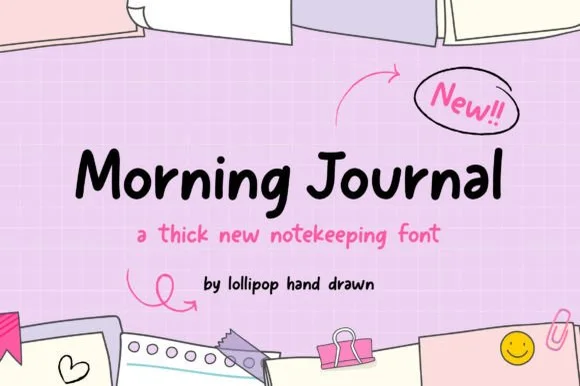
Tidy upright marker planner print
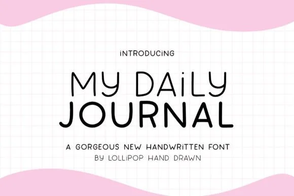
Digital Planner mimics neat felt-tip handwriting, keeping a medium upright weight that stays crisp on tablet planner tabs, sticker sheets, flashcards and teacher slides rather than turning wiry at small size.
Paid link
Get this fontProject & layout blueprintsAt-a-glance maker compatibility
Weld or Unite overlapping script joins into one continuous vector path before sending to the blade.
Visual anatomy & craft review
The strokes hold one medium weight, the letters stand upright without much slant, the bowls stay round and the ascenders remain modest. That even marker weight is the character: the writing looks like a careful hand on a page but survives a screen, which is why the sample lists small-format uses. Those uses come from the source rather than a test, so proof the actual characters at 12 pt and check the punctuation you need before trusting it with a full planner entry.
Tidy · Marker weight · Upright
Two-font hierarchy recipes
Tested contrast partners — pairing Digital Planner with grounded secondary typography.
Digital Planner + Orvelia
Anchors Digital Planner's fluid strokes with crisp Roman proportions on wedding suites, headers and packaging.
Inspect Orvelia specimen
Digital Planner + Bareum
Keeps small-scale dates, URLs, nutrition facts and care instructions crisp and legible below script titles.
Inspect Bareum specimenPractical applications
Concrete hierarchy, scale and production guidance tailored to Digital Planner’s stroke geometry.
The tidy marker print suits a flashcard set, and the upright letters stay clear at 16 pt on a small card, which is where thin hands usually fail.
Hierarchy & layout recipe
Print an 85 by 55 mm card: set the word at 16 pt on one line in the centre, keep 12 mm of clear ground beneath for a definition at 10 pt, and keep 8 mm of margin all round.
Pre-production check
A medium hand printed at 10 pt closes its counters; check the card and hold the word at 14 pt or above.
The neat hand suits printed planner tabs, and the even weight stays legible at 12 pt on a narrow strip, so a month name still reads at a glance.
Hierarchy & layout recipe
Print a 40 by 15 mm tab: set the month at 12 pt, keep 3 mm of clear paper at each end so the strip can be trimmed, and keep the word on one line for a straight baseline.
Pre-production check
Tabs cut from a sheet lose letters when the word runs to the edge; check the artwork and keep 3 mm of clearance.
The tidy print keeps a note warm without pretension, and the modest ascenders hold a short line at 20 pt on an A6 card, leaving room for a reply.
Hierarchy & layout recipe
Print an A6 card: set the line at 20 pt across the upper third, keep 14 mm of clear ground beneath, and leave the lower half free for a written message in the same tone.
Pre-production check
A printed hand beside real handwriting can look mismatched; check the card and keep the printed part short.
Technical & licence verification
Confirm included OTF/TTF/WOFF formats, full glyph tables and licence coverage on the live store page before batch production.
Closest visual alternatives
Matched across letterform anatomy, stroke behaviour and craft applications.
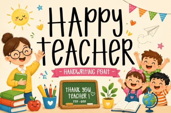
Tall bouncy classroom marker print (OTF & TTF)
Happy Teacher is a tall, upbeat handwritten marker font mixing lively uppercase and lowercase forms for warm classroom signage and gifts.
Ideas for this font
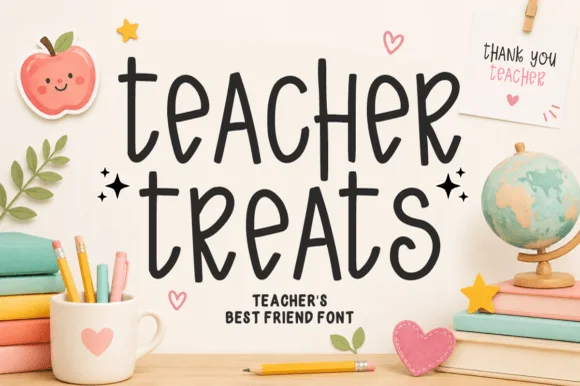
Playful tall curved classroom marker print
Teacher Treats is a tall, whimsical hand-drawn marker font featuring gently curled ascenders and airy, disconnected mixed-case print.
Ideas for this font
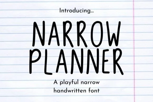
Narrow handwritten caps
Narrow Planner is a narrow handwritten face in black on ruled paper: tall condensed capitals drawn with a wobbly monoline stroke, uneven letter heights, and a lowercase that reads as the same hand at a normal width.
Ideas for this font
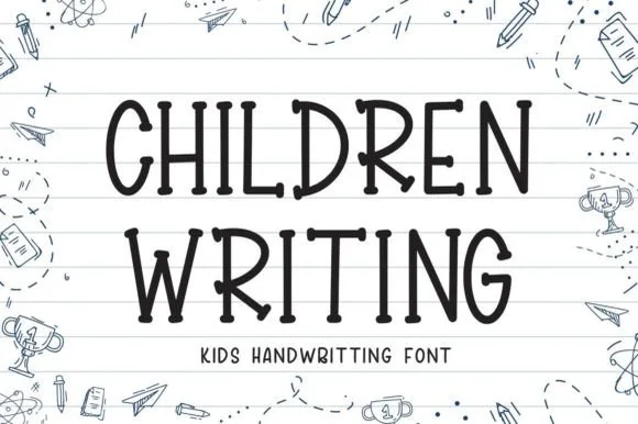
Neat elementary notebook-lined classroom print
Children Writing is a tidy, cheerful uppercase/print handwritten font with soft marker-dot terminals built for school and kid crafts.
Ideas for this font
Same independent foundry
Allow optional Google Analytics to measure visits and catalogue actions. Your search words and notes are not included. Privacy & storage