Editorial Serif Anchor

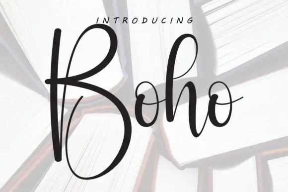
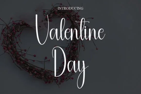
Simple Planner + Raffined
Anchors Simple Planner's fluid strokes with crisp Roman proportions on wedding suites, headers and packaging.
Inspect Raffined specimenDisclosure: MakerFileHub may earn a commission from qualifying purchases via paid links on this page. How our links work.
Tall skinny minimalist monoline planner caps & sans
Simple Planner is a tall, slender minimalist handwritten sans packing long headings neatly into narrow planner columns and spine labels.
Paid link
Get this fontProject & layout blueprintsAt-a-glance maker compatibility
Weld or Unite overlapping script joins into one continuous vector path before sending to the blade.
Visual anatomy & craft review
Simple Planner is a tall slender monoline handwritten sans with high-waisted A, P and R bowls, rounded stroke ends and generous spacing, so a heading reads as careful printing in a notebook rather than as a display face. The narrow stance packs a long heading into a planner column at 9 pt, and the even mono line keeps it legible after a photocopy. It needs roughly 12 pt for the high waist to read, and it is best in ink black on cream or in one pale ink on dark card.
Tall-skinny-neat · Bullet-journal · Space-saving
Two-font hierarchy recipes
Tested contrast partners — pairing Simple Planner with grounded secondary typography.
Simple Planner + Raffined
Anchors Simple Planner's fluid strokes with crisp Roman proportions on wedding suites, headers and packaging.
Inspect Raffined specimen
Simple Planner + Headline
Keeps small-scale dates, URLs, nutrition facts and care instructions crisp and legible below script titles.
Inspect Headline specimenPractical applications
Concrete hierarchy, scale and production guidance tailored to Simple Planner’s stroke geometry.
A slender planner face packs a long task list into a narrow column, which is what an autumn reset page needs. The even monoline stays legible at 9 pt beside ruled lines, and the high waist leaves visual room for handwriting.
Hierarchy & layout recipe
Planner 210 x 297 mm, section heads 16 pt, entries 9 pt on a 7 mm ruled pitch, 15 mm margins. List card 105 x 210 mm, lines 7 mm apart with 10 pt labels. Label 60 x 90 mm, word 12 mm, 4 mm die margin.
Pre-production check
A 7 mm ruled pitch with a 10 pt label leaves too little room to write and the entries collide. Set labels at 9 pt with a 7.5 mm pitch, and check one filled-in week before the print.
Neat planner lettering reads as a list written for the season, which is what a family gift sheet is. The tall caps fit a long recipient name in a narrow column, and one ink on cream keeps the sheet quiet.
Hierarchy & layout recipe
Sheet A4, column heads 16 pt, names 10 pt on an 8 mm ruled pitch, 20 mm margins. Tag 50 x 90 mm, word 10 mm with a 5 mm hole and 6 mm clear card. Recipe card 105 x 148 mm, title 14 pt, steps 8/11 pt.
Pre-production check
A 10 mm tag in a slender monoline printed on kraft breaks across the grain and the name looks scratched. Use smooth white tags, and check one printed tag before the batch.
A narrow handwritten sans reads as a planner a school hands out, which is what a term diary needs. The face holds a long subject name on a 60 mm label, and the even stroke survives a photocopy at 9 pt.
Hierarchy & layout recipe
Cover 148 x 210 mm, title 32 pt, name line 12 pt, 15 mm margins. Subject label 60 x 40 mm, name 9 mm, 3 mm margins. Notice A4, header 24 pt, body 11/15 pt, 20 mm margins.
Pre-production check
A school copier at 300 dpi renders a 0.3 mm monoline with visible steps on every curve. Print from vector PDF at 600 dpi, and check one copy on the classroom machine.
Technical & licence verification
Confirm included OTF/TTF/WOFF formats, full glyph tables and licence coverage on the live store page before batch production.
Closest visual alternatives
Matched across letterform anatomy, stroke behaviour and craft applications.
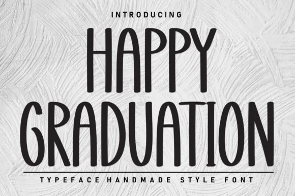
Tall skinny farmhouse marker print sans
Happy Graduation (by Berkah Shop) is a tall, narrow farmhouse print sans (NOT a slab serif!) built for vertical signs, tumblers, and ribbons.
Ideas for this font

Tall condensed farmhouse marker display sans (NOT a script!)
Bakery Shop is actually a tall, condensed marker print display font (zero connected cursive!) built for farmhouse canisters and chalkboard menus!
Ideas for this font
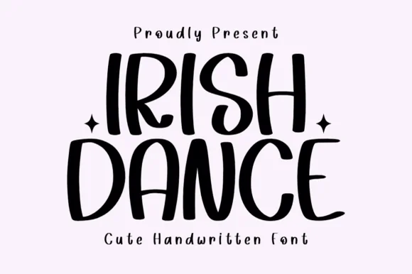
Tall bouncy farmhouse-cute marker capitals
Irish Dance is actually a clean, tall, disconnected handwritten marker font (not a cursive script or shamrock novelty)—great year-round on Cricut!
Ideas for this font
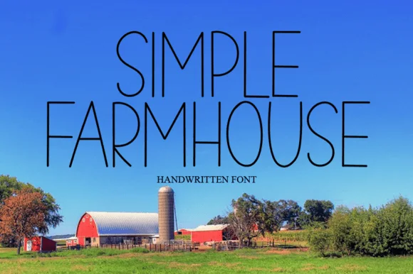
Thin tall handwritten caps
Simple Farmhouse is a thin handwritten caps face in dark ink over a bright landscape photograph: very tall narrow letters with a light even stroke, open arches and blunt terminals, set in two lines with a small tracked caption beneath, so the block reads as a hand-lettered sign on a barn.
Ideas for this font
Same independent foundry
Allow optional Google Analytics to measure visits and catalogue actions. Your search words and notes are not included. Privacy & storage