Editorial Serif Anchor

My Daily Journal + Mewah
Anchors My Daily Journal's fluid strokes with crisp Roman proportions on wedding suites, headers and packaging.
Inspect Mewah specimenDisclosure: MakerFileHub may earn a commission from qualifying purchases via paid links on this page. How our links work.
Neat geometric monoline bullet-journal print sans
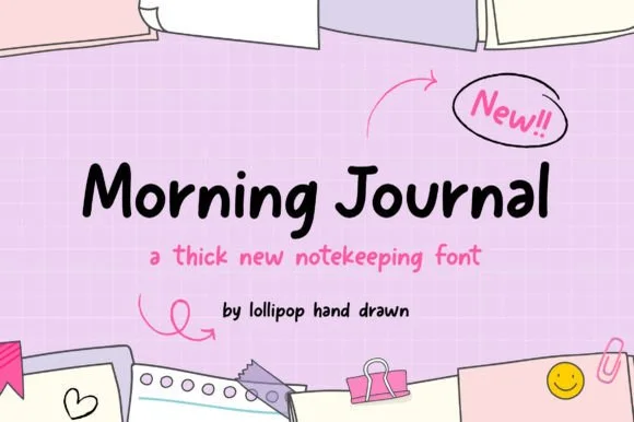
My Daily Journal is a crisp, even-weight monoline print sans pairing wide geometric 'O/D/U' bowls with friendly rounded pen tips.
Paid link
Get this fontProject & layout blueprintsAt-a-glance maker compatibility
Weld or Unite overlapping script joins into one continuous vector path before sending to the blade.
Visual anatomy & craft review
My Daily Journal is a neat geometric monoline bullet-journal print sans: an even fine stroke, perfectly round bowls, generous even spacing and small lift gaps at the joins, drawn to sit inside a ruled grid. The monoline keeps the face crisp at small sizes, and the round bowls are the only warmth. It needs roughly 20 mm for the round bowl and the lift gap to read, and it is best in one fine ink on smooth or dot-grid paper, or a single dark colour where the thin line still carries.
Clean-geometric-print · Grid-tidy · Minimal-cute
Two-font hierarchy recipes
Tested contrast partners — pairing My Daily Journal with grounded secondary typography.
My Daily Journal + Mewah
Anchors My Daily Journal's fluid strokes with crisp Roman proportions on wedding suites, headers and packaging.
Inspect Mewah specimen
My Daily Journal + Mango Dream
Keeps small-scale dates, URLs, nutrition facts and care instructions crisp and legible below script titles.
Inspect Mango Dream specimenPractical applications
Concrete hierarchy, scale and production guidance tailored to My Daily Journal’s stroke geometry.
A geometric monoline print sits inside a ruled grid without fighting the lines, which is what a bullet journal actually needs. The stroke holds at 16 mm in a header, and one ink prints the spreads and the labels in one pass.
Hierarchy & layout recipe
Journal spread A5, header 16 mm with 5 mm lift clearance, grid 5 mm, 12 mm margins. Planner sheet A4, header 16 mm, boxes 60 x 40 mm. Classroom label 105 x 40 mm, word 14 mm, 4 mm margins.
Pre-production check
At 14 mm on a label the monoline lands near 0.25 mm and a laser printer breaks it into dots. Raise labels to 20 mm and laminate them, and print one sheet before the class set.
A monoline print reads as hand-labelled stationery rather than a corporate logo. The stroke holds at 18 mm on a card, and one ink prints the card and the cover in one order.
Hierarchy & layout recipe
Card 85 x 55 mm, word 18 mm with 5 mm lift clearance, details 7/9 pt, 6 mm margins. Notebook cover 148 x 210 mm, word 34 mm, 15 mm margins. Envelope 160 x 110 mm, word 14 mm, 10 mm margins.
Pre-production check
On an 85 x 55 mm card the thin stroke prints grey and the name looks faded beside the details. Raise the card word to 24 mm, and check one card before the run.
A geometric monoline gives a journal feature a drawn header rather than a typeset one. The stroke holds at 24 pt, and the even spacing keeps a long title airy on a white page.
Hierarchy & layout recipe
Header 24 pt with 6 mm lift clearance, body 9/13 pt over two columns of 82 mm, 18 mm margins and a 12 mm head. Caption 8/11 pt in a 40 mm rail. Pull quote 20 pt.
Pre-production check
At 8 pt the caption's monoline drops out on uncoated stock and the line reads as pale marks. Set captions in the body face and keep the monoline at 18 pt and above, then proof one page at 1:1.
Technical & licence verification
Confirm included OTF/TTF/WOFF formats, full glyph tables and licence coverage on the live store page before batch production.
Closest visual alternatives
Matched across letterform anatomy, stroke behaviour and craft applications.
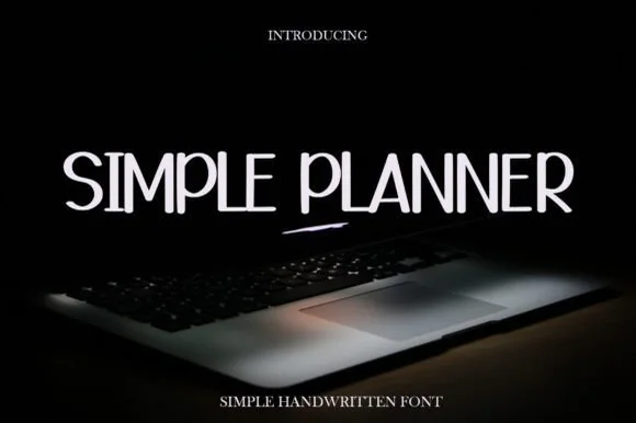
Tall thin handwritten capitals
Simple Planner is a tall thin handwritten face in white on a dark photograph: narrow capitals with gentle wobble, uneven heights, a high waist on the E and a rounded S, so the phrase reads as pen lettering written on a planner page rather than as a drawn display.
Ideas for this font
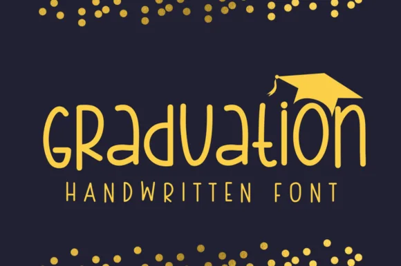
Geometric circular-bowl monoline classroom print sans
Graduation (by Sirinart) is a clean geometric monoline handwritten sans mixing circular lowercase 'a/d/o' bowls into sleek celebratory titles!
Ideas for this font
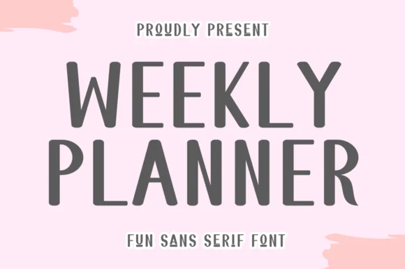
Tall quirky rounded sans
Weekly Planner is a tall rounded sans in grey on pink: narrow upright letters with rounded terminals, an open R leg, a bowed W and a curled L, presented in two stacked lines with a tracked caption beneath, so the pair reads as a planner cover rather than a neutral sans.
Ideas for this font
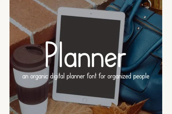
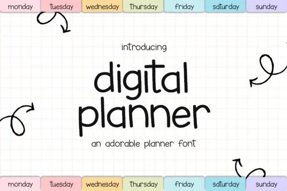
Neat iPad Apple-Pencil monoline digital-planner print sans
Planner is a tidy, upright monoline print font engineered specifically to look like neat Apple-Pencil handwriting inside GoodNotes & Notability planners!
Ideas for this font
Same independent foundry
Allow optional Google Analytics to measure visits and catalogue actions. Your search words and notes are not included. Privacy & storage