Editorial Serif Anchor

Montana + Svara
Anchors Montana's fluid strokes with crisp Roman proportions on wedding suites, headers and packaging.
Inspect Svara specimenDisclosure: MakerFileHub may earn a commission from qualifying purchases via paid links on this page. How our links work.
Heavy slanted brush script with a broad t bar and a rising final terminal
Montana is a heavy slanted brush script in which the stems carry dark weight, the M rises tall and angular, the t bar runs broad and the closing letter lifts into a high terminal, so a short headline reads as painted signage.
Paid link
Get this fontProject & layout blueprintsAt-a-glance maker compatibility
Fine grain and micro-texture excel in 300 DPI print, sublimation, and screen print rather than small vinyl weeding.
Visual anatomy & craft review
The M builds two tall slanted peaks under a wide bridge, the t carries a crossbar longer than the letter needs, the a closes a dark bowl and lifts its exit stroke, and the final letters push their terminals high above the x-height line. The slant is the character: every stem leans at the same angle, which is why the sample sets one line of thick script under a thin rule. Because the joins are heavy and continuous, the face welds into one path and cuts from 2.2 inches of x-height in vinyl; below that the brush edge frays. The cream ground, the torn paper edge and the small caps credit beneath are presentation; the dark painted word is the face. The maker supplies clean, rough and smooth versions, so a project can pick the texture before cutting rather than adding it later.
Heavy · Slanted · Brushy
Two-font hierarchy recipes
Tested contrast partners — pairing Montana with grounded secondary typography.
Montana + Svara
Anchors Montana's fluid strokes with crisp Roman proportions on wedding suites, headers and packaging.
Inspect Svara specimen
Montana + Nyxar
Keeps small-scale dates, URLs, nutrition facts and care instructions crisp and legible below script titles.
Inspect Nyxar specimenPractical applications
Concrete hierarchy, scale and production guidance tailored to Montana’s stroke geometry.
The broad slant reads from a dock, and the heavy stems stay solid at 70 mm on a painted board where a light script would thin out in the sun.
Hierarchy & layout recipe
Paint a 600 by 250 mm board: set the two-word name at 70 mm, keep 30 mm of clear ground above the top terminals, and set the nightly rate in a 16 mm sans under the baseline.
Pre-production check
The high exit terminal needs its own space; check the board layout and keep 30 mm above the cap line so the stroke is not clipped by the frame.
The dark brush weight gives a bag a mark that survives a matte print, and the broad t bar holds the eye at 30 mm on a 90 mm label.
Hierarchy & layout recipe
Print a 90 by 60 mm label: set the roast name at 30 mm, set the origin in a 7 pt caps sans beneath, and keep the brush texture intact rather than layering a distress filter over it.
Pre-production check
A rough version printed at 30 mm loses its edges; check the proof at full size and choose the smooth cut for small labels.
The slant pushes a short race name forward, and the heavy strokes stay readable at 110 mm on a printed poster against a photographic ground.
Hierarchy & layout recipe
Print an A2 poster: set the race name at 110 mm in one flat colour, keep the title on the calmest band of the photograph, and set the date and distance in a 14 pt sans beneath.
Pre-production check
A heavy script over a busy image loses its counters; check the poster and keep the title on a band no busier than a mid tone.
Technical & licence verification
Confirm included OTF/TTF/WOFF formats, full glyph tables and licence coverage on the live store page before batch production.
Closest visual alternatives
Matched across letterform anatomy, stroke behaviour and craft applications.
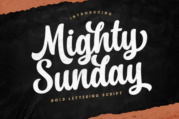
Bold lettering script with heavy looping capitals and a tight stacked fit
Mighty Sunday is a bold lettering script in which the capitals loop heavily, the strokes stay fat through the joins and two stacked words lock together into a single block.
Ideas for this font
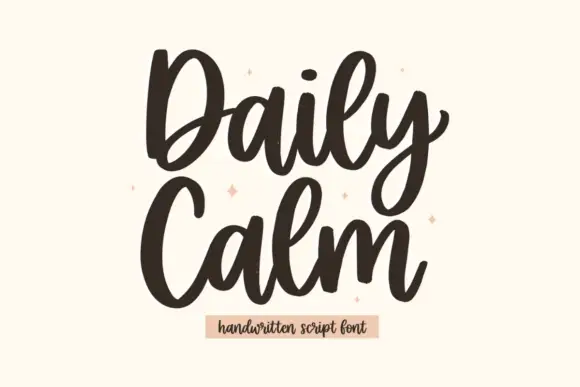
Tall rounded script with heavy entries and a stacked two-line rhythm
Daily Calm is a tall rounded script with heavy entries and light exits, drawn so two stacked words share the same width and read as a single column of movement.
Ideas for this font
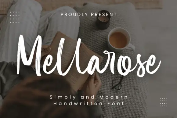
Tall textured brush script
Mellarose is a tall textured brush script in white over a dim photograph: narrow letters, dry broken edges and a light forward lean, with two tracked captions beneath.
Ideas for this font

Bouncing tail script with long entry and exit swashes
Farmhouse is a bouncing tail script in which the letters sit at different heights, the strokes swell on the downstroke and long swashes enter and leave the word, so a name reads as hand lettering on a painted board.
Ideas for this font
Allow optional Google Analytics to measure visits and catalogue actions. Your search words and notes are not included. Privacy & storage