 #1 · Best Overall
Valentines
Romantic brush script with heart-shaped terminals and looping joins
Get fontPaid link
Read review ↓Disclosure: MakerFileHub may earn a commission from qualifying purchases via paid links on this page. How our links work.
Heart tails, love scripts & February crafts
Valentine lettering is a narrow brief: a heart where a letter connector would be, or a tail that curls into one. Valentines and Luxury Romantic handle the formal and bouncy script registers, I Love Glitter and Little Love keep the hearts inside the letterforms, and Heart Bubble and Love Comic push into the plump display side for kids and classroom cards. Valentine Glow adds heart-swashed alternates.
Quick verdict
Valentines is the most versatile heart script, Luxury Romantic is the formal choice, and I Love Glitter keeps the hearts subtle enough for a card. Heart Bubble covers the kid-friendly side.
Quick answer
Short on time? Start with our three highest-rated Valentine standouts before scrolling the full breakdown.
#1 · Best OverallRomantic brush script with heart-shaped terminals and looping joins
 #2 · Runner-Up Pick
Heart-swash formal calligraphy with heavy stems and wide open loops
 #3 · Editor's Choice
We kept 26 of 690 candidates whose hearts are drawn into the glyph rather than pasted on the preview. Judged on connector thickness at 1 inch, whether a heart closes into a blob at small sizes, and how the script behaves in a two-word phrase.
Side-by-side summary
Compare specimens, OpenType/PUA traits and primary project roles side by side.
| Rank & Font | Style & File Specs | Best Project Fit | Store Listing |
|---|---|---|---|
| ScriptGirly | Valentine tumbler wrap, Galentine shirt or card | Get fontPaid link | |
| ScriptAlternates & swashes | Anniversary gift box, acrylic sign or wedding hanger | Get fontPaid link | |
| ScriptPUA encoded | A birthday card with one long wish | Get fontPaid link | |
| ScriptAlternates & swashes | A heart-linked two-word greeting | Get fontPaid link | |
| HandwrittenSweet | Classroom Valentine exchange card, teacher tote or sticker | Get fontPaid link |
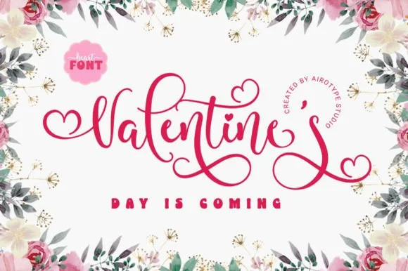
#1 · Best OverallValentine's is a romantic brush script in which the terminals swell into heart shapes, the joins loop high and the thick-to-thin stroke swings, so a single word reads as something written on a card with a loaded brush.
The V opens two wide arms with a heart at the apex, the a closes a round bowl, the l loops above the x-height, the e turns a light eye and the final s finishes in a heart-shaped tail, all at a brush contrast with soft, swelling joins and generous entry strokes. The heart terminals are the character: they sit at the ends of the strokes rather than as decoration, so the word carries its own ornament. Because the stroke is fat in the stems and thin in the joins, the face holds from 24 pt upward and wants a smooth stock. The floral frame, the pink ground, the small badge and the round studio credit are presentation; the red script word is the face.
Valentine tumbler wrap, Galentine shirt or card — Pair with small spaced sans capitals (DAY IS COMING) underneath.
Weld cursive overlaps before cutting HTV or permanent vinyl.
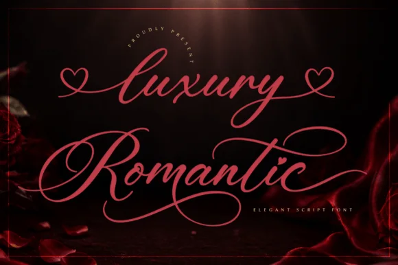
#2 · Runner-Up PickLuxury Romantic is a formal calligraphy script in which the heavy stems alternate with fine hairlines, the capitals open into wide heart-shaped swashes and the loops run far beyond the letter body.
The capital L opens with a broad looped stem that crosses itself and finishes in a heart-shaped swash, and the capital R repeats the gesture on the second word, which is what gives the composition its symmetry. The lowercase keeps a strong contrast: thick downstrokes, hairline upstrokes, small loops on the l and the d and a long curved descender on the y that sweeps under the line. Because the loops leave the letter body, the pair fills a wide format without extra ornament. The hairlines are the fragile part — they need a coated stock and a generous size, and at 30 pt the counters still open cleanly. The dark rose ground, the pink ink and the small arched caption are presentation; the script is the two words.
Anniversary gift box, acrylic sign or wedding hanger — Apply heart tails only on the outer start and end letters of a line.
Fine copperplate hairlines suit print, foil and laser engraving; add a slight offset for vinyl.
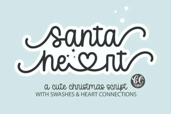
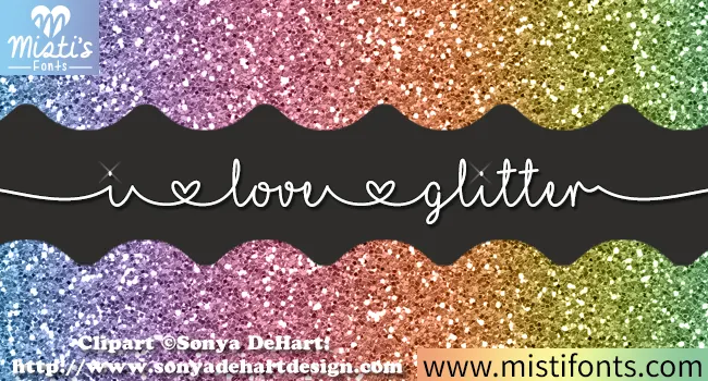
#3 · Editor's ChoiceI Love Glitter draws a fine handwritten line in which small heart shapes divide the words and long entry and exit strokes stretch the phrase wider than its letters alone, so a short message runs almost edge to edge.
The stroke stays thin and continuous, the joins barely widen, the hearts sit between words as dividers and the outer strokes travel far beyond the letters. The heart divider is the character: the phrase is separated by ornament rather than by a space, which is why the sample runs across the page. Because the stroke is fine and the tails are long, keep 24 pt as the floor on smooth stock and 20 mm at each end from a short line.
A birthday card with one long wish — Run the wish across the middle of a landscape card. Keep the recipient’s name above it in a plain face, with generous space at each side of the script.
Check the exact heart characters and joins in the actual files. Print a proof; fine lines may disappear at small sizes.
 #4 · Top Maker Utility
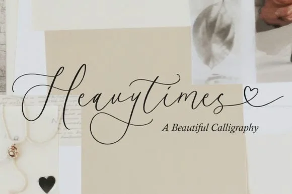
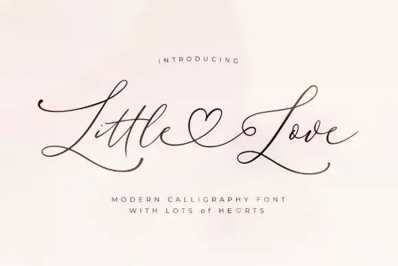
Little Love uses very fine strokes, broad L capitals and long lower sweeps across both words, where a heart-shaped connecting flourish sits between the two words and the exits travel well past the letters on either side.
The strokes stay hairline-fine, the capitals broaden, the sweeps run low and the heart joins the words. That connecting heart is the character: two short words read as one drawn phrase, which is why the sample sets them on a plain field. The flourish is part of the pairing, so check how your own words join, keep 28 pt for the hairlines, print on smooth stock and allow 26 mm at each end. The connecting heart is the join that fails first: it is drawn on a hairline, so it snaps in foil and closes into a comma below about 28 pt, which is why the phrase belongs on a card rather than a tag.
A heart-linked two-word greeting — Keep both words on one wide line with no extra border; put the sender below the lowest L sweep in plain type.
Verify the specific heart connection for the chosen words.
 #5 · Standout Silhouette
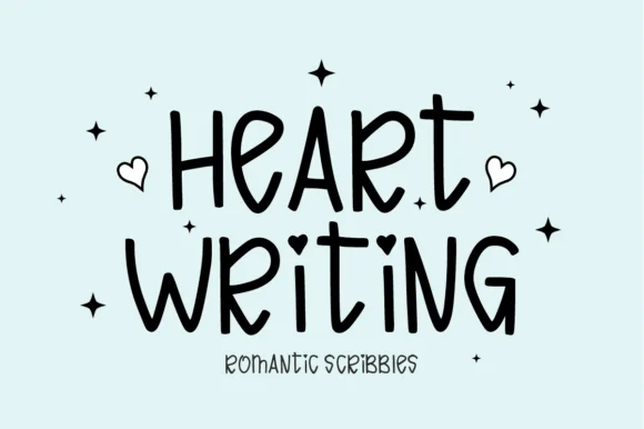
Heart Writing is a tall marker hand in which the letters vary in height, the strokes stay slender and even, and small hearts tip the ascenders and dots, so a short line reads as a classroom valentine written in one pass.
The H lifts two narrow stems, the a closes a small round bowl, the r carries a short arm and the t finishes with a heart instead of a bar, while the baseline wanders upward by a few points across a word. The heart tips are the character: they arrive on the strokes rather than beside them, which is why the sample sets two short words with doodles around them. Because the strokes are slender, the face wants 24 pt in print and welds for cutting from 1.1 inches of x-height so the hearts survive the blade. The pink field, the scribbles and the small caption are presentation; the marker lettering is the face.
Classroom Valentine exchange card, teacher tote or sticker — Set at medium-large display sizes on light pastel backgrounds.
Slender lines and tiny heart details work best for print, cards and larger HTV.
 #6
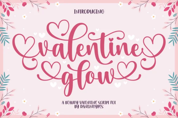
Valentine Glow is a romantic, bouncy brush calligraphy script wrapping lowercase words in symmetrical heart-looped entry, ascender & exit swashes!
Valentine Glow is a romantic brush calligraphy script in rose-pink weight with symmetrical heart-shaped loops on the entry, ascender and exit strokes, so the affection is built into the letters rather than added as a heart illustration. The contrast runs from a thick shaded downstroke to a fine exit, and the baseline is bouncy without becoming illegible. Hearts appear on the v and g and the final e and w, which means a designer can control how romantic a word looks by choosing where it starts and ends. It needs about 16 mm of cap-height for the heart loops to read as hearts.
Galentine glass-can wrap, 'love glow' candle & sweatshirt — Stack 2 lowercase words centered at 68–135 pt in rose pink, cherry red, or metallic gold.
Ribbon-smooth medium-thick strokes cut cleanly on Cricut Oracal 651 and HTV above 1.15 in—click Weld in Design Space first!
 #7
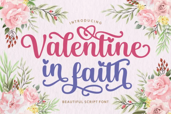
Valentine in Faith is a joyful, PUA-encoded thick brush script crowning words with interlocking heart swashes and heart-dotted 'i's!
Valentine in Faith is a PUA-encoded brush calligraphy script with heart crowns: a loaded brush stroke with connected letters, a light slant, and swash alternates that end in a small heart above the ascenders; the alternates only appear through the PUA keystrokes. The crowns add height and the hearts close first at small sizes. It needs roughly 26 mm for the heart crown and the brush edge to read, and it is best in one warm ink on smooth card, or a foil impression above 36 pt where the hearts still hold their lobes.
Valentine tote, Christian women's retreat tee & mug — Stack 2 mixed-case lines centered at 68–135 pt in berry pink and slate blue or all-white on red.
Copy PUA heart swashes via Character Map/Font Book, then click Weld in Design Space before cutting HTV or Oracal 651!
 #8
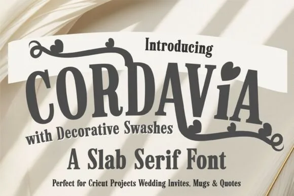
Cordavia Bold Swash is a warm, slightly condensed slab serif crowned with decorative canopy swashes, baseline curls, and solid heart i-dots.
Cordavia Bold Swash is a playful slab serif with heart details: heavy unbracketed slabs, open counters, a small heart replacing the dot on the i and swashes that finish in a heart tip at the entry and exit of a word. The hearts are the design and they close into dots as soon as the face is reduced. It needs roughly 28 mm for the heart and the slab to read, and it is best in two soft inks on white, or one ink plus paper where the hearts print as knockouts.
Cricut wedding mug, welcome wood sign & save-the-date — Set a couple surname or single word ('MR & MRS', 'ALWAYS') in uppercase, dropping in one lowercase heart-dotted 'i' for charm.
Thick slab bodies and solid swash ribbons cut reliably on Oracal 651 and HTV down to 1 inch cap height.
 #9
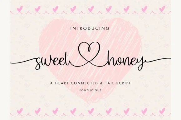
Sweet Honey is an airy handwritten script linking lowercase words through a tall central open-heart loop and sweeping side tails.
Sweet Honey is a delicate handwritten script in which adjacent letters connect through tall heart-shaped loops and the final letter runs out in a long tapered tail. The heart loops sit above the x-height and the hairline stroke is the lightest part of the face, so a word reads airy at large sizes and vanishes small. It needs roughly 24 mm for the heart loop and the tail to read, and it is best in a single warm ink on ivory or soft pink, with foil only above 40 pt.
Anniversary photo frame, honey-jar wedding favor & card — Link two lowercase words on one horizontal line at 44–76 pt above wide-tracked sans captions.
Slender pen strokes favor print, Foil Quill, sublimation mugs, and 1.6 in+ vinyl decals (weld all overlaps!).
 #10
Bunglon is a modern copperplate script in which the downstrokes carry weight, the hairlines stay fine and generous swashes arch above the x-height and below the baseline, so a single name reads as formal calligraphy.
The B opens a wide upper loop, the bowls swell on the downstroke and thin on the join, the ascenders carry tall loops and the swash set adds long arcs that clear the word above and below. The overhead swashes are the character: they frame a name without a border, which is why the sample sets one couple's name on a plain card. Because the swashes are long, a line needs 20 mm of clearance at both ends, and the joins must be welded before cutting from 1.1 inches of x-height. The pale ground, the fine rules and the small caps line are presentation; the dark calligraphic name is the face.
Save-the-date or thank-you card headline — Use swashed forms sparingly on first and last letters and keep event logistics in a clean serif.
Fine hairlines suit print and foil; thicken with a small offset path if adapting for large vinyl signs.
 #11
I Heart You runs a fine connected phrase along one long baseline, where a heart replaces the dot on the opening i and two more hearts rise above the joins between words, with long entrance and exit strokes widening the phrase on both sides.
The stroke stays one even monoline weight, the letters stay connected, the hearts sit on the joins rather than beside them and the ends run long. Those heart joins are the character, because the phrase is drawn as a single ribbon with three interruptions. The small typeface label beneath is cover text. Check how the heart is reached in your file, keep 26 pt so the monoline stays unbroken and remember that a cutting machine will need the hearts joined to the letters.
A single-line Valentine front — Centre the phrase on a wide card with generous end margins. Put the recipient name on the reverse rather than squeezing it between the heart loops.
Confirm the required heart alternates; single-line machine behaviour is not tested.
 #12
Hailey is a beauty script in which the strokes stay medium in weight, the ascenders loop high and long swashes enter and leave the word, so a single name reads as a written logo on a soft ground.
The h climbs a tall loop, the a closes a round bowl, the i carries a light dot, the l rises into a second loop, the e turns a light eye and the y drops a wide tail, all at a medium brush weight with generous entry and exit swashes and a gentle slope. The swashes are the character: they sit outside the word and take as much width as the letters, which is why the sample sets one name across a circular panel. Because the downstrokes are medium, the face holds from 26 pt and prints on smooth stock. The blush circle, the botanical sprig, the arched lettering above and the small caps beneath are presentation; the dark script name is the face.
A floral guest-book name cover — Keep the name alone in the centre, with a small plain date well below its lowest loop; put floral art in one distant corner.
Confirm the exact swash variants and leave ample vertical space.
 #13
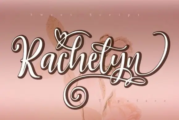
Rachelyn is an ornate sweet-style script in which the caps carry hearts, the joins curl into small loops and the word finishes with a large spiral swash that drops below the baseline.
The capital R opens with a looped stem and a heart worked into its bowl, and the letters after it stay round and connected: the a closes a small counter, the c and the h curl their joins, the e lifts and the l and the y carry the same soft weight. The defining gesture is the exit: a broad swash that curls into a spiral before finishing, sitting below the baseline and balancing the entry on the left. Weight is medium and even with slight contrast at the joins, so the face reads at 24 pt on a card and at 60 pt on a banner without thinning. The pale rose ground, the outline treatment in the sample and the small caption are presentation; the script is the word and its swash.
A keepsake name cover — Reserve the whole centre for the name and put the year in plain type outside the low spiral.
Verify the exact ornaments and test the thinnest crossings.
 #14
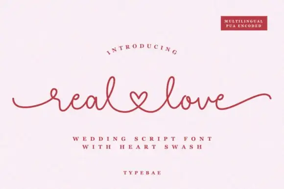
Real Love is thin continuous writing in which the stroke never thickens, the letters stay connected and the two words are joined by a link drawn as a heart, so a phrase reads as one signed line.
The r opens with a short entry stroke and closes a small arm, the e loops back through an open counter, the a holds a small bowl and the l rises into a narrow loop, all at one even light weight with the pen barely lifting. The heart link replaces the word space, which is what the face is remembered for and what makes it a wedding script rather than a general hand. Because the stroke is continuous and light, the phrase holds at 24 pt on a card and reads as one gesture, while the ends taper into long flat tails that fill a wide format. The light weight wants a smooth stock. The blush ground, the rose ink, the small badge and the three tracked caption lines are presentation; the script is the two words.
A linked-name invitation insert — Reserve one wide horizontal band for names and put all date/place text below the tail line.
Verify actual name connections and available alternates.
 #15
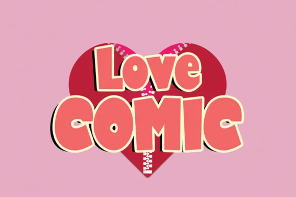
Love Comic is a chunky, upbeat cartoon display font packing plump mixed-case & uppercase shapes for Valentine, birthday, and sticker crafts!
Love Comic is a chunky retro cartoon and Valentine heart-badge bubble sans: fat rounded letters, a thick keyline, and a heart badge set into the counter of the round letters or hung off a terminal as a small outlined shape. The badge is the design and it closes into a dot when the face is reduced. It needs roughly 30 mm for the badge and the keyline to read, and it is best in two flat inks on white, or one ink plus paper where the badge prints as a knockout.
Kids' classroom Valentine card ('YOU'RE SUPER!'), tee & bag — Stack mixed-case row 1 (68 pt) above larger all-caps row 2 (92 pt) wrapped in a 0.10 in cream sticker offset over a red heart.
100% smooth, thick single-layer shapes cut and weed in 4 seconds on Cricut HTV, puff vinyl, and cardstock down to 0.6 in!
 #16
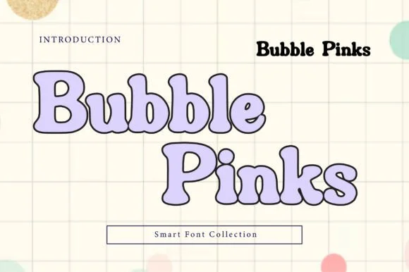
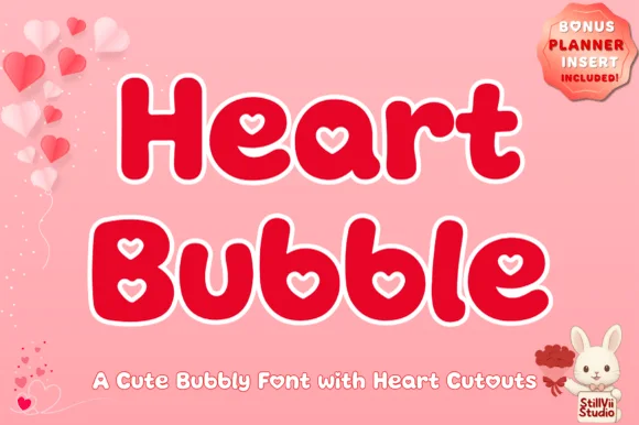
Heart Bubble is a cheerful rounded bubble display font where enclosed letter counters and i-dots are shaped as crisp upright hearts.
Heart Bubble is a plump kawaii bubble display with heart-shaped counters: very fat rounded letters, a thick balloon keyline and a heart cut into the bowl of the round letters and the counters of the capitals. The heart counters are the design and they close into dots as soon as the face is reduced. It needs roughly 28 mm for the heart counter and the keyline to read, and it is best in two soft inks on white, or one ink plus paper where the hearts print as knockouts.
Kids' Valentine shirt, classroom sticker & treat topper — Set 1-to-2-word greetings in bright berry red or hot pink wrapped in a 0.1 in white offset sticker contour.
Chunky outer walls weed easily on HTV and glossy vinyl; use a sharp weeding pin to lift the cute heart-shaped counter pieces cleanly.
 #17
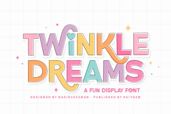
Twinkle Dreams combines firm block capitals with a heart-shaped dot above the i and curling extensions on selected letters, where the R and K tails swing below the main rows, each letter takes a pastel fill with a fine dark edge and the whole block sits on a faint grid.
The bodies stay blocky and even, the edges stay fine, the fills change per letter and two letters drop long tails under the baseline. That heart dot is the character: a plain display face gains one playful substitution, which is why the sample keeps a short title. The grid and the sparkles are cover treatment. Keep 40 pt so the fine edges stay separate from the fills, verify the heart form in your file and check the swinging tails against the line beneath.
A wish-themed party invitation — Keep the phrase large with clear room below any R tail; place details in plain text.
Check the actual letters and do not assume a heart appears in words without i.
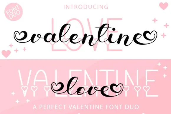 #18
Valentine Love Duo teams a bold bouncy brush script—with open heart terminal loops—with a tall slim sans accented by tiny baseline hearts.
Valentine Love Duo pairs a heart-tipped calligraphy script with a heart-accented tall sans: the script runs a moderate contrast stroke on a shallow slant with swashes that finish in a drawn heart tip, while the sans is a narrow block whose i dots are small hearts. The pair gives one card two voices and two heart placements from a single palette, so an invitation, a seal and a sleeve can be printed as one set. The hearts are the finest elements and both close into dots as soon as the face shrinks, and the script's hairlines are the first thing to lose on textured stock. The script needs roughly 26 mm and the sans 22 mm for their detail to read.
Galentine tumbler decal, wine tote & pajama set — Use the heart-ended black or red script at 4.5 inches wide across the center of tall pale-pink sans background capitals.
Weld all script letters before cutting vinyl, and use fine tweezers to weed the small interior heart loops at both ends.
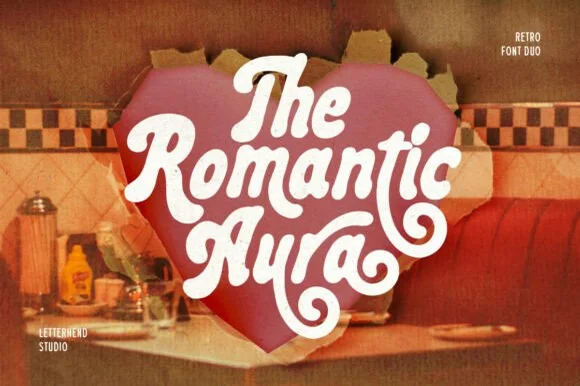 #19
Romantic Aura Duo pairs a thick, velvety 1970s swash script with a clean companion voice for nostalgic love notes and merch.
Romantic Aura Duo pairs a nineteen-seventies swashed retro script with a rounded sans: the script runs a high-contrast stroke with wide swelling swashes that lift above and below the line, while the sans is a soft rounded block for details and lists. The pair is a period look, so it works best in two warm flat inks on a light ground rather than in photographic tints. The swash thins are the finest element and they break first. The script needs roughly 32 mm and the sans 20 mm for their detail to read.
Retro Valentine sweatshirt, mug wrap & galentine card — Stack 2 to 3 centered words tightly inside a heart or arch silhouette so rising ascenders nest into the gaps of the line above.
Weld all overlapping script letters before cutting HTV, and keep total lockup width at 3.5 in+ so tight inner 'e' and 'a' counters weed cleanly.
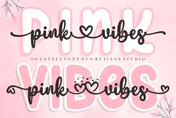 #20
Pink Vibes Duo pairs two fat rounded capital rows, drawn in white with a soft pink glow, with a small dark connected script that runs across them, and in the lower sample the script joins the words with heart shapes instead of a plain connector stroke.
The caps stay broad and inflated, the script stays thin and dark, the contrast between the two weights carries the pair and the hearts sit where a ligature would normally go. The upper sample sets the script over the caps without hearts, the lower inserts one heart between the words and a second heart cluster on the final s, so the decorative join is an option rather than the default. Branches in the corners are cover artwork. Check which connector glyphs your file carries before planning the heart link, keep 30 pt for the script strokes and set the caps in one colour so the pink glow does not come from the type.
A two-level greeting — Keep capitals above script rather than overlapping; leave heart tails in open space.
Check connector variants and actual duo contents.
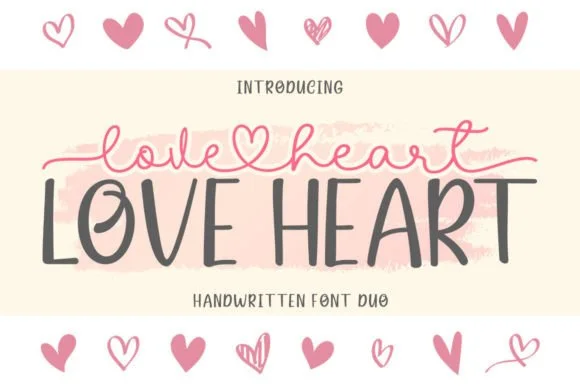 #21
Love Heart Duo matches a tall, slightly textured uppercase brush-sans with a fine monoline cursive featuring a built-in center heart swash.
Love Heart Duo pairs a hand-brushed tall sans with a heart-connected monoline script: the sans is narrow with a dry brush edge and open counters for headlines and lists, while the script runs an even thin stroke where the joins between two words swell into a small drawn heart. The pair gives one card a hand-linked line and a legible second voice from a single family and a single palette, so an invitation, a tag and a seal can be built together. The hearts are the finest element and they close into dots as soon as the face shrinks, and the dry brush edge fills when the sans is reversed or printed small. The sans needs roughly 24 mm and the script 26 mm for their detail to read.
Couple anniversary mug, pillow sham & Valentine card — Match the outer tip-to-tip width of the tailed script to the full width of the uppercase sans row underneath.
The fine monoline script cuts best above 1.75 in tall on vinyl; for smaller mugs, use sublimation or Print-Then-Cut.
 #22
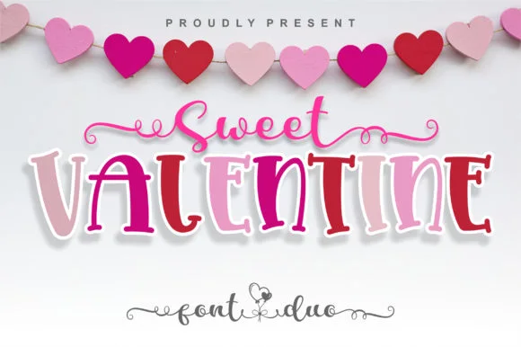
Sweet Valentine pairs a spiral-tailed monoline cursive with a lively, dancing mixed-width display serif.
Sweet Valentine is a duo of a curled heart-swash script and a bouncy cutout-style serif: the script runs a light stroke with joined letters and swashes that curl into a heart at the entry and exit, while the serif is a chunky cut-paper face with blunt brackets for the supporting line. The pair reads as a hand-cut Valentine without a printed motif, and the heart swash is the finest element. The script needs roughly 26 mm and the serif 24 mm for their detail to read.
Classroom Valentine exchange cards & treat-bag toppers — Place a short cursive opener ('Sweet', 'Be My') centered above the bold uppercase holiday or child's name.
For multi-color sticker toppers, use Print-Then-Cut with an offset white border rather than weeding tiny spiral end curls.
 #23
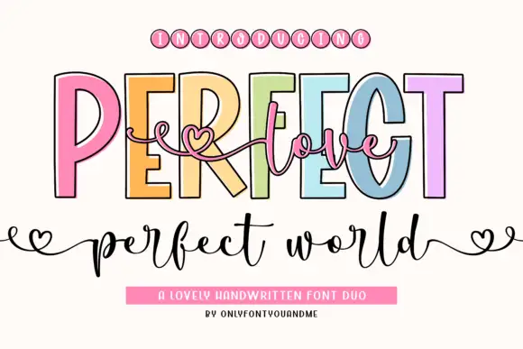
Perfect Love Perfect World places fine script across tall outlined capitals, where small hearts extend the script ends and the lower world line carries deep p and d strokes.
The caps stay tall and open, the outline runs thin, the script threads across them and the ends finish in small hearts. That layering is the character: one line sits over another instead of beside it, which is why the sample reads as a single romantic composition. Small hearts may be artwork rather than glyphs, and overlapping two members invites collisions, so test your own phrase and keep 18 mm of clear ground below from 26 pt. The overlap is the only real risk: the script has to cross the outline without touching it, so keep 20 mm of clear ground between the layers and test one phrase before a run of cards.
A welcome-sign direction — Place a short script line in the gap, then keep names on a separate baseline.
Check overlap at the capital counters.
 #24
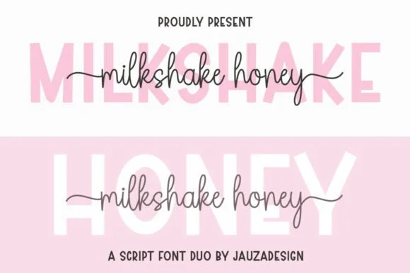
Milkshakehoney pairs a crisp, wide-stance uppercase sans-serif with a tall, narrow-looped monoline cursive accented by straight side tails.
Milkshakehoney pairs a clean geometric uppercase sans with a tall-looped monoline script: the sans is a wide, even-width capital set for signage and labels, while the script is a thin monoline with high loops that rise well above the x-height and joins that stay open. The pair gives one card a printed voice and a hand-written line and works from a single ink. The monoline hairline is the finest element and it breaks first. The sans needs roughly 20 mm and the script 30 mm for their detail to read.
Bridesmaid proposal box lid & satin robe chest print — Track the uppercase sans role title ('BRIDESMAID') wide in pale pink or gold behind the recipient's cursive first name.
Size HTV chest names at 4 inches wide or larger so the tall narrow 'k' and 'h' loops weed cleanly without stretching.
 #25
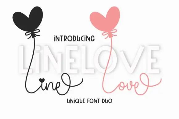
Line Love Duo is a two-cut pair in which a fine connected script with long loops answers a tall display letter set with uneven heights, so a card can separate a written line from a printed word in one palette.
The script lifts a heart-shaped dot over its i, runs thin connectors between small bowls and finishes with a long exit loop, while the display cut stands tall and unjoined with letters that vary in height and a slight lean. The contrast in join is the character: one member is written, the other is drawn, which is why the sample places a fine script above a set of tall letters. Set the script at 26 pt and the display at 34 pt, and weld the script before cutting from 1.1 inches of x-height. The heart balloons, the pale shading and the small caption are presentation; the two lettered rows are the duo.
A two-voice love note — Use LOVE as the main line with a small script phrase below, leaving high loops open and any balloon illustration separate.
Confirm supplied styles and any heart variant before composing.
 #26
Brown Carolina Duo contrasts broad high-contrast capitals with a much finer narrow slanted script, set dark on a plain cream field, where the capital R legs sweep below the neighbouring letters and the script carries long tails that run past the ends of both words.
The caps keep thin cross strokes and heavy uprights, the script keeps one fine weight, and the two voices sit in a strict stack: script, two cap rows, script. That alternating order is the character, because the fine lines frame the heavy block like a rule above and below. Both treatments appear on a plain light field, so the cover gives no clue about texture or shadow. Keep 34 pt for the caps before the thin strokes break up, keep 20 pt as the floor for the script and check the R leg before setting a line of capitals.
A boutique stationery front — Use the capital name centrally and a small script descriptor below, leaving the R sweep clear of contact information in a plain footer.
Confirm both styles and the actual capital alternates.
Practical buyer checklist
Key cutting, printing and pairing answers before choosing a Valentine typeface.
Usually through the underscore, vertical bar or bracket keys, or a private-use glyph you copy from Character Map. The download normally includes a PDF mapping, so start there before assuming the character is missing.
Yes if the connector stroke clears 0.5 mm at final size. Weld the word first, then zoom in on the heart: if the inner opening is smaller than the blade kerf, it will tear out and leave a hole.
A connector joins two letters within a word, while a tail finishes the word or wraps underneath it. Connectors are structural and must weld, tails are decorative and can be shortened without breaking the lettering.
Many do, especially the monoline scripts with small hearts, which read as affectionate rather than specific. Keep the palette and the copy in mind: a heart script on a wedding card looks different from the same script on a classroom card.
Keep exploring
Explore adjacent maker roundups or check our practical pre-production checklists.
19 curated fonts · Previews & pairings
27 curated fonts · Previews & pairings
30 curated fonts · Previews & pairings
25 curated fonts · Previews & pairings
Guides: Invitation font checklist · Vinyl & cutting checklist · How to pair script & sans fonts
Allow optional Google Analytics to measure visits and catalogue actions. Your search words and notes are not included. Privacy & storage