Neutral Sans Workhorse

Preppy Coquette + Memoir Slang
Lets Preppy Coquette own the focal silhouette while handling secondary copy, sizing and subheads cleanly.
Inspect Memoir Slang specimenDisclosure: MakerFileHub may earn a commission from qualifying purchases via paid links on this page. How our links work.
Rounded capitals filled with pastel stripes, flowers and large dots
Preppy Coquette is a colour font in which each cap is filled with a prep pattern: pink and blue stripes, a floral print on cream, a pale striped ground and a lilac polka dot, with stitched edges and a drawn bow under the row.
Paid link
Get this fontProject & layout blueprintsAt-a-glance maker compatibility
Sturdy stroke walls and open counters weed cleanly on adhesive vinyl, HTV apparel film, and cut cardstock.
Visual anatomy & craft review
ABCD fills the middle of the card, and each letter is a fat rounded shape with a fine dark outline and a small stitched edge, filled with a different print: diagonal pink stripes, a floral sprig pattern, pale blue stripes and lilac dots on cream. Below the row a pink bow is drawn in outline, and around it small stars and daisies float on the white ground. A heading at the top names the set in a serif with a full stop, and a small credit sits at the lower left. The palette is deliberately soft and the patterns are small-scale, so the word reads as fabric rather than as a colour page, which is what the coquette style is: bows, gingham, flowers and a lot of pale pink.
Rounded capitals filled with pastel stripes, flowers and large dots
Two-font hierarchy recipes
Tested contrast partners — pairing Preppy Coquette with grounded secondary typography.
Preppy Coquette + Memoir Slang
Lets Preppy Coquette own the focal silhouette while handling secondary copy, sizing and subheads cleanly.
Inspect Memoir Slang specimen
Preppy Coquette + Glofi
Grounds bold display lettering with classic typographic authority on posters, badges and apparel.
Inspect Glofi specimenPractical applications
Concrete hierarchy, scale and production guidance tailored to Preppy Coquette’s stroke geometry.
The soft patterns and the drawn bow set a romantic tone without a photograph, and the fine outline keeps a short word readable on a small card.
Hierarchy & layout recipe
Print a 105 by 148 mm card: set the word at 48 pt on one row, keep 18 mm of clear ground beneath before the message at 9 pt, and hold 13 mm from the bow to the card edge.
Pre-production check
Small florals close up below 26 pt; print one card at the finished size and check the print inside the letters.
The patterns suit a range of notebooks and pens, and one word in this face carries a shelf look that would otherwise need a printed pattern sheet.
Hierarchy & layout recipe
Print a 55 by 40 mm label: set the brand name at 15 pt on one row, keep 5 mm of clear ground beneath before the word goods at 4.5 pt, and hold 4 mm from the outline to the label edge.
Pre-production check
Fine stripes moire on a small label; print one label on the real stock and check the pattern before the order.
The palette and the bow set the theme in one word, and the soft colours keep the card from looking like a children's party.
Hierarchy & layout recipe
Print a 105 by 148 mm invitation: set the name at 36 pt across two rows, keep 15 mm of clear ground beneath before the details at 8.5 pt, and hold 12 mm of margin so no star is cut.
Pre-production check
Pale pink on cream loses contrast; print one card on the intended stock and check the outline before the batch.
Technical & licence verification
Confirm included OTF/TTF/WOFF formats, full glyph tables and licence coverage on the live store page before batch production.
Closest visual alternatives
Matched across letterform anatomy, stroke behaviour and craft applications.
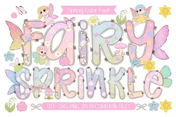
Pastel rounded letters with tiny flowers and overlapping fairy details
Fairy Sprinkle sets a spring scene in tall pastel colour-font letters, each interior printed with flowers, clouds and butterflies, each edge closed by a dashed stitch line, with small fairies perched on top.
Ideas for this font
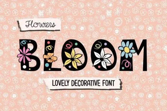
Uneven dark capitals with large outlined flowers, small circles and curled line details
Flowers Bloom sets heavy black caps with flat tops and feet, and grows a drawn flower out of each letter — a pink bloom on the B, an orange one on the L, a daisy on the M — with small doodle swirls and leaves around them.
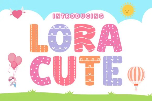
Stitched-pattern block display
Lora Cute is a patterned block display on a sky-blue ground: broad rounded capitals, each filled with a different treatment — stitching, loops, waves, stars — with a pale outline around every letter, plus small balloon, heart and sun illustrations around the edges.
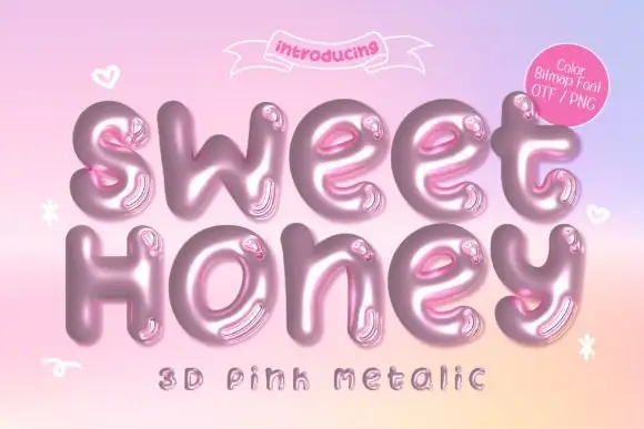
Inflated metallic colour display
Sweet Honey is an inflated colour display on a pink-to-peach gradient: rounded mixed case drawn as glossy pink metal with highlights and reflections, with small hearts and sparkles floating around and two plain lines above and beneath, one of them naming the effect and the formats.
Ideas for this font
Same independent foundry
Allow optional Google Analytics to measure visits and catalogue actions. Your search words and notes are not included. Privacy & storage