Editorial Serif Anchor

Blossom Script Font + Brenco
Anchors Blossom Script Font's fluid strokes with crisp Roman proportions on wedding suites, headers and packaging.
Inspect Brenco specimenDisclosure: MakerFileHub may earn a commission from qualifying purchases via paid links on this page. How our links work.
Broad connected brush script with a rising exit
Blossom Script is a broad connected brush script with tall B and l forms, open rounded middles and an exit stroke that rises instead of trailing flat.
Paid link
Get this fontProject & layout blueprintsAt-a-glance maker compatibility
Weld or Unite overlapping script joins into one continuous vector path before sending to the blade.
Visual anatomy & craft review
The letters are wider than they are tall in the lower-case, and the connections sit at mid-height, so a word holds together as one buoyant shape rather than a row of separate forms. The B carries a large upper loop and the l rises well above the x-height; the final m turns upward into a long curve that finishes above the baseline, which is the gesture the whole sample is built around. Weight is even, with soft brushy ends rather than sharp entry points, so the script stays friendly at large sizes. Tropical foliage at the corners of the preview is separate artwork, and the sub-line naming the style sits in a smaller hand-printed face.
Broad · Connected · Organic
Two-font hierarchy recipes
Tested contrast partners — pairing Blossom Script Font with grounded secondary typography.
Blossom Script Font + Brenco
Anchors Blossom Script Font's fluid strokes with crisp Roman proportions on wedding suites, headers and packaging.
Inspect Brenco specimen
Blossom Script Font + Kohilo
Keeps small-scale dates, URLs, nutrition facts and care instructions crisp and legible below script titles.
Inspect Kohilo specimenPractical applications
Concrete hierarchy, scale and production guidance tailored to Blossom Script Font’s stroke geometry.
The open lower-case and the rising exit give a shop sign a fresh, growing feel that a formal copperplate script would not.
Hierarchy & layout recipe
Set the name at 3-inch height on a 40 cm board, let the final curve rise into open space rather than meeting the frame, and keep the opening hours in a plain sans beneath.
Pre-production check
The rising exit needs horizontal room, so on a narrow sign choose a word that ends in a round letter instead.
Round open letters stay legible on a small seed packet while the rising tail gives the label a hand-made flourish that a clean sans cannot.
Hierarchy & layout recipe
Keep the script at 14 pt across a 60 mm packet, set the variety name in a small serif at 8 pt below, and leave 3 mm under the tail before the printed edge.
Pre-production check
At packet size the connection between letters is thin, so check that it prints as one continuous stroke.
A connected script reads as a maker's signature on a small tag, where a heavier display face would feel like a corporate brand mark.
Hierarchy & layout recipe
Print the name at 16 pt on a 50 by 30 mm kraft tag, punch the hole 8 mm from the edge, and keep the exit tail at least 4 mm away from the punched opening.
Pre-production check
The exit curve must not run into the hole, so decide the hole position before you centre the word on the tag.
Technical & licence verification
Confirm included OTF/TTF/WOFF formats, full glyph tables and licence coverage on the live store page before batch production.
Closest visual alternatives
Matched across letterform anatomy, stroke behaviour and craft applications.
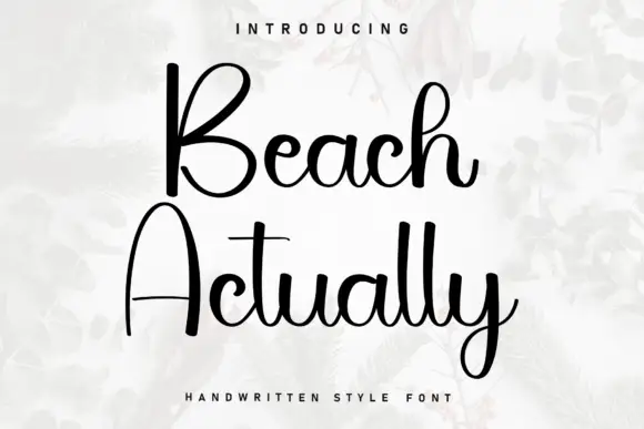
Tall open capitals with plain ascenders
Beach Actually pairs very tall open capitals with plain, almost unadorned ascenders, giving a relaxed coastal script with no flourish at all.
Ideas for this font

Beauty script with long entry and exit swashes
Hailey is a beauty script in which the strokes stay medium in weight, the ascenders loop high and long swashes enter and leave the word, so a single name reads as a written logo on a soft ground.
Ideas for this font
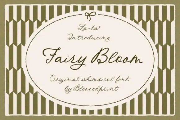
Whimsical formal script with ribbon-like loops and a light even stroke
Fairy Bloom is a whimsical formal script in which the capitals open into wide ribbon loops, the stroke stays light and even, and the joins curl into small ornate turns.
Ideas for this font
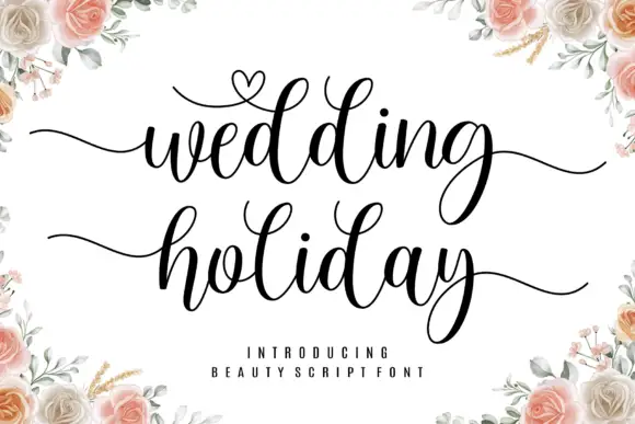
Brush script with a heart flourish
Wedding Holiday is a brush script in black on white: thick connected letters with high contrast at the joins, tall loops on the ascenders and a small heart drawn into the flourish above the first word, framed by peach roses.
Ideas for this font
Same independent foundry
Allow optional Google Analytics to measure visits and catalogue actions. Your search words and notes are not included. Privacy & storage