 #1 · Best Overall
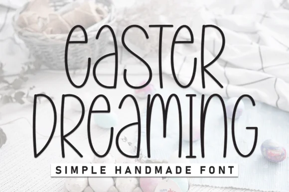
Easter Dreaming
Tall handmade monoline with elongated quirks and open counters
Get fontPaid link
Read review ↓Disclosure: MakerFileHub may earn a commission from qualifying purchases via paid links on this page. How our links work.
Bunny ears, egg patterns & pastel display
Easter lettering is a spring problem: pastel values are close together and the decorative detail is usually small. Easter Dreaming and Retro Easter keep a clean spring display and a seventies bubble, Easter and Cute Easter Bunny build the bunny ears into the glyph, and Easter Bunny Ears and Happy Easter add the illustrated options. Easter Quiz supplies the plain bunny-eared face for signage.
Quick verdict
Easter Dreaming is the most usable spring print for cards and signs, Retro Easter carries the display role, and Easter Bunny Ears is the strongest illustrated set for kids. Easter Quiz is the pick for a clean banner.
Quick answer
Short on time? Start with our three highest-rated Easter baskets & spring crafts standouts before scrolling the full breakdown.
#1 · Best OverallTall handmade monoline with elongated quirks and open counters
 #2 · Runner-Up Pick
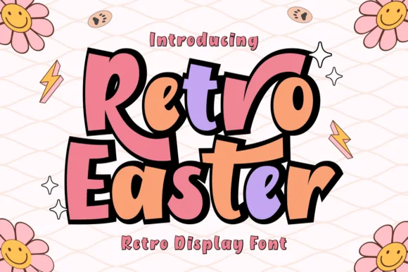
Chunky outlined seventies bubble letters in pastel spring colours
 #3 · Editor's Choice
We kept 17 of 404 candidates after removing generic nursery and party faces that share the pastel palette. Judged on whether ears and egg patterns are attached, readability at 16 pt, and contrast in a genuinely light palette.
Side-by-side summary
Compare specimens, OpenType/PUA traits and primary project roles side by side.
| Rank & Font | Style & File Specs | Best Project Fit | Store Listing |
|---|---|---|---|
| DisplayTall | Wooden Easter basket name tag or spring linen sign | Get fontPaid link | |
| DisplayGroovy | Kids' Easter shirt, basket decal or spring sticker sheet | Get fontPaid link | |
| DisplayWhimsical | Easter egg hunt banner, spring card or sublimated tote | Get fontPaid link | |
| DecorativeWhiskered-bunny | Easter coloring-sheet printable, cubby tag & Cricut card | Get fontPaid link | |
| DecorativeClean-bunny-ears | Cricut vinyl Easter bucket name, wood tag & shirt HTV | Get fontPaid link |
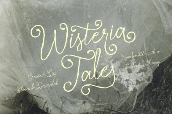
#1 · Best OverallEaster Dreaming is a tall handmade alphabet in which the letters stretch upward, the stems stay an even light line and a few forms wander, so a two-word title reads as a drawing rather than as type.
The e closes a tall eye, the a holds a narrow bowl, the s wobbles a shallow spine, the t raises a high bar, the r finishes a light arm and the g drops a straight tail, all at one even monoline weight with tall proportions and counters left wide open. The elongation is the character: the letters are almost twice as tall as they are wide, which is why the sample sets two stacked words loosely and lets the drawing behind them show through. Because the line is light and even, the face reads from 24 pt on a light ground and prints in one ink; on a busy photograph it needs a solid patch behind it. The pale pastel photograph, the basket and the small caps line beneath are presentation; the dark handmade words are the face.
Wooden Easter basket name tag or spring linen sign — Mix tall uppercase and rounded lowercase or run clean all-caps.
Thin-to-medium strokes engrave beautifully on wood tags; cut at 1.2"+ height for vinyl.
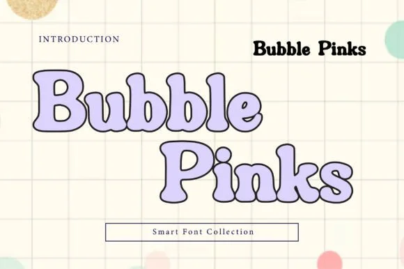
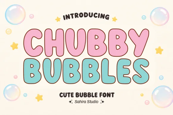
#2 · Runner-Up PickRetro Easter is a plump seventies bubble display in which the shapes stay rounded and heavy, an outline holds the pale fill and there are no tiny cut-outs, so a spring word stays simple for a cutting machine.
The R swells a broad bowl over a heavy leg, the E sets three rounded arms, the S turns a thick spine and the letters sit close with soft outer contours and small counters. The missing fragile detail is the character: there are no thin joins to tear, which is why the sample sets a cheerful word for basket decals. Because the shapes are simple, the face cuts cleanly from three quarters of an inch of cap height and prints at any size, though a long phrase still needs air between letters. The pastel eggs, the grass and the small caption are presentation; the outlined bubble letters are the face.
Kids' Easter shirt, basket decal or spring sticker sheet — Layer pastel fills inside a dark offset outline for classic retro sticker pop.
Very easy vinyl & HTV cut thanks to thick, smooth contours.
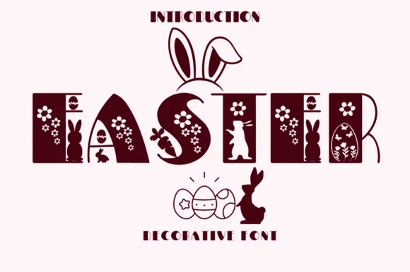
#3 · Editor's ChoiceEaster 2 is a decorative capital alphabet in which each letter is a solid rectangular panel with bunnies, eggs and daisies cut through it, so a word reads as a row of decorated blocks rather than as lettering.
The E carries a chick and a daisy inside its panel, the A cuts a rabbit through its apex, the S holds a basket shape, the T splits a flower between its arms and the R closes a rabbit at its foot, all at a solid display weight with straight panel edges and motifs cut as negative space. The motifs are the character: they are drawn inside the letter rather than around it, which is why the face needs 60 pt before the cut-outs read and why the sample sets one word at large size. It wants a light ground and one ink, and it cuts well in paper because every panel is solid. The mauve caption, the letters above and the decorative icon line are presentation; the motif-filled word is the face.
Easter egg hunt banner, spring card or sublimated tote — Print large (60pt+) in pastel or berry tones on crisp white backgrounds.
Tiny interior flower/dot cutouts suit print, sublimation and Print-Then-Cut rather than vinyl weeding.
 #4 · Top Maker Utility
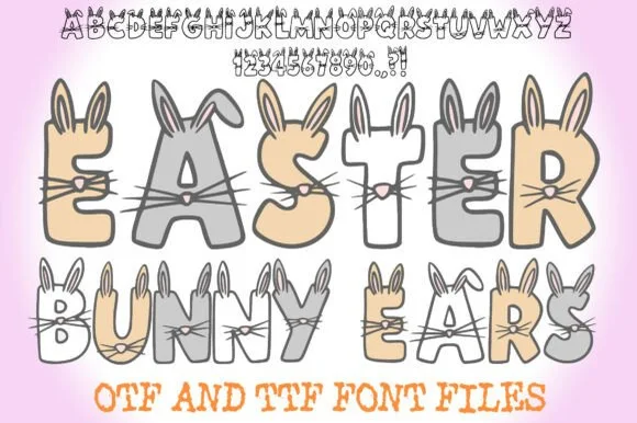
Easter Bunny Ears is a charming hand-drawn cartoon font sprouting tall rabbit ears, twitchy noses, and whiskers off every letter and number (OTF & TTF).
Easter Bunny Ears is a hand-drawn cartoon alphabet in chunky blocks where every letter and numeral sprouts tall inner rabbit ears, whiskers and a twitchy nose, drawn as part of the glyph rather than added as decoration. The blocks are heavy and wide, the faces are simple, and the extra features sit above the cap line, so the layout needs headroom. It needs roughly 30 mm for the ears to read as ears, and it works best in a bright fill with a dark keyline so the features stay separate at a distance.
Easter coloring-sheet printable, cubby tag & Cricut card — Print hollow or pastel-colored headers at 60–115 pt on white cardstock across balanced outer margins.
Thin protruding whisker lines favor Print-Then-Cut stickers, sublimation, coloring sheets, and DTF over blade-cut vinyl.
 #5 · Standout Silhouette
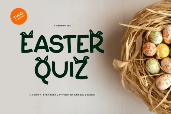
Easter Quiz is a clever, Cricut-friendly spring display font pairing clean solid hand-lettered capitals with cute floppy bunny-ear alternates!
Easter Quiz is a clean solid spring display with bunny ears on two alternates: rounded upright letters, an even weight with a soft corner and two alternate glyphs that carry a pair of drawn ears rising off the cap. The solid form keeps the face legible at small sizes, and the ears are the only illustration and add height. It needs roughly 26 mm for the ear and the rounded corner to read, and it is best in one soft ink on white, or two pastels where the ears take the second colour.
Cricut vinyl Easter bucket name, wood tag & shirt HTV — Turn on bunny-ear alternates on just the first and last letters of a child's name ('EMMA', 'NOAH') for tasteful balance!
100% solid single-layer shapes cut and weed cleanly on Oracal 651, wood tags, and HTV down to 1 inch!
 #6
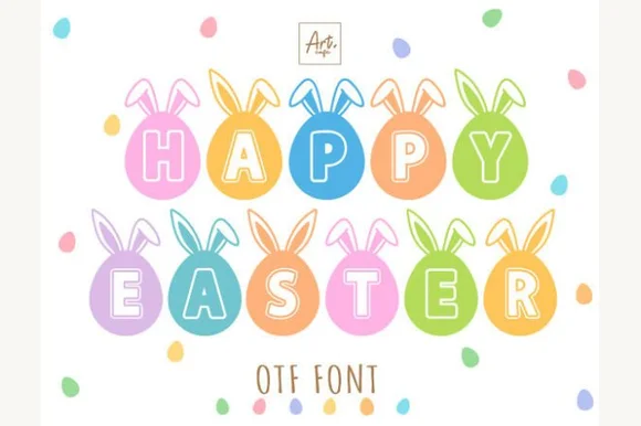
Happy Easter is an adorable novelty alphabet placing solid letters inside bunny-eared Easter-egg medallions (OTF).
Happy Easter is a decorative alphabet in which each letter is drawn inside an egg medallion: a pastel oval with a patterned band, small bunny ears perching on top and a thin contour around the whole shape. The ears extend above the egg, so a word grows taller, and the pattern band is the finest detail. It needs roughly 32 mm for the ears and the pattern band to read, and it is best in three pastel inks on white, or one ink with the pattern left as paper on tinted card.
Kids' Easter-basket name tag, egg-hunt banner & onesie — String 1-letter-per-pennant or stack 'HAPPY / EASTER' at 64–120 pt in 5 pastel shades on white.
Works great for Print-Then-Cut stickers, sublimation Easter bags, DTF tees, and 2 in+ cardstock banner cutouts!
 #7
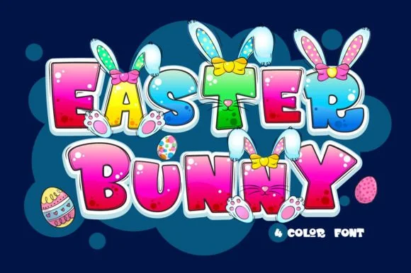
Easter Bunny is a playful 4-color cartoon display font sprouting floppy bunny ears, fuzzy paws, and colorful bows directly from bubbly capitals.
Easter Bunny is a four-colour illustrated cartoon in which the letters grow bunny ears and paws: rounded pastel forms with drawn fur edges, ear shapes that rise off the caps and a small paw that replaces a terminal, built as a layered four-colour file. The illustration is the letter, so the ears add height and the fur edge is the finest element. It needs roughly 36 mm for the fur edge and the ear to read, and it is best as a four-colour process print on white, or a two-colour build where the outline carries the shape and the fill stays flat.
Personalized Easter basket tag, egg-hunt shirt & tote bag — Type the child's first name at 4–7 inches wide over white sublimation blanks or Print-Then-Cut sticker sheets.
Full-color shading and multi-part bunny details are made for sublimation, DTF transfers, and Print-Then-Cut—not single-color cut vinyl.
 #8
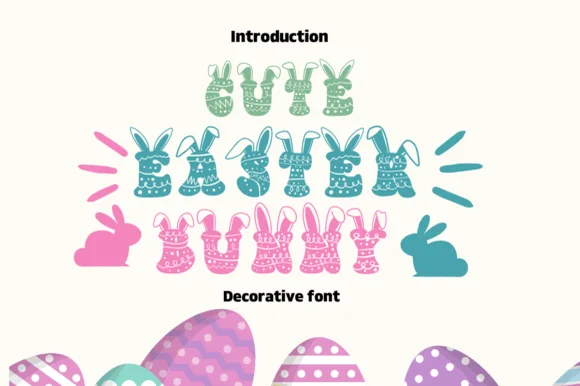
Cute Easter Bunny is a joyful spring novelty font crowning chunky polka-dot, chevron, and floral-patterned letters with cute bunny ears!
Cute Easter Bunny is a spring novelty display in which each chunky capital is filled with egg stripes, chevrons or floral dots and topped with upright rabbit ears, so a word reads as a decorated egg rather than as lettering. The pattern lives inside the stroke and the ears sit above the cap line, which means the layout must reserve headroom and the face needs size for the patterns to read. It needs roughly 30 mm for the interior pattern to hold, and it is best in mint, teal or pastel pink on white or cream.
Easter egg-hunt flyer, printable gift tag & kids' sublimation tee — Stack 2 or 3 short words centered in mint, aqua, pink, and lavender over white.
Dozens of tiny polka-dot and floral cutouts inside every letter mean Print-Then-Cut, sublimation, or DTF ONLY—never weed vinyl!
 #9
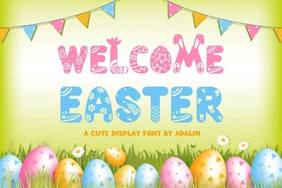
Welcome Easter is a cheerful decorative display font patterning chunky letters with painted Easter-egg swirls, flowers, and popping bunny ears.
Welcome Easter is a decorative spring display whose chunky rounded capitals are filled with painted egg swirls, flowers and zigzags, with bunny ears rising above some letters and bunting-like proportions across a word. The pattern lives inside the stroke, so the face needs size for the swirls to read as painted eggs rather than as mottled fill, and the ears add headroom that the layout has to reserve. It needs roughly 32 mm for the internal pattern to hold, and it is best in pastel multi-colour on cream or soft green.
Church / community egg-hunt banner, postcard & treat tag — Stack 2 uppercase words at 64–120 pt over sunny cream or pale lemon backgrounds framed by bunting.
Intricate interior egg-paint swirls make Print-Then-Cut stickers, vinyl banners, sublimation, and DTF the right workflow (avoid vinyl weeding).
 #10
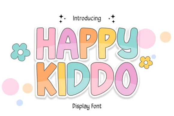
Happy Kiddo is a rounded, bouncy kids' display font featuring plump uppercase letters with crisp cartoon outlines and wide friendly counters.
Happy Kiddo is a soft-outlined pastel nursery and kids bubble display: fat rounded letters with a thick soft outline, a pale fill and a small heart or star tucked into one counter, drawn so the whole word looks like a fabric appliqué. The outline doubles the footprint and the tucked shape closes first when the face is reduced. It needs roughly 30 mm for the tucked shape and the outline to read, and it is best in two pastel inks on white, or one ink plus paper where the outline prints as a soft edge.
Pastel 1st-birthday welcome board, highchair banner & favor — Color individual letters in alternating pastel tones inside Canva or Illustrator and wrap in a 0.12 in white Print-Then-Cut border.
Clean, solid vector contours cut and weed smoothly on HTV, glossy cup vinyl, and cardstock down to 0.75 inches.
 #11
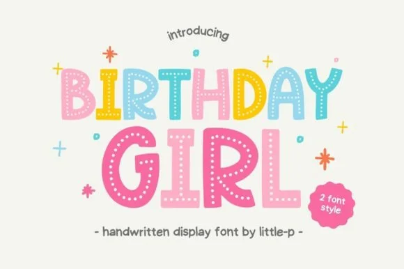
Birthday Girl is a cheerful 2-style kids' display font decorating chunky hand-cut letters with sweet interior polka-dot rows!
Birthday Girl is a two-style kids' display whose chunky hand-cut letters carry neat vertical trails of white polka dots down every stem, so a word reads as a decorated paper cut-out rather than as printed type. The dots are interior and regular, which means the face needs size for them to read as dots, and the hand-cut contour gives every letter its own wobble. It needs roughly 26 mm for the dot rows to hold, and it is best in pastel coral or mint on cream or in one ink on kraft.
Birthday-girl shirt, pastel party invite & cupcake topper — Color each letter in alternating coral, yellow, mint, blue, and pink at 64–120 pt surrounded by tiny confetti stars.
Use Print-Then-Cut, sublimation, or DTF for the dotted style—or switch to the companion solid style for fast Cricut HTV weeding!
 #12
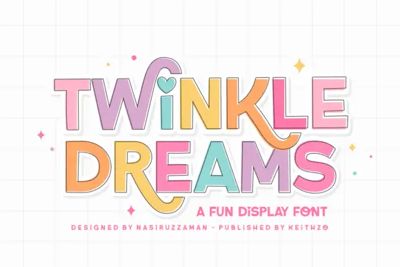
Twinkle Dreams combines firm block capitals with a heart-shaped dot above the i and curling extensions on selected letters, where the R and K tails swing below the main rows, each letter takes a pastel fill with a fine dark edge and the whole block sits on a faint grid.
The bodies stay blocky and even, the edges stay fine, the fills change per letter and two letters drop long tails under the baseline. That heart dot is the character: a plain display face gains one playful substitution, which is why the sample keeps a short title. The grid and the sparkles are cover treatment. Keep 40 pt so the fine edges stay separate from the fills, verify the heart form in your file and check the swinging tails against the line beneath.
A wish-themed party invitation — Keep the phrase large with clear room below any R tail; place details in plain text.
Check the actual letters and do not assume a heart appears in words without i.
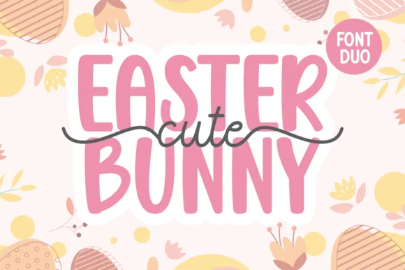 #13
Cute Easter Bunny combines a tall, chunky hand-cut uppercase sans with a sweet monoline cursive accented by long side tails.
Cute Easter Bunny is a playful pair of a tall pastel sans with a tailed monoline script: the sans is a soft narrow block whose counters stay open, while the script finishes every word with a small bunny tail that lifts off the baseline. The pair is built for a soft spring palette, so it loses its charm in a single harsh ink. The tail is the finest element and it closes into a dot once the face is reduced. The sans needs roughly 22 mm and the script 26 mm for their detail to read.
Personalized Easter basket tag & egg-hunt tote — Place two stacked uppercase words in pastel vinyl and overlay the dark tailed script across the seam between rows.
Use Print-Then-Cut with an offset white sticker border for multi-color tags, or layer smooth HTV pressing the chunky sans base first.
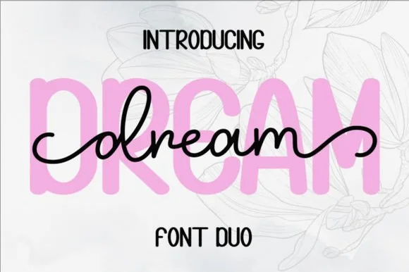 #14
Dream Duo combines a plump, soft-cornered uppercase sans-serif with a fluid monoline script that threads cleanly across wide titles.
Dream Duo pairs a chunky pastel rounded sans with a smooth monoline cursive: the sans is a fat even-width block with fully rounded corners and tight spacing for headlines, while the cursive is a soft even stroke with open loops and a gentle slant. The pair is built for a soft palette, so it loses its character when printed in a single harsh black. The monoline hairline is the finest element and it breaks first. The sans needs roughly 26 mm and the cursive 28 mm for their detail to read.
Nursery wall name sign & sweet-sixteen acrylic backdrop — Scale the background sans to 3.5 inches tall in soft pastel and center the dark monoline script across the middle 60% height.
Weld all cursive joins before cutting vinyl, and use Cricut's Slice or a 0.07 in offset knockout if avoiding two-layer vinyl overlap.
 #15
Hailey is a beauty script in which the strokes stay medium in weight, the ascenders loop high and long swashes enter and leave the word, so a single name reads as a written logo on a soft ground.
The h climbs a tall loop, the a closes a round bowl, the i carries a light dot, the l rises into a second loop, the e turns a light eye and the y drops a wide tail, all at a medium brush weight with generous entry and exit swashes and a gentle slope. The swashes are the character: they sit outside the word and take as much width as the letters, which is why the sample sets one name across a circular panel. Because the downstrokes are medium, the face holds from 26 pt and prints on smooth stock. The blush circle, the botanical sprig, the arched lettering above and the small caps beneath are presentation; the dark script name is the face.
A floral guest-book name cover — Keep the name alone in the centre, with a small plain date well below its lowest loop; put floral art in one distant corner.
Confirm the exact swash variants and leave ample vertical space.
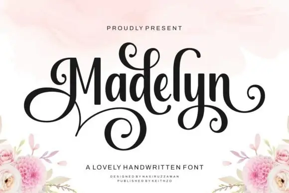 #16
Madelyn uses upright dark stems with a large looping M and curled d, y and terminal strokes, where a broad lower spiral extends beneath the left half of the name and floral corner illustrations sit around it as separate artwork.
The stems stand upright, the contrast swings from thick to hairline, the initial spirals and one descender curls wide. That upright stance is the character: the name reads as a signed inscription rather than a slanted hand, which is why the sample keeps one word centred. The floral corners are separate artwork, so plan 24 mm beneath the spiral, keep 30 pt for the hairlines and check the M loop against the margin. The initial spiral is the stroke that breaks: it is drawn on the hairline, so it snaps in foil and closes into a blob below about 30 pt, which is why one word on a card is the honest use.
A guest-book name cover — Centre the name in the upper half and place the plain guest-book label well below the spiral, leaving flowers at the bottom corners.
Check the exact initial and available curls.
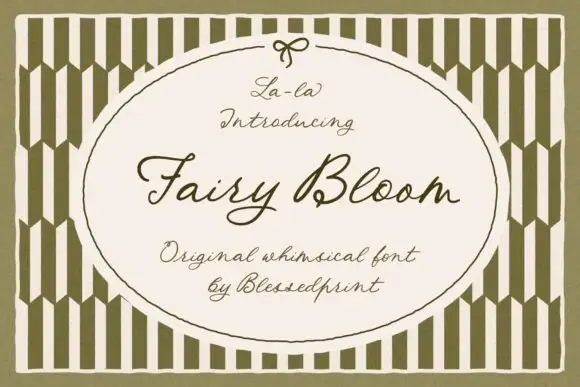 #17
Fairy Bloom is a whimsical formal script in which the capitals open into wide ribbon loops, the stroke stays light and even, and the joins curl into small ornate turns.
The capital F opens with a broad looped stem and a curl above the crossbar, and the capital B that follows closes two looped bowls, which is where the face gets its ornamental character. The lowercase stays light and open: the a and the i close small bowls, the r keeps a short arm, the y drops a fine tail and the l rises into a narrow loop, all at one even weight. Because the stroke is light and the loops are generous, the face reads as invitation calligraphy rather than as a display script, and it holds at 20 pt on a card without cluttering. The olive striped field, the oval panel with its bow and the four small caption lines are presentation; the script is the two words.
A garden-ceremony welcome cover — Keep the script inside a broad empty panel with names/date in plain type below the y tail.
Compare actual uppercase sets and proof fine strokes.
Practical buyer checklist
Key cutting, printing and pairing answers before choosing a Easter baskets & spring crafts typeface.
Only heavily drawn ones above 2 inches. Thin ears and whiskers become loose pieces during weeding. For basket tags and small decals, print the design, and reserve cutting for the plain spring display faces.
At least 4.5:1 for small text and 3:1 for large display. That usually means a mid or dark tone for the lettering rather than white, because pale lettering on a pastel ground disappears in daylight.
The cleaner spring prints and the plain bunny-eared face, with one accent colour. Illustrated cartoon alphabets read as a children's party, which is fine for a family event and wrong for a formal service.
Most include 0 to 9, and many include a simple ampersand. If the design needs a date or a time, set those glyphs first to confirm they match the letters in weight, since illustrated sets often leave numerals plain.
Keep exploring
Explore adjacent maker roundups or check our practical pre-production checklists.
25 curated fonts · Previews & pairings
30 curated fonts · Previews & pairings
24 curated fonts · Previews & pairings
29 curated fonts · Previews & pairings
Guides: Invitation font checklist · Vinyl & cutting checklist · How to pair script & sans fonts
Allow optional Google Analytics to measure visits and catalogue actions. Your search words and notes are not included. Privacy & storage