High-Contrast Display Serif

Mahrine Prestige + Grandeur – Elegant Classic Serif
Pairs sculptural editorial warmth with Mahrine Prestige's clean modern geometry.
Inspect Grandeur – Elegant Classic Serif specimenDisclosure: MakerFileHub may earn a commission from qualifying purchases via paid links on this page. How our links work.
Looping slanted upper lettering above narrow serif capitals
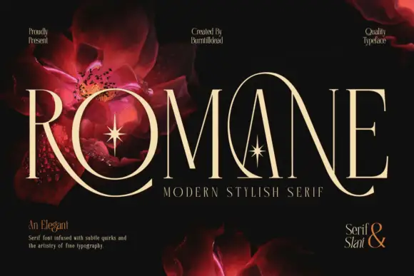
Mahrine Prestige shows a pale slanted upper word with thin connected-looking strokes and large loops, while tall narrow PRESTIGE capitals form a more upright base crossed by a fine sweeping extension, and red flowers with gold flourishes fill the dark background.
Paid link
Get this fontProject & layout blueprintsAt-a-glance maker compatibility
Sturdy stroke walls and open counters weed cleanly on adhesive vinyl, HTV apparel film, and cut cardstock.
Visual anatomy & craft review
The upper line leans, the loops grow large, the lower caps stand upright and a single extension crosses both. That vertical pairing is the character: a light script floats above a narrow serif and one stroke ties them, which is why the sample stacks the two members tightly. The flower and flourish assets are cover decoration, so confirm both member files and their metrics, keep 20 mm between the rows and check that the crossing extension clears the caps. The crossing extension is the failure point: it has to clear the caps below, so 20 mm between the rows keeps it off their tops, and the loop thins out under 30 pt and needs a coated sheet.
Looping slanted upper lettering above narrow serif capitals
Two-font hierarchy recipes
Tested contrast partners — pairing Mahrine Prestige with grounded secondary typography.
Mahrine Prestige + Grandeur – Elegant Classic Serif
Pairs sculptural editorial warmth with Mahrine Prestige's clean modern geometry.
Inspect Grandeur – Elegant Classic Serif specimen
Mahrine Prestige + Stylish
Introduces organic movement on pull-quotes, signatures and gift tags.
Inspect Stylish specimenPractical applications
Concrete hierarchy, scale and production guidance tailored to Mahrine Prestige’s stroke geometry.
The script-over-serif pairing gives a suite elegance, and the two voices fit at 30 pt and 24 pt on heavy card, where the crossing stroke joins the rows.
Hierarchy & layout recipe
Print a 130 by 180 mm invitation: set the script names at 30 pt, set the serif line at 24 pt beneath with 20 mm of clear ground, and keep 18 mm of margin so the extension stays inside the trim.
Pre-production check
The extension crossing a date line looks like a fault; check the layout and keep 14 mm clear below it.
The pair gives a shop a romantic mark, and the narrow serif holds the town at 18 pt under a looped name at 22 pt, where the upright base steadies the lean above.
Hierarchy & layout recipe
Print a 55 by 70 mm label: set the looped name at 22 pt, set the serif line at 12 pt beneath with 12 mm of clear ground, and keep 6 mm of border so no loop is cut.
Pre-production check
Two members may carry different metrics; check each file's baseline before stacking them, and set the pair in one text box per line.
The looping upper line suits a soft card, and the tall caps hold a short dedication at 26 pt on an A6 sheet, where the extension supplies the flourish.
Hierarchy & layout recipe
Print an A6 card: set the looped line at 26 pt across the upper half, set the caps line at 18 pt beneath with 16 mm of clear ground, and leave the lower third blank for handwriting.
Pre-production check
Loops printed over a photograph disappear; check the card and keep the pairing on flat colour.
Technical & licence verification
Confirm included OTF/TTF/WOFF formats, full glyph tables and licence coverage on the live store page before batch production.
Closest visual alternatives
Matched across letterform anatomy, stroke behaviour and craft applications.
Fine serif and loose signature duo
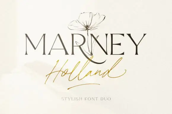
Marney Holland pairs a tall high-contrast serif capital cut with a loose thin script: the R curls its leg below the serif line, the script runs light through its joins and a long low exit stroke closes the written line.
Ideas for this font
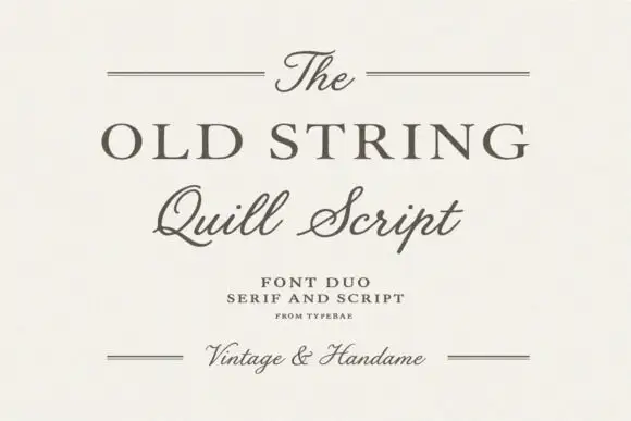
Serif and quill script duo
The Old String is a duo in soft grey-brown on cream: a wide classical serif in caps for the main line, a quill script with fine hairlines and long tails for the second, and small tracked notes between hairline rules, with the script repeated at the foot in a smaller size.
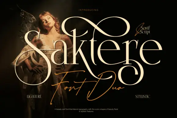
Fine serif lettering with oversized loops above a thin script
Saktere shows pale high-contrast serif forms with huge looping extensions that rise over the middle of the word and fall below the final letters, while a much finer slanted script line crosses the lower part of the composition.
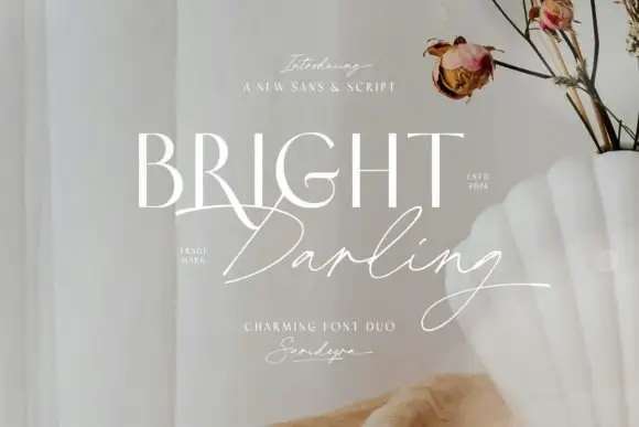
Fine upright capitals paired with a loose slanted signature and long lower stroke
Bright Darling Duo pairs pale upright capitals with a fine slanted signature over a muted floral interior, where the caps keep tall contrasting stems and a curved R leg while the signature runs loose connected strokes with a final loop that descends past the words and overlaps the R.
Ideas for this font
Same independent foundry
Allow optional Google Analytics to measure visits and catalogue actions. Your search words and notes are not included. Privacy & storage