Modern Grotesque Body

Velvet Midnight + Noar
Creates crisp high-hierarchy contrast beneath Velvet Midnight headlines across menus, websites and labels.
Inspect Noar specimenDisclosure: MakerFileHub may earn a commission from qualifying purchases via paid links on this page. How our links work.
Opulent celestial & baroque ornamental display serif
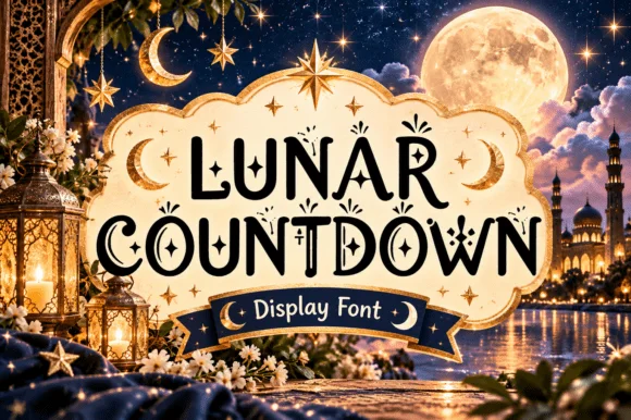
Velvet Midnight is a high-contrast ornamental display serif embellished with curled teardrop hooks, diamond sparkles, and moonlit palace drama.
Paid link
Get this fontProject & layout blueprintsAt-a-glance maker compatibility
Crisp hairline serifs shine on stationery, foil stamping, and packaging; add slight offset for small decals.
Visual anatomy & craft review
Velvet Midnight is an opulent celestial baroque display serif: heavy stems with fine curled serifs, a moon-phase ornament set into the crossbars, small stars scattered along the diagonals and a swash that trails from the first letter. The ornaments sit on the silhouette, so the word grows in both directions, and the stars are the finest element. It needs roughly 36 mm for the moon and the stars to read, and it is best in one gold ink on deep navy or black, or a fine foil above 50 pt where the curls stay sharp.
Nocturnal-luxury · Celestial · Regal
Two-font hierarchy recipes
Tested contrast partners — pairing Velvet Midnight with grounded secondary typography.
Velvet Midnight + Noar
Creates crisp high-hierarchy contrast beneath Velvet Midnight headlines across menus, websites and labels.
Inspect Noar specimen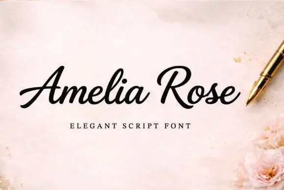
Velvet Midnight + Amelia Rose
Adds a warm human signature touch for 1-to-3-word callouts without competing against structured serif capitals.
Inspect Amelia Rose specimenPractical applications
Concrete hierarchy, scale and production guidance tailored to Velvet Midnight’s stroke geometry.
A celestial baroque serif gives a winter gala the opulence of engraved stationery rather than a printed flyer. The moon ornaments hold at 30 pt on an invitation, and one gold ink on deep navy prints the suite in a single order.
Hierarchy & layout recipe
Invitation 130 x 180 mm, names 30 pt with 10 mm ornament clearance, details 9/13 pt, 15 mm margins. Menu 120 x 210 mm, header 20 pt, courses 9/12 pt. Table card 90 x 50 mm, name 12 pt, 4 mm margins.
Pre-production check
At 12 pt on a table card the moon ornament fills and the name reads as a gold block at the table. Raise table cards to 18 pt or use the plain cut, and proof one card before the set.
A celestial display serif reads as a gilded title page rather than a modern cover, which is what an art issue about night wants. The heavy stems give the title presence at 72 pt on a dark cover, and the star scatter supplies texture in one pass.
Hierarchy & layout recipe
Cover 210 x 297 mm, title 72 pt with 12 mm ornament clearance, cover lines 10/14 pt, 18 mm margins and 10 mm trim. Feature opener 60 pt with 10 mm star clearance. Folio mark 12 mm, 8 mm clear of the trim edge and 20 mm above the foot.
Pre-production check
At 12 mm on the folio mark the stars turn into grit and the mark reads as a smudge. Use a single star on the folio and keep the face for the cover, then proof one cover at 1:1.
A baroque celestial serif reads as an engraved flacon label rather than a modern brand, which is what a small perfumer wants on a carton. The ornaments hold at 26 mm on a label, and one metallic ink on deep stock prints the carton and the label from one file.
Hierarchy & layout recipe
Carton 60 x 160 x 30 mm, word 26 mm with 8 mm ornament clearance, 8 mm margins. Bottle label 70 x 50 mm, word 16 mm, 4 mm margins. Card 85 x 55 mm, word 16 mm, 5 mm margins.
Pre-production check
A 70 x 50 mm bottle label at 16 mm closes the moon ornament and the label reads as a gold bar. Keep the label at 24 mm or use the ornament-free cut, and check one label on the bottle.
Technical & licence verification
Confirm included OTF/TTF/WOFF formats, full glyph tables and licence coverage on the live store page before batch production.
Closest visual alternatives
Matched across letterform anatomy, stroke behaviour and craft applications.

Art-Nouveau ligature & celestial-sparkle editorial serif
Resquel is an expressive high-contrast editorial serif featuring sweeping ribbon under-tails, interlocked ligatures, and star-sparkle counters.
Ideas for this font

Flamboyant coiled-swash couture editorial serif
Alerigue is a high-contrast luxury editorial serif distinguished by dramatic coiled spiral terminals and sweeping calligraphic ascender loops.
Ideas for this font

Crisp neoclassical high-contrast fashion editorial serif
Askino is a clean, restrained high-contrast editorial serif with razor-flat hairlines, tall ascenders, and un-cluttered Parisian magazine elegance.
Ideas for this font

Tall condensed ribbon-swashed glamour display serif
Lumera Editorial is a tall, glamorous display serif braiding sweeping calligraphic loops through condensed high-fashion capitals!
Ideas for this font
Same independent foundry
Allow optional Google Analytics to measure visits and catalogue actions. Your search words and notes are not included. Privacy & storage