Modern Grotesque Body

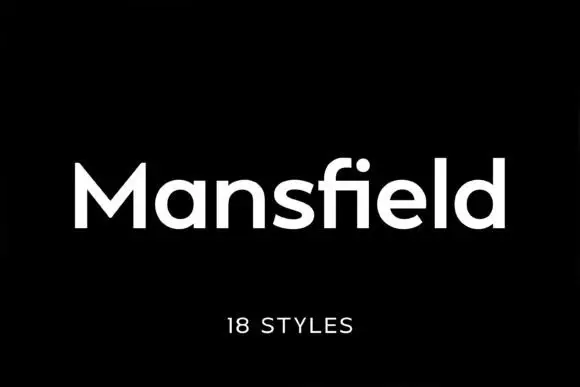
New Year + Mansory
Creates crisp high-hierarchy contrast beneath New Year headlines across menus, websites and labels.
Inspect Mansory specimenDisclosure: MakerFileHub may earn a commission from qualifying purchases via paid links on this page. How our links work.
Classic high-contrast formal holiday & editorial serif
New Year (by Umitype) is a clean, dignified high-contrast modern Roman serif with flared wedge brackets and crisp holiday authority.
Paid link
Get this fontProject & layout blueprintsAt-a-glance maker compatibility
Crisp hairline serifs shine on stationery, foil stamping, and packaging; add slight offset for small decals.
Visual anatomy & craft review
New Year by Umitype is a high-contrast formal Roman serif with flared wedge brackets, strong vertical pillars and crisp small serifs, so a word reads as an engraved invitation or a newspaper masthead rather than a festive display. The hairlines are delicate against the pillars, which means the face needs size and a smooth stock, and the wide caps fill a panel with a short word. It needs roughly 28 mm for the wedge brackets to read, and it is best in snow white on a dark ground or as a fine foil on ivory.
Dignified · Crisp · Classic-holiday
Two-font hierarchy recipes
Tested contrast partners — pairing New Year with grounded secondary typography.
New Year + Mansory
Creates crisp high-hierarchy contrast beneath New Year headlines across menus, websites and labels.
Inspect Mansory specimen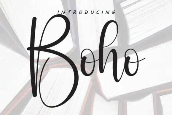
New Year + Boho
Adds a warm human signature touch for 1-to-3-word callouts without competing against structured serif capitals.
Inspect Boho specimenPractical applications
Concrete hierarchy, scale and production guidance tailored to New Year’s stroke geometry.
A dignified Roman serif reads as an engraved card rather than a seasonal graphic, which is what a formal family greeting is. The hairlines hold at 26 pt on smooth card, and the wedge brackets give the message weight without an ornament.
Hierarchy & layout recipe
Card 120 x 170 mm, greeting 26 pt, message 9/13 pt, 14 mm margins and 10 mm trim. Menu 120 x 210 mm, header 16 pt, dishes 9/13 pt. Place card 90 x 50 mm, name 9 pt on an 11 pt leading.
Pre-production check
Heavy cotton stock drinks ink and the hairlines swell until the contrast that makes the face work disappears. Print one proof on the final card, and move to a smooth 300 gsm if the joins thicken.
A formal Roman serif reads as a gala programme, which is what a New Year dinner prints. The wide caps hold at 100 pt on a poster in one ink, and the small serifs stay crisp in a two-colour offset run.
Hierarchy & layout recipe
Poster A2, title 100 pt, details 22/28 pt, 30 mm margins and 20 mm trim. Programme A5, cover 40 pt, running order 8/11 pt. Plan 420 x 297 mm, names 9 pt on a 12 pt leading.
Pre-production check
A 9 pt plan in a high-contrast serif on uncoated card fills and two guests with similar names look identical. Set plan names in a sturdier companion at 10 pt, and proof against the RSVPs twice.
A high-contrast serif reads as a masthead that has existed for decades, which is what an annual edition wants. The wide caps fill the trim at 96 pt, and the flared brackets give the cover its authority without an illustration.
Hierarchy & layout recipe
Cover 210 x 297 mm, title 96 pt, cover lines 10/14 pt, 18 mm margins. Spread 420 x 297 mm, headline 110 mm, body 9.5/14 pt. Masthead 210 x 40 mm, word 40 pt, 10 mm margins.
Pre-production check
A web-offset run drops hairlines under 0.1 mm and the title looks chipped along the brackets. Confirm coated stock and a 0.12 mm floor, and check one printed signature before the full run.
Technical & licence verification
Confirm included OTF/TTF/WOFF formats, full glyph tables and licence coverage on the live store page before batch production.
Closest visual alternatives
Matched across letterform anatomy, stroke behaviour and craft applications.
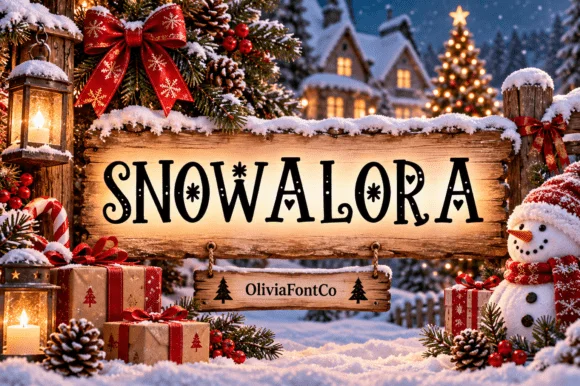
Festive holiday display serif accented with snowflake stars
Snowalora is a classic high-contrast holiday display serif embellished with delicate hanging snowflakes and curled swash terminals.
Ideas for this font
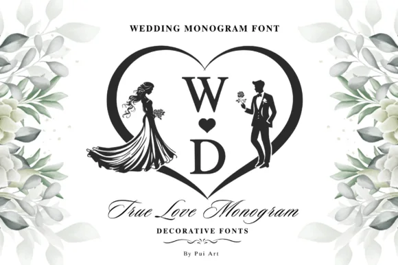
Heart-framed wedding monogram
True Love Monogram is a decorative wedding set in black on white: two serif initials stacked with a heart between them inside a heart-shaped frame, a bride silhouette at the left and a groom at the right, eucalyptus and blossom sprays at the corners, and a script line beneath naming the face.
Ideas for this font

Modern combination serif with italic
Things is a modern serif in blue on white: moderate-high contrast, a wide f with an overhanging arm, a g whose descender loops fully closed, and tall ascenders, presented with a note that the family includes an italic and a paragraph of small text.
Ideas for this font

Luxury editorial serif with script
Medvilea Editorial is a luxury editorial serif in near-black on white: high contrast, long flat serifs and a wide bowl, paired with a swashed script that loops above and below the line, with small tracked notes in all four corners and a centred caption beneath.
Ideas for this font
Same independent foundry
Allow optional Google Analytics to measure visits and catalogue actions. Your search words and notes are not included. Privacy & storage