High-Contrast Display Serif

Royal Fortune + Rosemode
Pairs sculptural editorial warmth with Royal Fortune's clean modern geometry.
Inspect Rosemode specimenDisclosure: MakerFileHub may earn a commission from qualifying purchases via paid links on this page. How our links work.
High-contrast luxury serif & fine copperplate script duo
Royal Fortune is a refined luxury font duo pairing a tall, razor-thin high-contrast editorial serif with a poised copperplate calligraphy script.
Paid link
Get this fontProject & layout blueprintsAt-a-glance maker compatibility
Weld or Unite overlapping script joins into one continuous vector path before sending to the blade.
Visual anatomy & craft review
Royal Fortune is a luxury duo: a tall razor-thin high-contrast editorial serif with fine bracketed feet, paired with a poised copperplate script that slants on a steady axis. The serif's hairlines are the design, so it needs size and a smooth stock, while the script carries the flourish; together they set a brand line and a signature in one voice. The serif needs roughly 30 mm for the hairlines to hold, and the pair is best in ivory on a dark manor ground or a fine foil on matte board.
Aristocratic · Couture · Paired
Two-font hierarchy recipes
Tested contrast partners — pairing Royal Fortune with grounded secondary typography.
Royal Fortune + Rosemode
Pairs sculptural editorial warmth with Royal Fortune's clean modern geometry.
Inspect Rosemode specimen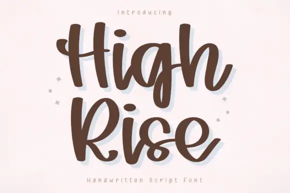
Royal Fortune + High Rise
Introduces organic movement on pull-quotes, signatures and gift tags.
Inspect High Rise specimenPractical applications
Concrete hierarchy, scale and production guidance tailored to Royal Fortune’s stroke geometry.
A thin editorial serif over copperplate is how a formal invitation is set when the couple wants quiet luxury rather than a flourish everywhere. The serif holds the names at 28 pt without shouting, and the script signs the details at 9 pt on the same card.
Hierarchy & layout recipe
Invitation 130 x 180 mm, names 28 pt, script line 12 pt, details 9/13 pt, 15 mm margins and 10 mm trim. Menu 120 x 210 mm, header 16 pt, dishes 9/13 pt. Place card 90 x 50 mm, name 9 pt.
Pre-production check
Textured card breaks a 0.2 mm hairline at 12 pt and the script line looks scratched. Print one proof on the final card, and keep the script at 14 pt or above on textured stock.
Thin high-contrast serif with copperplate reads as a heritage house, which is what a small fragrance brand prints on a carton. The pair covers the name and the legal line without a second typeface, and one ink on coated board keeps the print elegant.
Hierarchy & layout recipe
Carton 55 x 140 x 30 mm, name 20 pt, script 10 pt, weight 5.5 pt, 8 mm margins. Card 85 x 55 mm, name 10 pt, role 5.5 pt. Sign 600 x 200 mm, word 90 mm, 40 mm margins.
Pre-production check
A 5.5 pt weight line in a razor-thin serif fills and reads as a grey rule under the name. Keep fine print in a sturdier companion serif, and check one assembled carton under shop light.
A razor-thin serif with copperplate reads as a fashion title, which is what a luxury supplement prints. The pair lets a cover be a masthead and a signed line, and the hairlines hold at 96 pt on coated stock.
Hierarchy & layout recipe
Cover 210 x 297 mm, title 96 pt, script line 20 pt, cover lines 10/14 pt, 18 mm margins. Opener 420 x 297 mm, headline 110 mm, body 9/13 pt. Insert 148 x 210 mm, word 40 pt, 15 mm margins.
Pre-production check
A web-offset run drops hairlines under 0.1 mm and the masthead looks chipped. Confirm coated stock and a 0.12 mm floor, and check one printed signature before the full run.
Technical & licence verification
Confirm included OTF/TTF/WOFF formats, full glyph tables and licence coverage on the live store page before batch production.
Closest visual alternatives
Matched across letterform anatomy, stroke behaviour and craft applications.
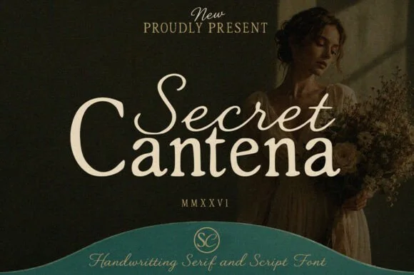
Handwritten serif paired with a script
Secret Cantena is a duo in cream on deep olive: a handwritten serif with a swashy S and a curled t forms the first word, a heavier serif sets the second, and a thin script line beneath carries the description, so the pair covers a title and a subtitle in one family voice.
Ideas for this font
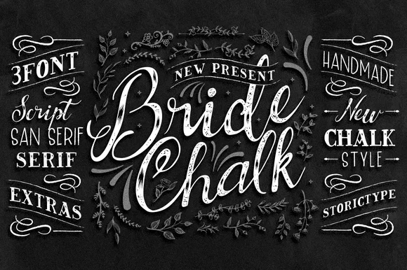
4-part wedding chalkboard family (Script, Sans, Serif & Extras)
BrideChalk is a comprehensive hand-lettered chalkboard system bundling a shaded calligraphy Script, tall Sans Serif, classic Serif, and chalk Extras.
Ideas for this font
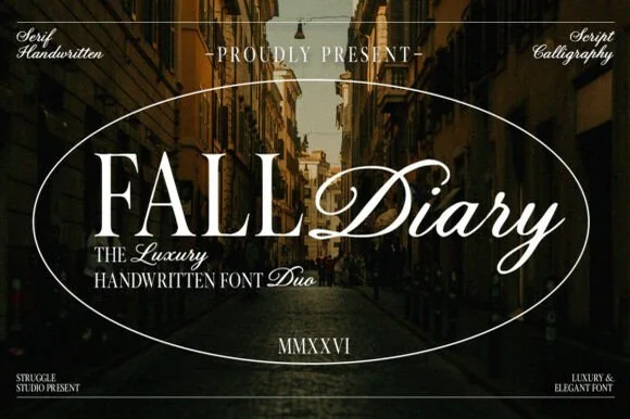
Classical editorial Roman serif + sweeping calligraphy script duo
Fall Diary is an atmospheric editorial font duo pairing tall, crisp hand-crafted Roman serif capitals with a lush slanted calligraphy script.
Ideas for this font
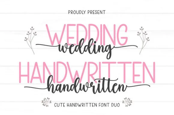
Tall slender sans & tailed calligraphy script duo
Wedding Handwritten pairs a tall, narrow rounded sans-serif with a lively thick-thin calligraphy script sporting symmetrical side tails.
Ideas for this font
Same independent foundry
Allow optional Google Analytics to measure visits and catalogue actions. Your search words and notes are not included. Privacy & storage



