MakerFileHub · Fonts4,091 curated & craft fonts · 93 curated collections · Original previews
MakerFileHubSaved 0

Foundry portfolio · Sans serif · Slab Serif · Display

Pian45 Fonts
(19 typefaces).

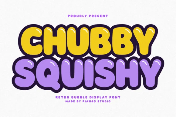
Pian45 builds heavy, tactile letterforms. Chubby Squishy is deliberately soft and inflated, Further leans into a sturdier slab, and the 19 releases favour thick strokes and closed shapes that read clearly from a distance.

Before you buy from this studio

Closed counters and thick strokes make these faces excellent for cutting but poor for long text. Keep them for signage, tags and single-line headlines.

Typefaces by Pian45

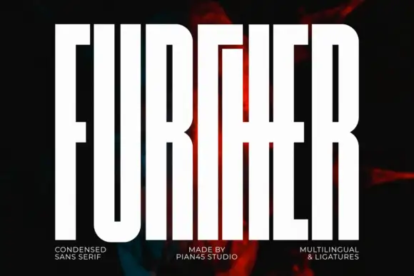
Original Further preview by Pian45

Extremely tall block capitals with narrow slots and a shared middle cross-stroke

Further

Further shows white capitals filling most of a dark portrait cover, where extremely tall heavy stems leave narrow vertical slot counters, the U rounds only at its base and a long middle cross-stroke connects the central letters into a dense architectural arrangement.

Explore
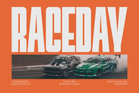
Original Raceday preview by Pian45

Condensed heavy display sans

Raceday

Raceday is a condensed heavy display sans in white on orange: very tall caps with flat terminals, narrow counters, a low crossbar on the A and tight spacing, set across the top of the plate above a motorsport photograph, so the word reads as a race livery rather than a poster headline.

Explore
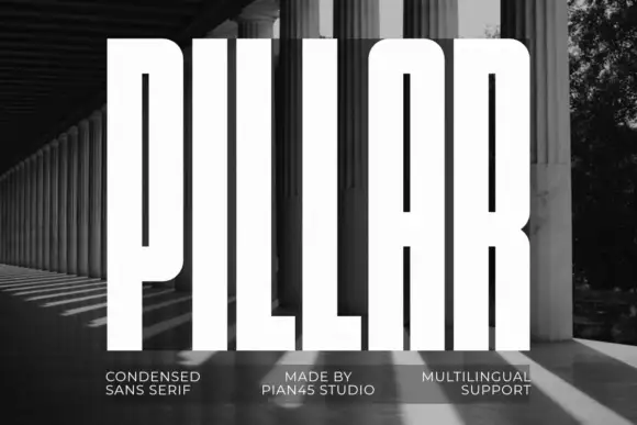
Original Pillar preview by Pian45

Extremely tall heavy capitals

Pillar

Pillar is an extremely tall heavy sans in white over a black-and-white photograph of a colonnade: capitals with narrow vertical slots, flat tops, a rounded arch-top A and an even thick stroke, set as one word filling the frame with three small tracked notes along the foot.

Explore
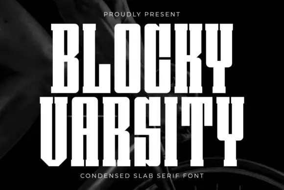
Original Blocky Varsity preview by Pian45

Extremely condensed straight slabs with narrow vertical counters

Blocky Varsity

Blocky Varsity stacks tall white capitals on a dark fabric-like background. The stems are long and close, the O counter is a narrow vertical slot, the Y descends as an unusually long upright stem, small square feet sit at the baseline and tight row spacing emphasises height over width.

Explore

Help improve the font catalogue?

Allow optional Google Analytics to measure visits and catalogue actions. Your search words and notes are not included. Privacy & storage

Original preview

Clear review data?