Neutral Sans Workhorse

Further + Bielchon
Lets Further own the focal silhouette while handling secondary copy, sizing and subheads cleanly.
Inspect Bielchon specimenDisclosure: MakerFileHub may earn a commission from qualifying purchases via paid links on this page. How our links work.
Extremely tall block capitals with narrow slots and a shared middle cross-stroke
Further shows white capitals filling most of a dark portrait cover, where extremely tall heavy stems leave narrow vertical slot counters, the U rounds only at its base and a long middle cross-stroke connects the central letters into a dense architectural arrangement.
Paid link
Get this fontProject & layout blueprintsAt-a-glance maker compatibility
Sturdy stroke walls and open counters weed cleanly on adhesive vinyl, HTV apparel film, and cut cardstock.
Visual anatomy & craft review
The stems stretch to the full height, the counters narrow to slots, the base rounds late and one cross-stroke runs through several letters. That shared stroke is the character: the row reads as a structure rather than a set of separate letters, which is why the sample fills a whole cover with one word. Ligature and language claims are not illustrated, so check the characters you need, keep 44 pt before the slots close and give the row its full height.
Extremely tall block capitals with narrow slots and a shared middle cross-stroke
Two-font hierarchy recipes
Tested contrast partners — pairing Further with grounded secondary typography.
Further + Bielchon
Lets Further own the focal silhouette while handling secondary copy, sizing and subheads cleanly.
Inspect Bielchon specimen
Further + The Simple Editorial
Grounds bold display lettering with classic typographic authority on posters, badges and apparel.
Inspect The Simple Editorial specimenPractical applications
Concrete hierarchy, scale and production guidance tailored to Further’s stroke geometry.
The tall blocks fill a cover, and the slot counters hold a one-word title at 90 pt on a coated cover, where the shared cross-stroke reads as structure.
Hierarchy & layout recipe
Print an A4 cover: set the title at 90 pt on one row, keep 26 mm of clear ground beneath before the year at 10 pt, and keep the photograph masked so the slots stay visible over flat areas.
Pre-production check
Slots printed under 2 mm fill in at 60 pt; check the cover proof and keep the title at 76 pt or above.
The architectural caps suit a facade sign, and the tall stems hold a short name at 70 mm on a printed panel, where the cross-stroke ties the row together.
Hierarchy & layout recipe
Print a 700 by 350 mm panel: set the school name at 70 mm on one row, keep 26 mm of clear ground beneath before the course line at 15 pt, and keep 28 mm of border so the tall stems are not cut.
Pre-production check
A panel with a busy background breaks the slots; check the mounted sign and keep the ground plain.
The extreme height sets a poster headline, and the dense row holds a two-word title at 60 pt on an A2 sheet, where the narrow slots stay readable across a room.
Hierarchy & layout recipe
Print an A2 poster: set the title at 60 pt over two rows with 26 mm between baselines, keep 26 mm of clear ground beneath before the times at 15 pt, and keep 26 mm of margin all round.
Pre-production check
Two tall rows on one poster merge into a single mass; check the layout, open the gap to 30 mm and view it from four metres before printing.
Technical & licence verification
Confirm included OTF/TTF/WOFF formats, full glyph tables and licence coverage on the live store page before batch production.
Closest visual alternatives
Matched across letterform anatomy, stroke behaviour and craft applications.
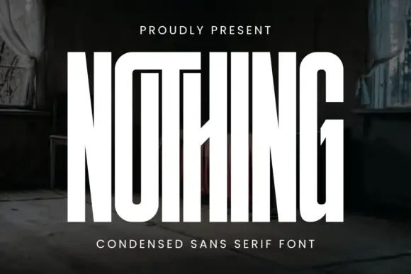
Very tall condensed display
Nothing is an extremely tall condensed display in white on a dark, peeling interior: narrow capitals whose tops join a shared bar, with a central diagonal joint across the middle of the word, flat terminals and hairline counters, and tracked caps above and beneath that name the style.
Ideas for this font
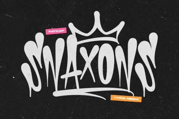
Graffiti tag logo display
Snaxons is a graffiti tag in white on black: letters written as one continuous dripping line, a crown drawn above the word, and a heavy baseline shadow that turns the tag into a logo rather than a scrawl.
Ideas for this font
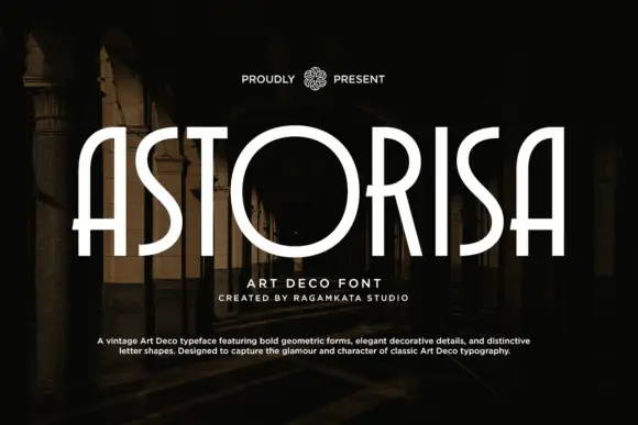
Deco-like capitals combining very narrow uprights with an oversized circular O
Astorisa draws its capitals tall and narrow in the art deco manner, lifts the crossbars high, squares the curves into octagonal facets and closes the counters with a thin inner line.
Ideas for this font
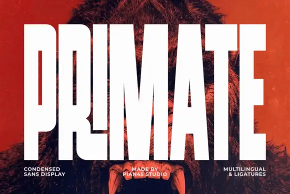
Ultra condensed display sans
Primate is an ultra condensed sans display in white on a red-tinted portrait: very tall narrow caps with flat terminals, a high waist and thin counters, set edge to edge so the letters nearly touch, with three small tracked labels along the foot.
Ideas for this font
Same independent foundry
Allow optional Google Analytics to measure visits and catalogue actions. Your search words and notes are not included. Privacy & storage