Neutral Sans Workhorse

Magical Holiday + Cultivo
Lets Magical Holiday own the focal silhouette while handling secondary copy, sizing and subheads cleanly.
Inspect Cultivo specimenDisclosure: MakerFileHub may earn a commission from qualifying purchases via paid links on this page. How our links work.
Retro bubble display with drips
Magical Holiday is a retro bubble display in red on cream: fat rounded letters with a heavy black outline, drips hanging from every baseline, and star-shaped highlights sitting on the letterforms, so the pair reads as a painted fairground sign.
Paid link
Get this fontProject & layout blueprintsAt-a-glance maker compatibility
Sturdy stroke walls and open counters weed cleanly on adhesive vinyl, HTV apparel film, and cut cardstock.
Visual anatomy & craft review
Both words are set at the same width and stacked, and the drawing is deliberately soft: the stems swell, the terminals are round, and each letter carries a drip at the bottom, which pulls the eye downward and gives the block a melted look. The black outline is heavy and even, and it wraps the drips as well, so the letters read as stickers rather than as printed type; the highlights are drawn as four-point stars rather than gloss slivers, which keeps the style period rather than glossy. Spacing is tight, so the drips almost touch the letter below, and the counters stay wide enough to keep the words legible. The ground is a plain cream, and the two caption lines are set in a spaced sans with a title case that matches the retro register.
Retro, bubbly, drippy, festive
Two-font hierarchy recipes
Tested contrast partners — pairing Magical Holiday with grounded secondary typography.
Magical Holiday + Cultivo
Lets Magical Holiday own the focal silhouette while handling secondary copy, sizing and subheads cleanly.
Inspect Cultivo specimen
Magical Holiday + Worldstar
Grounds bold display lettering with classic typographic authority on posters, badges and apparel.
Inspect Worldstar specimenPractical applications
Concrete hierarchy, scale and production guidance tailored to Magical Holiday’s stroke geometry.
A drippy bubble face reads as a painted seasonal sign, and the heavy outline keeps the lettering legible on a dark poster where a bare red would vanish.
Hierarchy & layout recipe
A2 portrait: the two words at 110 mm cap height, the details in a 16 mm sans, and a 5 mm outline. Keep 25 mm of clear ground beneath the drips so they read as part of the lettering rather than as a printing fault.
Pre-production check
Check the drips at full size, where a drip under 2 mm can look like a speck; keep them generous. Confirm the 16 mm details read at three metres and that the outline stays even where two letters are close.
A bubble face with drips sets a playful retro tone without a photograph, and the outlined construction keeps the lettering crisp on a home-printed card.
Hierarchy & layout recipe
A6 card: the phrase at 34 pt with a 1.5 mm outline, the details in a 9 pt sans, and two star highlights at the corners. Keep the card to two colours plus the outline so the drips read clearly at that size.
Pre-production check
Check the 34 pt phrase on a home printer, where a 1.5 mm outline can thicken and close the drips; keep the drips at least 2 mm. Confirm the 9 pt details keep a 4.5:1 contrast and that the stars do not sit on the letterforms.
A drippy retro label makes a limited-edition bottle feel festive, and the two-colour print keeps the outline affordable on a short run.
Hierarchy & layout recipe
Print a 60 mm round label: the brand at 15 pt with a 0.8 mm outline, the flavour in a 7 pt sans, and the volume in 6 pt. Keep 4 mm of clear label inside the die so the drips are never cut, and print two flat inks.
Pre-production check
Check the 15 pt brand on the label, where the outline can merge with the fill at print size; widen the outline slightly. Confirm the 6 pt volume reads on the curved glass and that the drips stay inside the die.
Technical & licence verification
Confirm included OTF/TTF/WOFF formats, full glyph tables and licence coverage on the live store page before batch production.
Closest visual alternatives
Matched across letterform anatomy, stroke behaviour and craft applications.
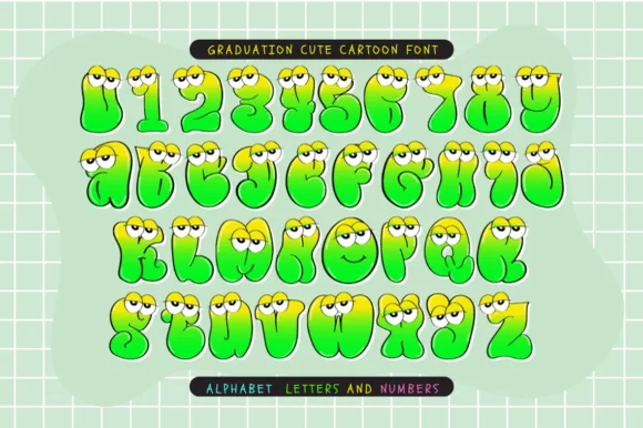
Full-color googly-eyed lime monster bubble alphabet (OTF & TTF)
Graduation Cute Cartoon is a full-color goofy monster-blob cartoon font (not a slab serif) topping bubbly lime-yellow letters and numbers with googly eyes.
Ideas for this font
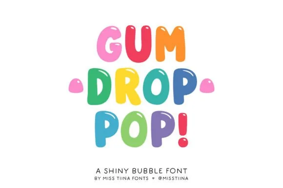
Glossy jellybean & candy-drop upright bubble display
Gum Drop Pop is a tall, bouncy candy-drop bubble font accented with tiny white shine highlights on every colorful character.
Ideas for this font
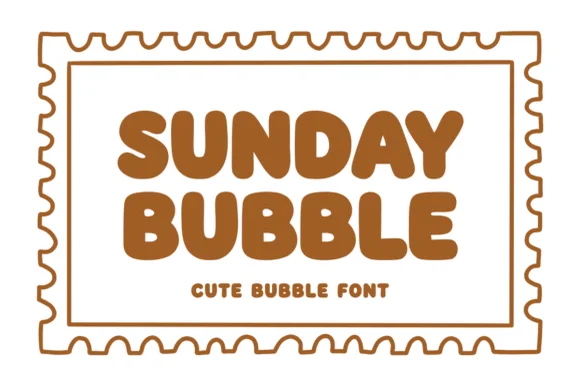
Warm chubby zero-counter-clutter retro bubble sans
Sunday Bubble is a warm, ultra-plump rounded bubble display font with soft cozy strokes and super-fast Cricut weeding.
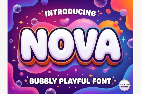
Inflated bubbly display with layered depth
Nova is an inflated display in glossy white on a psychedelic gradient: rounded, blown-up letters with a thick outline and two offset layers behind them in orange and violet, so the word looks like a balloon sign lit from above.
Ideas for this font
Same independent foundry
Allow optional Google Analytics to measure visits and catalogue actions. Your search words and notes are not included. Privacy & storage