Neutral Sans Workhorse

Chubby Squishy + Hermano
Lets Chubby Squishy own the focal silhouette while handling secondary copy, sizing and subheads cleanly.
Inspect Hermano specimenDisclosure: MakerFileHub may earn a commission from qualifying purchases via paid links on this page. How our links work.
Retro bubble display with glossy highlights and a thick dark outline
Chubby Squishy is a retro bubble display alphabet in which the strokes swell into round cushions, the counters shrink to dots and a thick outline wraps every letter, so a word reads as a rubber sticker.
Paid link
Get this fontProject & layout blueprintsAt-a-glance maker compatibility
Sturdy stroke walls and open counters weed cleanly on adhesive vinyl, HTV apparel film, and cut cardstock.
Visual anatomy & craft review
The C closes almost to a ball, the H sets two round stems with a short bar, the U fills its bowl, the B stacks two cushions, the Y splays two round arms and the S holds a fat spine, all at a maximal weight with fully round ends, a drawn highlight and one heavy contour. The combination of cushion shapes and highlight is the character: it turns a two-word title into an object rather than a line of type. Because the contour is drawn, the face holds at 24 pt in one colour, but the highlight is lost under 40 pt. The white ground, the purple and yellow fills, the small caps above and the studio credit are presentation; the two bubble words are the face.
Bubble · Glossy · Retro
Two-font hierarchy recipes
Tested contrast partners — pairing Chubby Squishy with grounded secondary typography.
Chubby Squishy + Hermano
Lets Chubby Squishy own the focal silhouette while handling secondary copy, sizing and subheads cleanly.
Inspect Hermano specimen
Chubby Squishy + Askinо
Grounds bold display lettering with classic typographic authority on posters, badges and apparel.
Inspect Askinо specimenPractical applications
Concrete hierarchy, scale and production guidance tailored to Chubby Squishy’s stroke geometry.
The bubble letters read across a room, and the drawn contour lets a home printer cut the word out without a die at 60 mm.
Hierarchy & layout recipe
Print an A3 banner: set the word at 60 mm, keep the contour at 3 mm, and cut around the outer line so the letters stay joined at the contour rather than falling apart.
Pre-production check
Cutting between the contour and the letter separates the word; check the banner and keep the contour as one connected shape.
The glossy bubble shape reads as confectionery, and the heavy contour keeps a sweet shop name solid at 35 mm on a window.
Hierarchy & layout recipe
Print a 60 mm round sticker: set the shop name at 35 mm, keep 6 mm of white between the word and the die, and print the highlight in the paper colour rather than a second ink.
Pre-production check
A highlight printed as a second white ink cracks when the sticker bends; check a sample and keep the highlight as a knockout.
The round letters suit a summer pool kiosk, and the drawn contour keeps the word readable at 100 mm of board in flat sunlight.
Hierarchy & layout recipe
Print a 500 by 300 mm board: set the word at 100 mm, keep 25 mm of border, and print in two flat inks with no gradient so the letters stay crisp in direct light.
Pre-production check
A gradient fill on a bubble letter looks like a printing fault at distance; check the board and keep both inks flat.
Technical & licence verification
Confirm included OTF/TTF/WOFF formats, full glyph tables and licence coverage on the live store page before batch production.
Closest visual alternatives
Matched across letterform anatomy, stroke behaviour and craft applications.
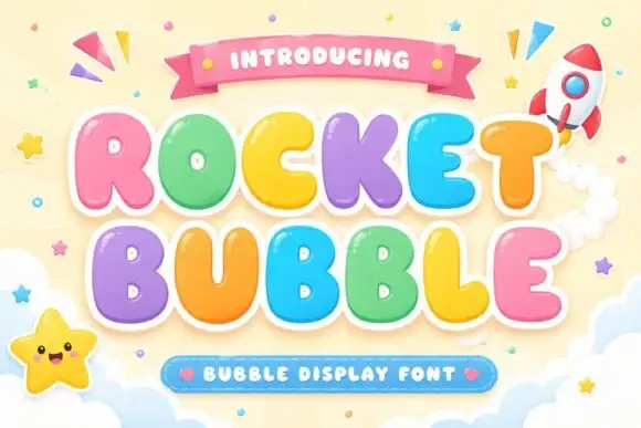
Fat bubble display with contour
Rocket Bubble is a fat bubble display in pastel rainbow with a heavy white contour: very round letters with fat strokes and pinched counters, a bounce across the line, a ribbon above and a badge beneath, with a rocket and a smiling star in the corners of a soft sky.
Ideas for this font
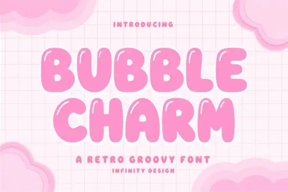
Inflated bubble capitals with soft irregular contours and no straight edges
Bubble Charm is an inflated capital alphabet in which every letter swells outward, the contours wobble slightly and no stroke runs straight, so a word reads as a set of soft shapes rather than as typography.
Ideas for this font
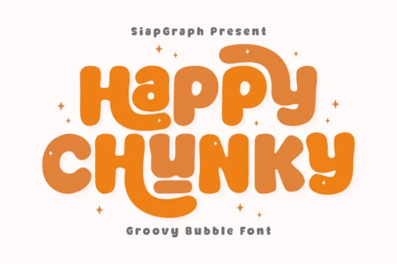
Extra-plump groovy bubble letters with tucked curl terminals
Happy Chunky is an extra-plump bubble display in which the stems balloon, the counters shrink to small openings, the terminals tuck into curls and the letters almost touch, so a short phrase reads as one sticker-ready block.
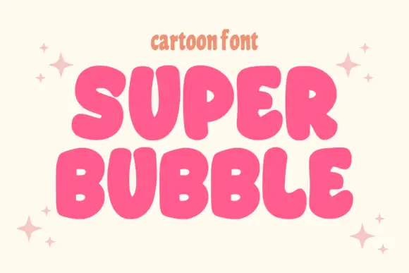
Heavy rounded cartoon capitals with small counters and uneven widths
Super Bubble is a heavy rounded cartoon display in which the capitals inflate, the counters shrink to small openings and the widths vary, so two stacked words read as gently over-full balloons.
Ideas for this font
Same independent foundry
Allow optional Google Analytics to measure visits and catalogue actions. Your search words and notes are not included. Privacy & storage