High-Contrast Display Serif

Raceday + Resquel
Pairs sculptural editorial warmth with Raceday's clean modern geometry.
Inspect Resquel specimenDisclosure: MakerFileHub may earn a commission from qualifying purchases via paid links on this page. How our links work.
Condensed heavy display sans
Raceday is a condensed heavy display sans in white on orange: very tall caps with flat terminals, narrow counters, a low crossbar on the A and tight spacing, set across the top of the plate above a motorsport photograph, so the word reads as a race livery rather than a poster headline.
Paid link
Get this fontProject & layout blueprintsAt-a-glance maker compatibility
Sturdy stroke walls and open counters weed cleanly on adhesive vinyl, HTV apparel film, and cut cardstock.
Visual anatomy & craft review
The word is set edge to edge and the drawing is a grotesque compressed and thickened at once: the stems are wide, the counters are narrow slits, and the shoulders are squared, which keeps the letters distinct even at extreme proportions. The flat terminals and the low crossbar give it a technical, decal-like feel, and the tight spacing lets a long word fill the width without a second line. Because the weight and the compression both push hard, the face works only at display sizes, and the specimen respects that by setting one word large with three small tracked captions at the corners. Below the word, a photograph of two racing cars on a track runs to the edges, and the orange ground is the only other colour.
Condensed, heavy, sporty, modern
Two-font hierarchy recipes
Tested contrast partners — pairing Raceday with grounded secondary typography.
Raceday + Resquel
Pairs sculptural editorial warmth with Raceday's clean modern geometry.
Inspect Resquel specimen
Raceday + Aureline
Introduces organic movement on pull-quotes, signatures and gift tags.
Inspect Aureline specimenPractical applications
Concrete hierarchy, scale and production guidance tailored to Raceday’s stroke geometry.
A condensed heavy sans gives a motorsport cover the look of a livery decal, and the narrow width fits a long event name across the top while a photograph fills the lower half.
Hierarchy & layout recipe
Set the title at 110 mm cap height across 230 mm, the subtitle in a 10 pt grotesque, and the year at 9 pt. Keep the title on a flat band and let the photograph run full bleed beneath it.
Pre-production check
Check the title at 110 mm, where narrow counters can close on uncoated stock; proof the cover. Confirm the 10 pt subtitle reads at newsstand distance and that the title holds at thumbnail size online.
A condensed heavy mark reads at speed on a moving vehicle, and the flat-sided letters survive being cut in vinyl and applied to a curved panel.
Hierarchy & layout recipe
Cut a 600 mm door panel: the team name at 140 mm cap height, a 12 mm minimum stroke, and 20 mm clear between letters. Keep the vinyl to two colours and test one panel on a curved surface before the full set.
Pre-production check
Check the panel at 140 mm on a curve, where the outer letters distort; reduce the width or split the name. Confirm the mark reads at fifty metres and that the vinyl edges stay down after a wash.
A condensed sans gives a track day poster the language of a race entry, and the heavy weight reads from a pit lane where a light display would disappear.
Hierarchy & layout recipe
A2 portrait: the event at 140 mm cap height, the timetable in an 12 mm mono, and the date at 30 mm. Keep 25 mm margins, print two colours, and align the timetable to a strict column at the left.
Pre-production check
Check the poster at six metres, where the narrow counters can merge; open the tracking. Confirm the 12 mm timetable reads at two metres and that the date sits on the same baseline as the column.
Technical & licence verification
Confirm included OTF/TTF/WOFF formats, full glyph tables and licence coverage on the live store page before batch production.
Closest visual alternatives
Matched across letterform anatomy, stroke behaviour and craft applications.
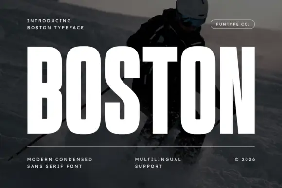
Tall heavy condensed capitals with narrow O bowls and a long N diagonal
Boston shows white uppercase lettering over a dark skiing photograph, where tall thick strokes surround narrow rounded rectangular B and O counters, the S uses broad compact curves, the N leaves a thin diagonal inner channel and the T has a broad flat top that makes the central title dense and upright.
Ideas for this font
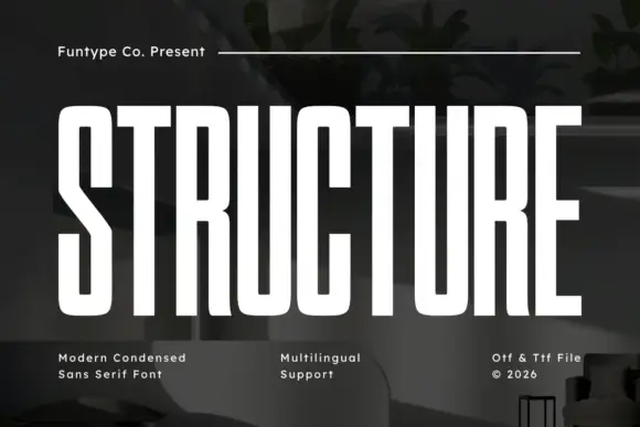
Tall condensed structural sans
Structure is a tall condensed sans in white over a dark interior: narrow capitals with rounded-square bowls, long horizontals, a long diagonal middle on the S and an even stroke, set as one large word with a plain credit above and three notes at the foot.
Ideas for this font
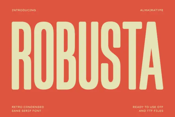
Tall condensed retro sans
Robusta is a tall condensed sans in cream on terracotta: very tall caps with softly squared curves, an even heavy stroke and a triangular counter in the A, set as one word across the plate with tracked notes in all four corners.
Ideas for this font
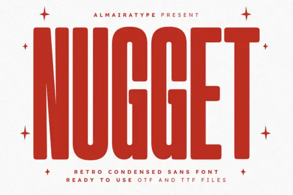
Very tall heavy capitals with rounded corners and narrow internal channels
Nugget shows red capitals filling most of a white cover, where thick near-even strokes leave thin vertical openings in the U and G, the N draws a sharply narrowing diagonal and every outer corner softens.
Ideas for this font
Same independent foundry
Allow optional Google Analytics to measure visits and catalogue actions. Your search words and notes are not included. Privacy & storage