High-Contrast Display Serif

Urbanic + Amor Hadena
Pairs sculptural editorial warmth with Urbanic's clean modern geometry.
Inspect Amor Hadena specimenDisclosure: MakerFileHub may earn a commission from qualifying purchases via paid links on this page. How our links work.
Condensed sans display
Urbanic is a condensed sans display in white on a dark industrial interior: very tall narrow capitals, visually even stroke weight, flat horizontal terminals and tight spacing, so a long word fills the width without a single flourish.
Paid link
Get this fontProject & layout blueprintsAt-a-glance maker compatibility
Sturdy stroke walls and open counters weed cleanly on adhesive vinyl, HTV apparel film, and cut cardstock.
Visual anatomy & craft review
The word runs the full width of the frame and the drawing is a condensed grotesque pushed to a display weight: the stems are thick relative to the width, the O is a narrow rectangle with rounded ends, and the A has a flat apex, so the letterforms read as a row of bars rather than as an alphabet with rhythm. Tracking is pulled back until the letters nearly touch, which is what gives the line its density, and the strokes stay even in weight so the word holds at a distance. Because the counters are narrow, the face works best above about 30 pt and is unsuited to long text, which the sample acknowledges by setting it once at hero scale. The ground is a dark industrial hall with a bright window behind, and three small tracked captions along the top name the style, the studio and the language support.
Condensed, modern, industrial, bold
Two-font hierarchy recipes
Tested contrast partners — pairing Urbanic with grounded secondary typography.
Urbanic + Amor Hadena
Pairs sculptural editorial warmth with Urbanic's clean modern geometry.
Inspect Amor Hadena specimen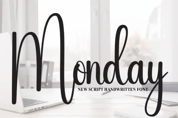
Urbanic + Monday
Introduces organic movement on pull-quotes, signatures and gift tags.
Inspect Monday specimenPractical applications
Concrete hierarchy, scale and production guidance tailored to Urbanic’s stroke geometry.
A condensed display gives a streetwear mark the vertical presence of a printed tag, and the tight tracking makes a short word read as a solid block on a garment.
Hierarchy & layout recipe
Set the mark at 36 pt with tracking at minus 20 units for print, and build a 20 pt version with tracking at zero for woven labels. Keep the mark one colour and always place it so the tall letters have 10 mm of clear space above.
Pre-production check
Check the 20 pt woven label, where the narrow counters close first; use the open tracking for that size. Confirm the mark holds on a dark garment in white and that the tight version does not fuse the letters at 36 pt.
A condensed sans gives an annual a cover that reads as infrastructure, and the tight tracking lets a long title fill a portrait cover without reducing the cap height.
Hierarchy & layout recipe
Set the title at 130 pt with 10 mm bleeds on both sides, the year in a 12 pt grotesque at the foot, and a 0.5 pt rule at the head. Keep the whole cover to two inks so the dense letterforms stay crisp.
Pre-production check
Check the bleeds at trim: a condensed line loses letters quickly, so keep at least 75 percent of the first and last letter. Confirm the 12 pt year reads at newsstand distance and that the rule does not crowd the tight lettering.
A condensed face reads at a distance and signals a design-led institution, and the dense line gives a long school name enough presence on a banner.
Hierarchy & layout recipe
Print 1,200 by 600 mm: the school name at 220 mm cap height, the date in a 40 mm grotesque, and the address at 25 mm. Keep 50 mm of clear space around the display and print white on a dark ground for maximum contrast.
Pre-production check
Check the banner at ten metres, where the tight tracking can fuse letters; open the tracking by 20 units for the large format. Confirm the 25 mm address reads from five metres and that the display clears the banner's eyelets.
Technical & licence verification
Confirm included OTF/TTF/WOFF formats, full glyph tables and licence coverage on the live store page before batch production.
Closest visual alternatives
Matched across letterform anatomy, stroke behaviour and craft applications.

Ultra-narrow 6:1 skyscraper condensed editorial sans (OTF & TTF)
Homies is an extreme 6:1 ultra-condensed sans serif packing razor-slim, towering vertical bars for high-fashion streetwear & album art (OTF & TTF).
Ideas for this font
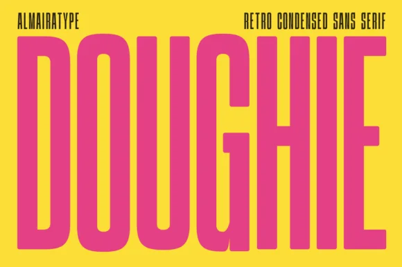
Ultra-tall 5:1 pillar-condensed retro poster sans
Doughie is an ultra-tall, compressed retro condensed sans stretching rounded-corner vertical pillars edge-to-edge across posters and packaging!
Ideas for this font
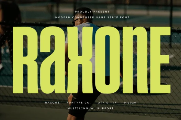
Heavy notched-joint athletic court condensed sans (OTF, TTF & Multilingual)
Raxone is a heavy, muscular condensed sans featuring subtle architectural waist notches on 'R', 'a', 'x', and 'n' for modern sports & streetwear (OTF/TTF).
Ideas for this font
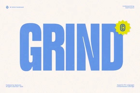
Heavy condensed inktrap display sans
Gc Grind is a bold condensed sans-serif engineered with subtle corner inktraps and flat industrial curves across 170+ languages.
Ideas for this font
Same independent foundry
Allow optional Google Analytics to measure visits and catalogue actions. Your search words and notes are not included. Privacy & storage