Modern Grotesque Body

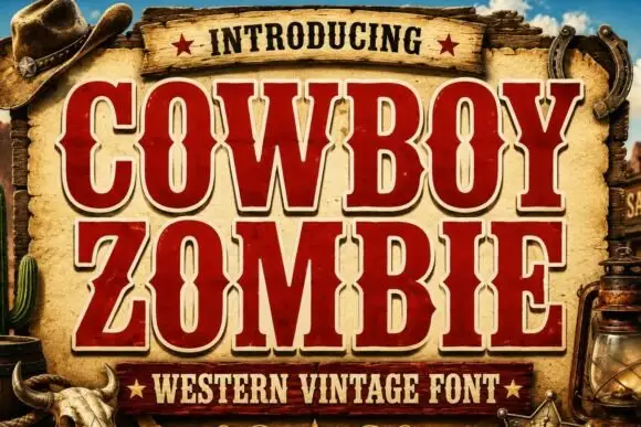
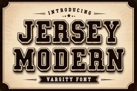
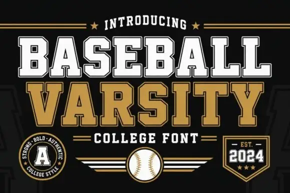
Pixel Typewriter + Corven
Creates crisp high-hierarchy contrast beneath Pixel Typewriter headlines across menus, websites and labels.
Inspect Corven specimenDisclosure: MakerFileHub may earn a commission from qualifying purchases via paid links on this page. How our links work.
Classic ink-stamped vintage mechanical typewriter slab serif
Pixel Typewriter is actually a classic vintage mechanical typewriter slab serif (not a blocky 8-bit pixel font) with warm ink-ribbon edges!
Paid link
Get this fontProject & layout blueprintsAt-a-glance maker compatibility
Fine grain and micro-texture excel in 300 DPI print, sublimation, and screen print rather than small vinyl weeding.
Visual anatomy & craft review
Pixel Typewriter is a vintage mechanical typewriter slab in caps, with wide square serifs, blunted ink edges and slightly uneven inking along each stroke, so a word reads as struck through a ribbon rather than set digitally. The uneven edge is the character, which means the face looks right at text sizes and weak when enlarged past a headline. It needs roughly 14 pt for the ink edge to read as ribbon, and it is best in charcoal on off-white index stock or in one ink on a coloured card.
Mechanical-key · Ink-ribbon · Archival
Two-font hierarchy recipes
Tested contrast partners — pairing Pixel Typewriter with grounded secondary typography.
Pixel Typewriter + Corven
Creates crisp high-hierarchy contrast beneath Pixel Typewriter headlines across menus, websites and labels.
Inspect Corven specimen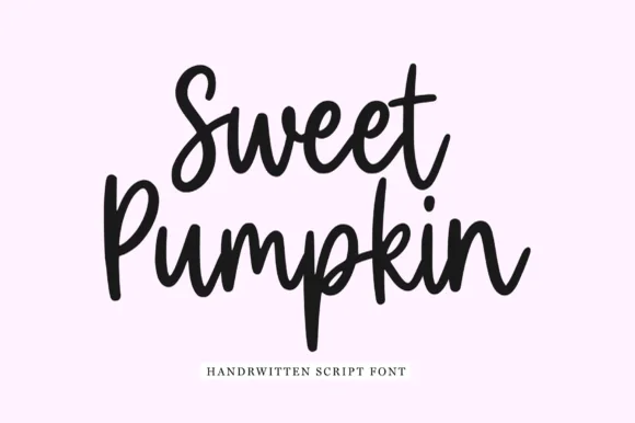
Pixel Typewriter + Sweet Pumpkin
Adds a warm human signature touch for 1-to-3-word callouts without competing against structured serif capitals.
Inspect Sweet Pumpkin specimenPractical applications
Concrete hierarchy, scale and production guidance tailored to Pixel Typewriter’s stroke geometry.
Ribbon-struck slabs read as a typed manuscript, which is what a literary journal wants on a cover and in a pull quote. The uneven inking gives a cheap print run its texture, and the wide serifs stay legible at 9 pt in a 60 mm column.
Hierarchy & layout recipe
Cover 148 x 210 mm, title 54 pt, subtitle 12/16 pt, 15 mm margins. Card 105 x 148 mm, quote 18 pt, source 8 pt, ruled lines 8 mm apart. Zine body 9.5/14 pt in a 60 mm column.
Pre-production check
A 54 pt title enlarges the ribbon edge into a ragged outline that reads as a bad scan. Keep this face below 30 pt and set headlines in a cleaner slab, and check one printed proof before the run.
Typewriter slabs read as a recipe typed for a farm kitchen, which is what an autumn market hands out with a purchase. The face carries a long ingredient list at 8 pt, and the ribbon edge gives kraft printing a period feel without an ornament.
Hierarchy & layout recipe
Menu insert 105 x 148 mm, title 18 pt, items 8/12 pt, 10 mm margins. Card 105 x 148 mm, heading 14 pt, text 9/13 pt. Recipe sheet A4, title 24 pt, steps 9.5/14 pt, 20 mm margins.
Pre-production check
Kraft at 300 gsm pulls a 8 pt slab foot into a dark line and the ingredient list closes up. Print on 120 gsm or heavier white stock, and check one card before the market.
Ribbon-struck letterforms read as a note typed on a machine that has been in the family, which is what a keepsake thank-you wants. The wide serifs hold at 9 pt on a card, and the ink edge prints convincingly in one colour on cream.
Hierarchy & layout recipe
Note 148 x 105 mm, greeting 16 pt, message 9/13 pt, 12 mm margins. Card 120 x 170 mm, greeting 20 pt, 14 mm margins. Label 60 x 40 mm, name 9 pt, 4 mm die margin.
Pre-production check
A 9 pt label on a self-adhesive sheet shows the ribbon edge as a dirty outline and the name looks smudged. Set labels at 11 pt or use a plain roman, and check one applied label before the batch.
Technical & licence verification
Confirm included OTF/TTF/WOFF formats, full glyph tables and licence coverage on the live store page before batch production.
Closest visual alternatives
Matched across letterform anatomy, stroke behaviour and craft applications.
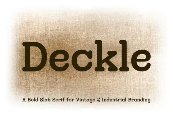
Rounded typewriter & letterpress industrial slab serif
Deckle is a bold, ink-softened slab serif blending classic typewriter mechanics with warm, rounded letterpress corners.
Ideas for this font
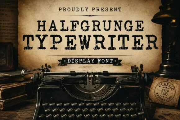
Rough-stamped grunge display typewriter slab
Halfgrunge Typewriter is a wide, muscular uppercase typewriter display font roughened with pitted metal-stamp texture and irregular edges.
Ideas for this font
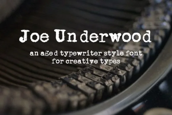
Heavy ribbon-inked Underwood typewriter slab
Joe Underwood is a bold, ink-rich vintage typewriter font modeled on classic mechanical typebars striking fresh cloth ribbon.
Ideas for this font
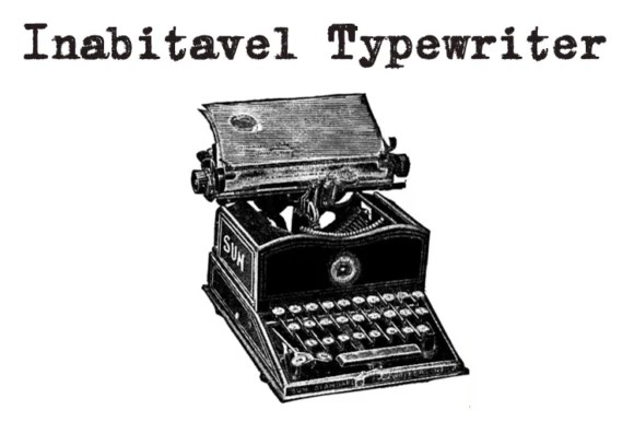
Authentic carbon-ribbon 1910 mechanical typewriter serif
Inabitavek Typewriter ('Inabitavel Typewriter') is an authentic antique mechanical-ribbon font capturing true 1910s cloth-ink strike bleed.
Ideas for this font
Same independent foundry
Allow optional Google Analytics to measure visits and catalogue actions. Your search words and notes are not included. Privacy & storage