Editorial Serif Anchor

Whimsy Typewriter + The Lumina Awesome
Anchors Whimsy Typewriter's fluid strokes with crisp Roman proportions on wedding suites, headers and packaging.
Inspect The Lumina Awesome specimenDisclosure: MakerFileHub may earn a commission from qualifying purchases via paid links on this page. How our links work.
Slender quirky hand-drawn vintage typewriter font
Whimsy Typewriter is a tall, hairline-slender hand-drawn typewriter font with charmingly uneven baselines and playful dropped terminals.
Paid link
Get this fontProject & layout blueprintsAt-a-glance maker compatibility
Fine grain and micro-texture excel in 300 DPI print, sublimation, and screen print rather than small vinyl weeding.
Visual anatomy & craft review
Whimsy Typewriter is a slender hand-drawn vintage typewriter serif: uneven stems, small ink gaps where the drawn line lifted, a drifting baseline and serifs that taper rather than bracket. The hand-drawn irregularity is the point, so it reads light at any size and closes only when reversed. It needs roughly 22 mm for the drawn taper and the ink gap to read, and it is best in one weary black or blue on an uncoated text sheet, or a single sepia on cream.
Slender · Quirky · Literary
Two-font hierarchy recipes
Tested contrast partners — pairing Whimsy Typewriter with grounded secondary typography.
Whimsy Typewriter + The Lumina Awesome
Anchors Whimsy Typewriter's fluid strokes with crisp Roman proportions on wedding suites, headers and packaging.
Inspect The Lumina Awesome specimen
Whimsy Typewriter + Clyne Sans
Keeps small-scale dates, URLs, nutrition facts and care instructions crisp and legible below script titles.
Inspect Clyne Sans specimenPractical applications
Concrete hierarchy, scale and production guidance tailored to Whimsy Typewriter’s stroke geometry.
A hand-drawn typewriter reads as a typed manuscript rather than a typeset header, which suits an essay about writing or archives. The drawn taper holds at 24 pt, and the ink gaps supply texture with no extra artwork.
Hierarchy & layout recipe
Header 24 pt with 6 mm clearance, body 9/13 pt in two columns of 82 mm, 18 mm margins. Byline strap 10 pt with 4 mm above. Caption note 8/11 pt in the outer margin.
Pre-production check
At 8 pt the caption note's ink gaps widen and the line reads as a broken grey rule. Set captions in the body face and keep the hand-drawn cut at 20 pt and above, then proof one page.
A slender drawn typewriter gives a bookbinder the look of a typed label rather than a designed logo. The uneven stems hold at 18 mm on a card back, and one black pass prints the card and the stamp on cheap stock without registration risk.
Hierarchy & layout recipe
Card back 85 x 55 mm, word 18 mm, details 7/9 pt, 5 mm margins. Stamp 60 x 30 mm, word 10 mm, 3 mm margins. Envelope 160 x 110 mm, word 12 mm, 10 mm margins.
Pre-production check
On a small stamp the drifting baseline tilts the address half a millimetre out and it reads as misaligned printing. Keep stamps at 14 mm and above, and check one impressed stamp before the run.
A hand-drawn typewriter reads as a typed recommendation rather than a printed advert, which is what an independent bookshop wants on a shelf. The taper holds at 60 mm on a poster, and one sepia ink prints the poster, the talkers and the cards in a single order.
Hierarchy & layout recipe
Poster A3, word 80 mm with 10 mm clearance, details 24 mm, 18 mm margins. Shelf talker 100 x 150 mm, word 20 mm, 6 mm margins. Reading card 105 x 148 mm, header 16 pt, text 9/12 pt.
Pre-production check
On a 100 x 150 mm shelf talker at 20 mm the ink gaps merge into a solid stroke and the hand-drawn look vanishes. Keep talkers at 26 mm or use the clean cut, and check one talker on the shelf before the batch.
Technical & licence verification
Confirm included OTF/TTF/WOFF formats, full glyph tables and licence coverage on the live store page before batch production.
Closest visual alternatives
Matched across letterform anatomy, stroke behaviour and craft applications.
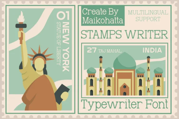
Clean travel-postage & passport monoline typewriter serif
Stamps Writer is a neat, slender monoline typewriter serif inspired by vintage postage cancels, travel passports, and archival index cards.
Ideas for this font
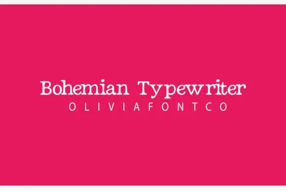
Romantic hand-drawn curly-terminal bohemian typewriter serif
Bohemian Typewriter is a romantic, hand-drawn typewriter serif softening classic monoline stems with delicate curled ball terminals.
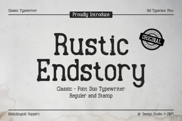
Two-cut vintage typewriter duo (Regular & Stamp)
Rustic Endstory is a two-style vintage typewriter family offering both a clean Regular cut and a weathered Stamp cut for flexible craft work.
Ideas for this font
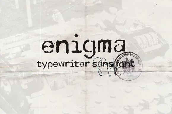
Heavily ink-bled WWII cipher & dossier sans typewriter
Enigma Typewriter Sans is an authentic, heavily ink-bled sans-serif typewriter font modeled after wartime cipher machines and aged carbon copies.
Ideas for this font
Allow optional Google Analytics to measure visits and catalogue actions. Your search words and notes are not included. Privacy & storage