Modern Grotesque Body

Typewriter + Lemon Milk Pro FTR
Creates crisp high-hierarchy contrast beneath Typewriter headlines across menus, websites and labels.
Inspect Lemon Milk Pro FTR specimenDisclosure: MakerFileHub may earn a commission from qualifying purchases via paid links on this page. How our links work.
Hand-inked vintage typewriter slab duo (Regular & Outline)
Typewriter (Inked) is a warm, hand-drawn vintage typewriter font family pairing a solid Inked Regular with a matching hollow Outline style!
Paid link
Get this fontProject & layout blueprintsAt-a-glance maker compatibility
Fine grain and micro-texture excel in 300 DPI print, sublimation, and screen print rather than small vinyl weeding.
Visual anatomy & craft review
Typewriter Inked is a hand-inked vintage typewriter slab family with a solid regular and a matching hollow outline, both carrying organic ribbon-ink warmth and rounded monoline slabs, so a word reads as typed on a machine rather than typeset. The outline style lets a designer layer a cut line under the solid, and the even weight keeps it legible at 10 pt. It needs roughly 14 pt for the ink edge to read, and it is best in charcoal on cream or in one ink on kraft.
Hand-inked · Regular-and-Outline · Cozy-literary
Two-font hierarchy recipes
Tested contrast partners — pairing Typewriter with grounded secondary typography.
Typewriter + Lemon Milk Pro FTR
Creates crisp high-hierarchy contrast beneath Typewriter headlines across menus, websites and labels.
Inspect Lemon Milk Pro FTR specimen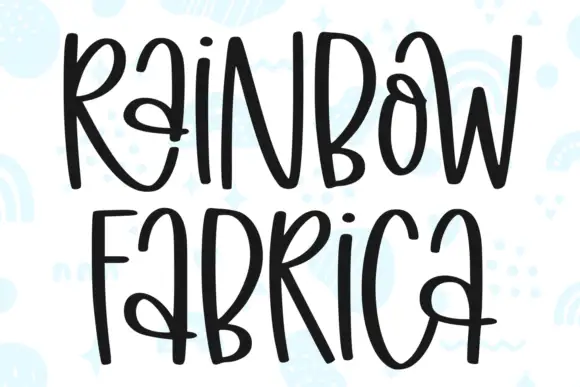
Typewriter + Rainbow Fabrica
Adds a warm human signature touch for 1-to-3-word callouts without competing against structured serif capitals.
Inspect Rainbow Fabrica specimenPractical applications
Concrete hierarchy, scale and production guidance tailored to Typewriter’s stroke geometry.
Inked slabs read as a typed page, which is what a literary journal wants on a cover. The outline style gives the cover a knock-out second line without a second face, and the solid holds body text at 9.5 pt.
Hierarchy & layout recipe
Cover 148 x 210 mm, title 54 pt, outline line 30 pt, subtitle 12/16 pt, 15 mm margins. Card 105 x 148 mm, quote 18 pt, source 8 pt. Zine body 9.5/14 pt in a 60 mm column.
Pre-production check
The outline at 30 pt on uncoated stock closes its 0.5 mm double line and the second line reads as a solid band. Keep the outline above 36 pt or print coated, and check one proof before the run.
Inked typewriter slabs read as a recipe typed for a farm kitchen, which is what an autumn market hands out. The face carries a long ingredient list at 9 pt, and the ink edge gives kraft printing a period feel.
Hierarchy & layout recipe
Menu card 105 x 148 mm, title 18 pt, items 8/12 pt, 10 mm margins. Recipe sheet A4, title 24 pt, steps 9.5/14 pt, 20 mm margins. Label 60 x 90 mm, word 12 mm, 4 mm die margin.
Pre-production check
An 8 pt item line on kraft wicks and the price column closes up. Print on white stock or raise the items to 9 pt, and check one card before the market.
Ribbon-inked letterforms read as a note typed on a machine that has been in the family, which is what a keepsake thank-you wants. The even weight holds at 9 pt on cream, and the outline gives a heading a second voice without a new font.
Hierarchy & layout recipe
Note 148 x 105 mm, greeting 16 pt, message 9/13 pt, 12 mm margins. Card 120 x 170 mm, greeting 20 pt, outline line 14 pt, 14 mm margins. Label 60 x 40 mm, name 9 pt, 4 mm die margin.
Pre-production check
A 9 pt label on a self-adhesive sheet shows the ink edge as a dirty outline and the name looks smudged. Set labels at 11 pt or use the plain style, and check one applied label before the batch.
Technical & licence verification
Confirm included OTF/TTF/WOFF formats, full glyph tables and licence coverage on the live store page before batch production.
Closest visual alternatives
Matched across letterform anatomy, stroke behaviour and craft applications.
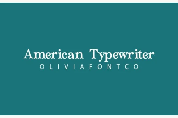
Bouncy hand-inked rounded typewriter slab
American Typewriter (by OliviaFontCo) is a soft, hand-drawn rounded slab-serif font with gentle baseline bounce and cozy craft appeal.
Ideas for this font
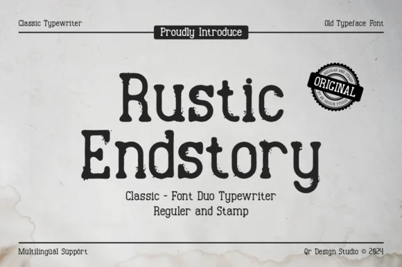
Two-cut vintage typewriter duo (Regular & Stamp)
Rustic Endstory is a two-style vintage typewriter family offering both a clean Regular cut and a weathered Stamp cut for flexible craft work.
Ideas for this font
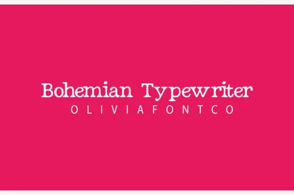
Romantic hand-drawn curly-terminal bohemian typewriter serif
Bohemian Typewriter is a romantic, hand-drawn typewriter serif softening classic monoline stems with delicate curled ball terminals.
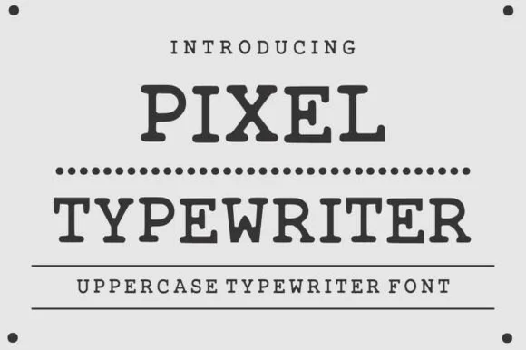
Classic ink-stamped vintage mechanical typewriter slab serif
Pixel Typewriter is actually a classic vintage mechanical typewriter slab serif (not a blocky 8-bit pixel font) with warm ink-ribbon edges!
Ideas for this font
Same independent foundry
Allow optional Google Analytics to measure visits and catalogue actions. Your search words and notes are not included. Privacy & storage