Modern Grotesque Body

Stamps Writer + Olline
Creates crisp high-hierarchy contrast beneath Stamps Writer headlines across menus, websites and labels.
Inspect Olline specimenDisclosure: MakerFileHub may earn a commission from qualifying purchases via paid links on this page. How our links work.
Clean travel-postage & passport monoline typewriter serif
Stamps Writer is a neat, slender monoline typewriter serif inspired by vintage postage cancels, travel passports, and archival index cards.
Paid link
Get this fontProject & layout blueprintsAt-a-glance maker compatibility
Fine grain and micro-texture excel in 300 DPI print, sublimation, and screen print rather than small vinyl weeding.
Visual anatomy & craft review
Stamps Writer is a monoline typewriter serif drawn from travel postage and passport stamps: even thin strokes, small slab serifs, a slight ink squash at the feet and a baseline that stays level so a word reads as stamped rather than typed. The monoline holds on absorbent paper, and the slab feet are what stop it reading as a plain sans. It needs roughly 20 mm for the slab foot and the monoline to read, and it is best in one passport blue or black on cream and buff stock, or a single stamp-pad colour on thin paper.
Postage · Crisp · Documentary
Two-font hierarchy recipes
Tested contrast partners — pairing Stamps Writer with grounded secondary typography.
Stamps Writer + Olline
Creates crisp high-hierarchy contrast beneath Stamps Writer headlines across menus, websites and labels.
Inspect Olline specimen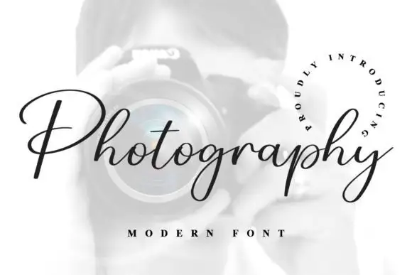
Stamps Writer + Photography Font
Adds a warm human signature touch for 1-to-3-word callouts without competing against structured serif capitals.
Inspect Photography Font specimenPractical applications
Concrete hierarchy, scale and production guidance tailored to Stamps Writer’s stroke geometry.
A postage monoline reads as a customs stamp rather than a styled header, which is what a travel feature wants at the top of the page. The slab feet hold at 22 pt, and one blue ink prints the header and the stamp box from one file.
Hierarchy & layout recipe
Header 22 pt with 6 mm clearance, body 9/13 pt in two columns of 82 mm, 18 mm margins. Stamp box 30 x 36 mm with 8 pt caption underneath. Caption 8/11 pt.
Pre-production check
At 8 pt inside the stamp box the monoline drops below what a litho press holds and the caption reads as a grey bar. Keep box text at 9 pt and above, and proof one page at 1:1.
A passport monoline makes a postcard look officially stamped rather than designed, which is what a small print shop sells in autumn. The slab feet print at 18 mm, and one blue ink covers the postcards and the envelope band in a single order.
Hierarchy & layout recipe
Postcard 105 x 148 mm, word 22 mm, message 9/12 pt, 10 mm margins. Envelope band 200 x 30 mm, word 10 mm, 5 mm margins. Market tag 50 x 90 mm, word 12 mm with a 4 mm hole and 8 mm clear.
Pre-production check
On a 200 x 30 mm band the monoline prints unevenly across the fold and the name looks typed twice. Keep the band word off the crease, and fold one band before the batch.
A postage monoline gives a stationery maker a mark that reads as printed rather than branded, which is the language their own product speaks. The even stroke holds at 16 mm on a card, and one stamp-pad ink prints the card back and the rubber stamp from one artwork.
Hierarchy & layout recipe
Card 85 x 55 mm, word 16 mm, details 7/9 pt, 5 mm margins. Rubber stamp 40 x 20 mm, word 7 mm, 2 mm margin. Envelope 160 x 110 mm, word 12 mm, 10 mm margins.
Pre-production check
A 40 x 20 mm rubber stamp at 7 mm closes the slab feet and the mark reads as a smudge on the envelope corner. Keep stamps at 10 mm and above, and test one impression before the order.
Technical & licence verification
Confirm included OTF/TTF/WOFF formats, full glyph tables and licence coverage on the live store page before batch production.
Closest visual alternatives
Matched across letterform anatomy, stroke behaviour and craft applications.
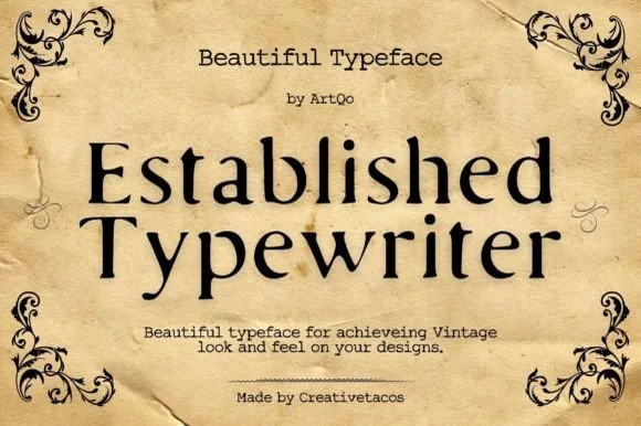
Refined old-style book & correspondence typewriter serif
Established Typewriter blends classical old-style book serif proportions with subtle ribbon-press warmth for heirloom stationery and labels.
Ideas for this font
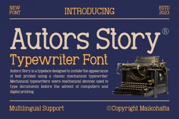
Clean classic mechanical display & text typewriter serif
Autors Story is a clean, high-legibility mechanical typewriter serif with generous x-height, curled ball terminals, and multilingual coverage.
Ideas for this font
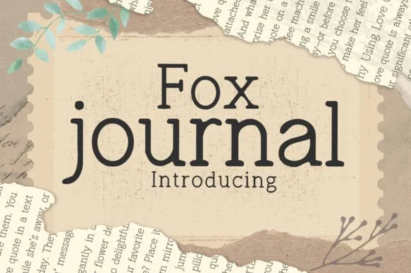
Clean hand-drawn bookish journal & typewriter slab serif
Fox Journal is a charming, clean-lined hand-drawn serif (NOT a plain sans!) pairing crisp slab feet with friendly single-story 'a' lowercase.
Ideas for this font
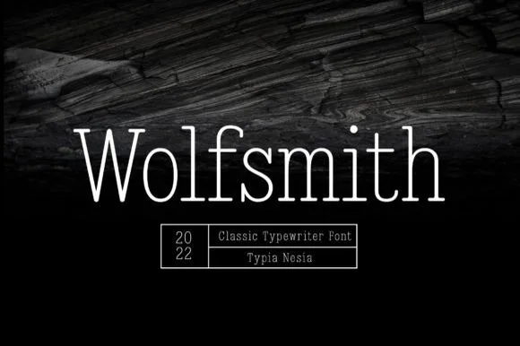
Light typewriter serif with wide spacing
Wolfsmith is a classic typewriter serif in white on dark wood: light even strokes, small slab serifs, a wide and open set, shown as one large line with a ruled box of small capitals beneath it.
Ideas for this font
Same independent foundry
Allow optional Google Analytics to measure visits and catalogue actions. Your search words and notes are not included. Privacy & storage