Modern Grotesque Body

Field Trip Typewriter + Sailors
Creates crisp high-hierarchy contrast beneath Field Trip Typewriter headlines across menus, websites and labels.
Inspect Sailors specimenDisclosure: MakerFileHub may earn a commission from qualifying purchases via paid links on this page. How our links work.
Playful uneven-baseline storybook typewriter serif
Field Trip Typewriter is a charming, slightly bouncy vintage typewriter serif mimicking sticky-key mechanical charm on nature notes and scrapbooks.
Paid link
Get this fontProject & layout blueprintsAt-a-glance maker compatibility
Fine grain and micro-texture excel in 300 DPI print, sublimation, and screen print rather than small vinyl weeding.
Visual anatomy & craft review
A playful typewriter serif framed by autumn botanical blooms on cream: compact rounded lowercase with plump ball terminals and an uneven baseline, so the line reads as a page typed on a machine with a sticky key rather than as a neo-grotesque with a texture. The bounce is gentle and repeatable, which is what keeps a paragraph readable, and the ball terminals give the strokes their soft finish. No glyphs touch, so nothing needs welding. The botanical frame is staging and names the seasonal register. Uses are journals, classroom labels, pantry jars and storybook headings where warmth matters more than polish.
Field-notes · Bouncy-keys · Storybook
Two-font hierarchy recipes
Tested contrast partners — pairing Field Trip Typewriter with grounded secondary typography.
Field Trip Typewriter + Sailors
Creates crisp high-hierarchy contrast beneath Field Trip Typewriter headlines across menus, websites and labels.
Inspect Sailors specimen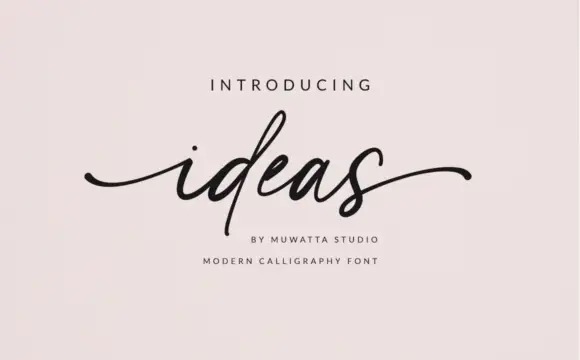
Field Trip Typewriter + Ideas
Adds a warm human signature touch for 1-to-3-word callouts without competing against structured serif capitals.
Inspect Ideas specimenPractical applications
Concrete hierarchy, scale and production guidance tailored to Field Trip Typewriter’s stroke geometry.
The slight baseline bounce gives worksheets, pressed-flower labels and journal headings a storybook personality that a clean serif cannot, and because the letters stay separate the face reads clearly for children and adults alike.
Hierarchy & layout recipe
A5 journal: the heading at 28 pt, the notes in an 11 pt serif, and the date at 9 pt. Keep 18 mm margins, keep the bounced baseline inside a 2 mm band so the text block stays level, and leave 8 mm under the heading.
Pre-production check
Clean solid rounded strokes with no interior dust cut smoothly on vinyl, HTV and sticker labels down to 0.6 inch, and no welding is needed. Check the 11 pt notes read in hand at a photocopied size.
Plump ball terminals stay durable on waterproof pantry labels, so a recipe box, a sourdough jar or a batch of preserves gets a hand-typed look without the fragility of a thin script, and the bounce gives each jar its own character.
Hierarchy & layout recipe
Print a 50 by 30 mm label: the contents at 12 pt, the date at 7 pt, and one ink on a waterproof white stock. Keep 4 mm inside the die and keep the ball terminals above 0.5 mm.
Pre-production check
Check the 12 pt contents on the die, where a ball terminal can fill; keep it above 0.5 mm. Confirm the label survives a wash cycle and that the date still reads after a wipe.
A warm bouncy serif names trays and shelves without the severity of an all-caps label, which matters in a room where children read the names, and the separate glyphs mean a teacher can cut a set by hand without welding.
Hierarchy & layout recipe
Print an A4 sheet of twelve labels: each name at 16 pt on a 45 by 25 mm tag, the subject at 8 pt, and one ink on white card. Keep 4 mm inside each die and 6 mm between tags.
Pre-production check
Check the 16 pt name across the room, where the bounce can blur into a wobble; keep the band tight. Confirm the tags take laminate without bubbling and that the ink does not smear.
Technical & licence verification
Confirm included OTF/TTF/WOFF formats, full glyph tables and licence coverage on the live store page before batch production.
Closest visual alternatives
Matched across letterform anatomy, stroke behaviour and craft applications.
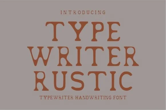
Warm hand-stamped terracotta rustic typewriter serif
Typewriter Rustic is a chunky, hand-stamped organic typewriter slab serif with soft ink-bleed curves built for cozy cottage and apothecary labels.
Ideas for this font
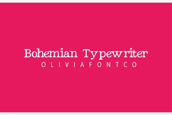
Romantic hand-drawn curly-terminal bohemian typewriter serif
Bohemian Typewriter is a romantic, hand-drawn typewriter serif softening classic monoline stems with delicate curled ball terminals.
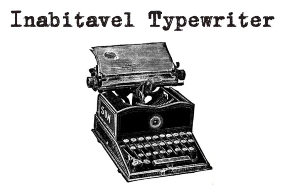
Authentic carbon-ribbon 1910 mechanical typewriter serif
Inabitavek Typewriter ('Inabitavel Typewriter') is an authentic antique mechanical-ribbon font capturing true 1910s cloth-ink strike bleed.
Ideas for this font
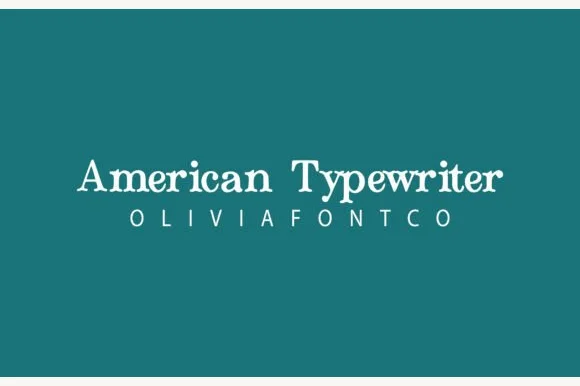
Bouncy hand-inked rounded typewriter slab
American Typewriter (by OliviaFontCo) is a soft, hand-drawn rounded slab-serif font with gentle baseline bounce and cozy craft appeal.
Ideas for this font
Allow optional Google Analytics to measure visits and catalogue actions. Your search words and notes are not included. Privacy & storage