Modern Grotesque Body

Rusted Typewriter + Cenura
Creates crisp high-hierarchy contrast beneath Rusted Typewriter headlines across menus, websites and labels.
Inspect Cenura specimenDisclosure: MakerFileHub may earn a commission from qualifying purchases via paid links on this page. How our links work.
Eroded ink-ribbon vintage serif typewriter
Rusted Typewriter is a warm, medium-weight serif typewriter font with organic ink-bleed edges that mimic a heavily used cloth ribbon.
Paid link
Get this fontProject & layout blueprintsAt-a-glance maker compatibility
Fine grain and micro-texture excel in 300 DPI print, sublimation, and screen print rather than small vinyl weeding.
Visual anatomy & craft review
Rusted Typewriter is a vintage serif typewriter face with an eroded ink-ribbon surface: even bracketed stems, open counters, a level baseline and edges that look eaten by a worn ribbon so the stroke breaks into patches. The erosion is the design and it silts at small sizes on uncoated stock. It needs roughly 20 mm for the erosion and the serif to read, and it is best in one dense ink on uncoated paper, or a single ink at 70 percent where the patches read as intentional.
Worn-ribbon · Soulful · Nostalgic
Two-font hierarchy recipes
Tested contrast partners — pairing Rusted Typewriter with grounded secondary typography.
Rusted Typewriter + Cenura
Creates crisp high-hierarchy contrast beneath Rusted Typewriter headlines across menus, websites and labels.
Inspect Cenura specimen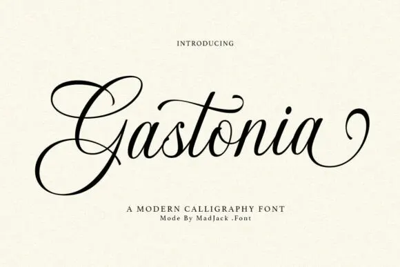
Rusted Typewriter + Gastonia Script
Adds a warm human signature touch for 1-to-3-word callouts without competing against structured serif capitals.
Inspect Gastonia Script specimenPractical applications
Concrete hierarchy, scale and production guidance tailored to Rusted Typewriter’s stroke geometry.
An eroded typewriter serif sets a long archive feature as a carbon copy rather than a modern body face. The open counters stay legible at 9 pt, and the patched edges give the page a document texture without a scan.
Hierarchy & layout recipe
Body 9/13 pt in two columns of 82 mm with 18 mm margins, 5 mm gutter and a 12 mm head. Standfirst 11/15 pt with 4 mm below. Caption 8/11 pt in a 40 mm outer-margin rail.
Pre-production check
At 9 pt across a full page the eroded patches silt into grey and the gaps between words close. Raise the body to 9.5 pt or run one column, and proof one signature at 1:1.
An eroded serif reads as a typed note rather than a printed acknowledgement. The serifs hold at 24 mm on a card, and one ink prints the card, the tag and the label in one pass.
Hierarchy & layout recipe
Card A6, word 24 mm with 6 mm serif clearance, note 8/11 pt, 12 mm margins. Tag 50 x 90 mm, word 12 mm with a 5 mm hole and 8 mm clear. Jar label 70 x 45 mm, word 12 mm, 4 mm die margin.
Pre-production check
A 70 x 45 mm jar label at 12 mm closes the erosion into a solid bar on wet-strength paper. Raise the label to 16 mm, and check one labelled jar before the batch.
An eroded typewriter serif gives a country fair a printed programme rather than a designed flyer. The serifs hold at 9 pt through a long schedule, and one ink prints the programme and the tickets in one order.
Hierarchy & layout recipe
Programme 105 x 148 mm, head 18 pt, schedule 9/12 pt, 12 mm margins. Ticket 100 x 50 mm, word 12 mm with 6 mm serif clearance, 4 mm perforation. Prize label 90 x 60 mm, word 16 mm, 5 mm margins.
Pre-production check
A 100 x 50 mm ticket at 12 mm fills the erosion into a solid stamp and the word reads as a blot. Raise the ticket to 18 mm, and print one ticket before the batch.
Technical & licence verification
Confirm included OTF/TTF/WOFF formats, full glyph tables and licence coverage on the live store page before batch production.
Closest visual alternatives
Matched across letterform anatomy, stroke behaviour and craft applications.
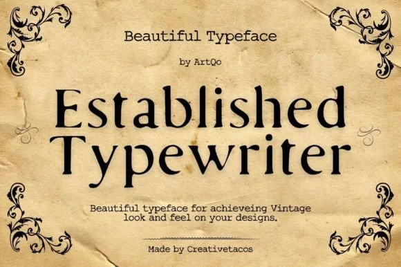
Refined old-style book & correspondence typewriter serif
Established Typewriter blends classical old-style book serif proportions with subtle ribbon-press warmth for heirloom stationery and labels.
Ideas for this font
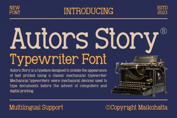
Clean classic mechanical display & text typewriter serif
Autors Story is a clean, high-legibility mechanical typewriter serif with generous x-height, curled ball terminals, and multilingual coverage.
Ideas for this font
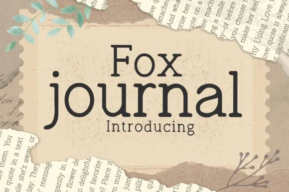
Clean hand-drawn bookish journal & typewriter slab serif
Fox Journal is a charming, clean-lined hand-drawn serif (NOT a plain sans!) pairing crisp slab feet with friendly single-story 'a' lowercase.
Ideas for this font
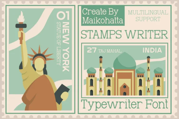
Clean travel-postage & passport monoline typewriter serif
Stamps Writer is a neat, slender monoline typewriter serif inspired by vintage postage cancels, travel passports, and archival index cards.
Ideas for this font
Allow optional Google Analytics to measure visits and catalogue actions. Your search words and notes are not included. Privacy & storage