Modern Grotesque Body

American Typewriter + Borsen
Creates crisp high-hierarchy contrast beneath American Typewriter headlines across menus, websites and labels.
Inspect Borsen specimenDisclosure: MakerFileHub may earn a commission from qualifying purchases via paid links on this page. How our links work.
Bouncy hand-inked rounded typewriter slab
American Typewriter (by OliviaFontCo) is a soft, hand-drawn rounded slab-serif font with gentle baseline bounce and cozy craft appeal.
Paid link
Get this fontProject & layout blueprintsAt-a-glance maker compatibility
Fine grain and micro-texture excel in 300 DPI print, sublimation, and screen print rather than small vinyl weeding.
Visual anatomy & craft review
American Typewriter is a soft hand-inked rounded slab with plump ball serifs, slightly dancing letter heights and a warm baseline bounce, drawn to read as a friendly typewriter rather than a mechanical one. The slab structure keeps a heading stable, while the bounce and rounded serifs stop it from looking institutional. Because the weight is even and the serifs are blunt, it prints on kraft and label stock without clogging, and it holds at about 11 mm. It is a craft and editorial face, best in mixed case and short phrases.
Warm · Bouncy · Friendly-retro
Two-font hierarchy recipes
Tested contrast partners — pairing American Typewriter with grounded secondary typography.
American Typewriter + Borsen
Creates crisp high-hierarchy contrast beneath American Typewriter headlines across menus, websites and labels.
Inspect Borsen specimen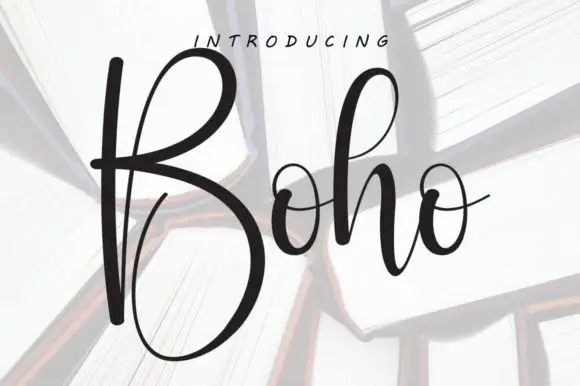
American Typewriter + Boho
Adds a warm human signature touch for 1-to-3-word callouts without competing against structured serif capitals.
Inspect Boho specimenPractical applications
Concrete hierarchy, scale and production guidance tailored to American Typewriter’s stroke geometry.
A friendly rounded slab reads as a book made by a maker rather than a publisher, which is the promise of a craft title. Ball serifs hold at 14 pt on a project header where a hairline serif would break on uncoated paper.
Hierarchy & layout recipe
Book 190 x 245 mm, title 44 pt, chapter openers 26 pt, body 10/14 pt in a companion serif, 20 mm margins. Insert 210 x 297 mm, header 22 pt, diagrams labelled 8.5/11 pt.
Pre-production check
Uncoated text paper draws ink and the ball serifs thicken until the counters nearly close at 14 pt. Request a proof on the actual stock, and raise the header to 18 pt if the serifs blob.
A warm slab looks stamped onto a card rather than composed, which suits a harvest recipe or a farm stand. Blunt serifs stay solid on a small label applied by hand.
Hierarchy & layout recipe
Card 105 x 148 mm, title 16 mm, method 8/11 pt, 12 mm margins. Label 60 x 45 mm, word 9 mm, 3 mm top arc. Sign 600 x 400 mm, word 90 mm, 40 mm margins.
Pre-production check
Jam labels go into a water bath and uncoated paper disintegrates at the edge. Use a synthetic label with a permanent adhesive, and test one sealed jar through a full processing cycle before printing the batch.
Rounded slabs read as a printed craft box rather than a retail label, which is what a small supply shop wants. Even weight holds at 9 mm on a yarn band where a display face would be unreadable.
Hierarchy & layout recipe
Box 200 x 150 x 80 mm, word 34 mm on the lid, 25 mm margins. Yarn band 200 x 45 mm, word 9 mm within the flat 120 mm centre, yardage 5 pt at the wrap end. Card 105 x 148 mm, heading 18 mm, details 7/10 pt, 12 mm margins.
Pre-production check
Yarn bands are wrapped around a squishy cylinder and any word set to the full width distorts at the curve. Keep the word within the flat 120 mm centre, and check one band on an actual skein.
Technical & licence verification
Confirm included OTF/TTF/WOFF formats, full glyph tables and licence coverage on the live store page before batch production.
Closest visual alternatives
Matched across letterform anatomy, stroke behaviour and craft applications.
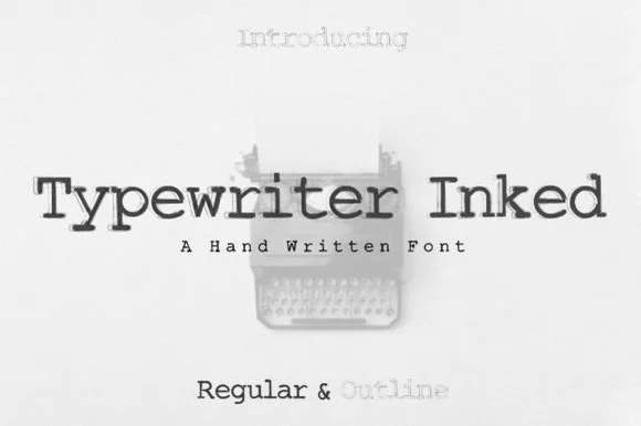
Hand-inked vintage typewriter slab duo (Regular & Outline)
Typewriter (Inked) is a warm, hand-drawn vintage typewriter font family pairing a solid Inked Regular with a matching hollow Outline style!
Ideas for this font
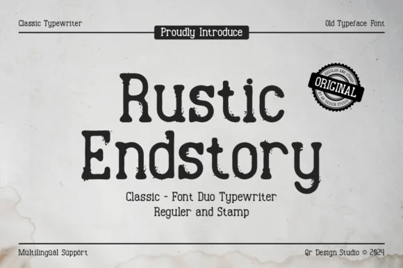
Two-cut vintage typewriter duo (Regular & Stamp)
Rustic Endstory is a two-style vintage typewriter family offering both a clean Regular cut and a weathered Stamp cut for flexible craft work.
Ideas for this font
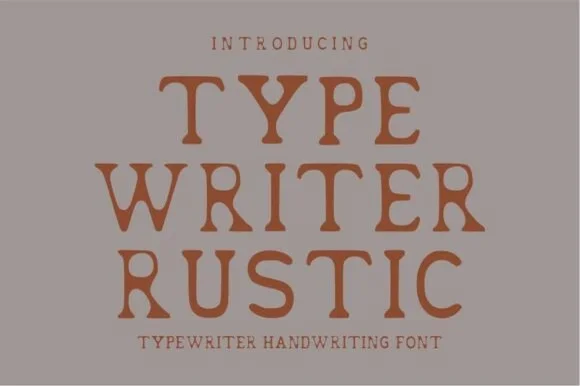
Warm hand-stamped terracotta rustic typewriter serif
Typewriter Rustic is a chunky, hand-stamped organic typewriter slab serif with soft ink-bleed curves built for cozy cottage and apothecary labels.
Ideas for this font
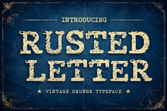
Vintage grunge slab caps
Rusted Letter is a vintage grunge slab in cream on navy: heavy bracketed serifs, wide caps, and a corroded texture that eats into the edges and speckles the interiors, framed with hairline ornaments and two stars, so the pair reads as a stamped shipping crate rather than a modern slab.
Ideas for this font
Same independent foundry
Allow optional Google Analytics to measure visits and catalogue actions. Your search words and notes are not included. Privacy & storage