Modern Grotesque Body

Chronicles Secret + Mansory
Creates crisp high-hierarchy contrast beneath Chronicles Secret headlines across menus, websites and labels.
Inspect Mansory specimenDisclosure: MakerFileHub may earn a commission from qualifying purchases via paid links on this page. How our links work.
3-style stencil-broken mystery & crime monospace typewriter
Chronicles Secret is a 3-style monospaced crime-thriller typewriter family fractured with authentic hammer-miss stencil breaks and ink grain.
Paid link
Get this fontProject & layout blueprintsAt-a-glance maker compatibility
Open counter bridges hold interior islands intact on laser-cut wood, acrylic, and mylar stencils.
Visual anatomy & craft review
Chronicles Secret is a three-style stencil-broken monospace typewriter: even monospaced letters with a fine bridge cutting every closed counter, a slightly inked contour and a second cut that widens the breaks and a third that adds a stamp texture. The breaks are structural, so they must stay wide enough to read, and the monospace keeps a word level. It needs roughly 24 mm for the bridge and the contour to read, and it is best in one dense black on a buff sheet, or a single stamp-pad colour on copy paper where the breaks stay open.
Suspenseful · Stencil-worn · Forensic
Two-font hierarchy recipes
Tested contrast partners — pairing Chronicles Secret with grounded secondary typography.
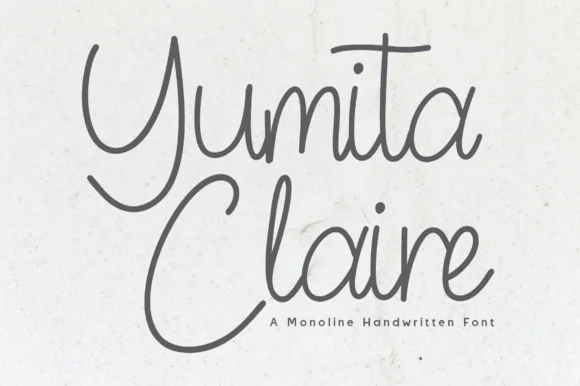
Chronicles Secret + Mansory
Creates crisp high-hierarchy contrast beneath Chronicles Secret headlines across menus, websites and labels.
Inspect Mansory specimen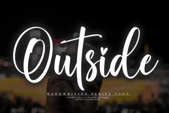
Chronicles Secret + Outside
Adds a warm human signature touch for 1-to-3-word callouts without competing against structured serif capitals.
Inspect Outside specimenPractical applications
Concrete hierarchy, scale and production guidance tailored to Chronicles Secret’s stroke geometry.
A stencil-broken monospace reads as a declassified file rather than a styled header, which is what an investigation feature wants. The breaks hold at 24 pt, and one black pass prints the header and the redaction panels without a second plate.
Hierarchy & layout recipe
Header 24 pt with 6 mm bridge clearance, body 9/13 pt in two columns of 82 mm, 18 mm margins. Redaction panel 40 x 8 mm per block, 6 mm apart. Caption 8/11 pt.
Pre-production check
At 8 pt the caption's breaks fill and the line reads as a broken grey rule. Set captions in a clean mono and keep the face at 20 pt and above, then proof one page at 1:1.
A broken-stencil monospace reads as a typed threat rather than a cartoon, which is what a quiet scare event wants. The breaks give the flyer menace at 100 mm, and one black plus a spot red prints the flyer, the tickets and the jar labels.
Hierarchy & layout recipe
Flyer A4, word 110 mm with 10 mm bridge clearance, details 30 mm, 15 mm margins. Ticket 100 x 50 mm, word 14 mm, 4 mm perforation. Jar label 70 x 50 mm, word 12 mm, 4 mm margins.
Pre-production check
A 70 x 50 mm jar label at 12 mm closes the bridges and the word reads as a solid block behind glass. Raise the jar word to 18 mm, and label one jar before the batch.
A broken monospace gives an archive or research studio the look of a stamped file rather than a designed logo. The breaks hold at 18 mm on a folder, and one ink prints the folder and the card back in one pass.
Hierarchy & layout recipe
Folder 240 x 320 mm, word 40 mm with 8 mm bridge clearance, 20 mm margins. Card back 85 x 55 mm, word 16 mm, 5 mm margins. Box label 100 x 70 mm, word 22 mm, 6 mm margins.
Pre-production check
On an 85 x 55 mm card back at 16 mm the bridges close and the address reads as a solid bar. Keep the card at 20 mm or use the uncut style, and check one impress before the order.
Technical & licence verification
Confirm included OTF/TTF/WOFF formats, full glyph tables and licence coverage on the live store page before batch production.
Closest visual alternatives
Matched across letterform anatomy, stroke behaviour and craft applications.
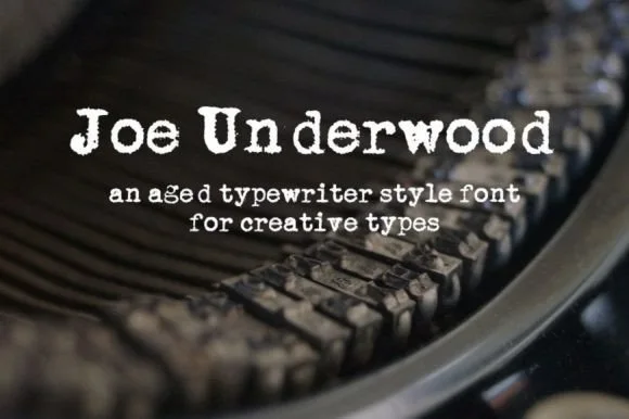
Heavy ribbon-inked Underwood typewriter slab
Joe Underwood is a bold, ink-rich vintage typewriter font modeled on classic mechanical typebars striking fresh cloth ribbon.
Ideas for this font
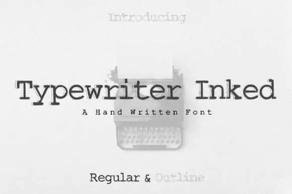
Hand-inked vintage typewriter slab duo (Regular & Outline)
Typewriter (Inked) is a warm, hand-drawn vintage typewriter font family pairing a solid Inked Regular with a matching hollow Outline style!
Ideas for this font
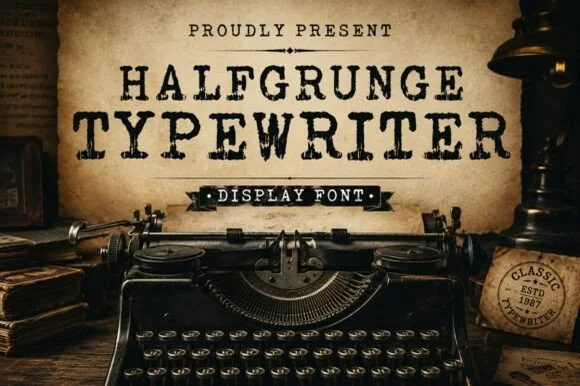
Rough-stamped grunge display typewriter slab
Halfgrunge Typewriter is a wide, muscular uppercase typewriter display font roughened with pitted metal-stamp texture and irregular edges.
Ideas for this font
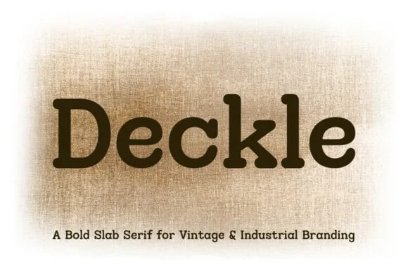
Rounded typewriter & letterpress industrial slab serif
Deckle is a bold, ink-softened slab serif blending classic typewriter mechanics with warm, rounded letterpress corners.
Ideas for this font
Same independent foundry
Allow optional Google Analytics to measure visits and catalogue actions. Your search words and notes are not included. Privacy & storage