Modern Grotesque Body

Autors Story + Bargain Condensed
Creates crisp high-hierarchy contrast beneath Autors Story headlines across menus, websites and labels.
Inspect Bargain Condensed specimenDisclosure: MakerFileHub may earn a commission from qualifying purchases via paid links on this page. How our links work.
Clean classic mechanical display & text typewriter serif
Autors Story is a clean, high-legibility mechanical typewriter serif with generous x-height, curled ball terminals, and multilingual coverage.
Paid link
Get this fontProject & layout blueprintsAt-a-glance maker compatibility
Fine grain and micro-texture excel in 300 DPI print, sublimation, and screen print rather than small vinyl weeding.
Visual anatomy & craft review
Autors Story is a clean mechanical typewriter serif built as a display and a text face: even bracketed stems, open counters, a level baseline and small slabbed feet, with the display size carrying a slightly heavier stroke than the text size. The pair lets a page set its title and body in one voice, and the mechanical regularity is the only texture. The display needs roughly 22 mm and the text runs honestly at 9 pt on uncoated stock, in one dense ink.
Editorial · Crisp · Mechanical
Two-font hierarchy recipes
Tested contrast partners — pairing Autors Story with grounded secondary typography.
Autors Story + Bargain Condensed
Creates crisp high-hierarchy contrast beneath Autors Story headlines across menus, websites and labels.
Inspect Bargain Condensed specimen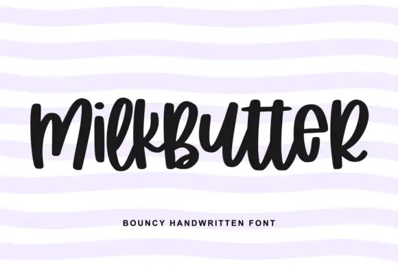
Autors Story + Milkbutter
Adds a warm human signature touch for 1-to-3-word callouts without competing against structured serif capitals.
Inspect Milkbutter specimenPractical applications
Concrete hierarchy, scale and production guidance tailored to Autors Story’s stroke geometry.
A mechanical typewriter serif sets a report as a typed document rather than a designed brochure, which is what a technical readership trusts. The display carries the cover at 30 pt, and the text cut holds 9 pt through dense columns.
Hierarchy & layout recipe
Cover 210 x 297 mm, title 30 pt with 6 mm serif clearance, body 9/13 pt over two columns of 82 mm with 18 mm margins, 5 mm gutter and a 12 mm head. Folio line 7/9 pt, 12 mm from the trim edge.
Pre-production check
At 7 pt the folio line's slab feet merge and the line reads as a grey rule. Set folios in the text face at 8 pt, and proof one page at 1:1.
A mechanical typewriter serif reads as a typed letterhead rather than a corporate logo, which is what a small studio wants on its stationery. The display holds at 24 mm, and one ink prints the card and the letterhead in one order.
Hierarchy & layout recipe
Letterhead 210 x 297 mm, word 28 mm with 6 mm serif clearance, 20 mm margins. Card 85 x 55 mm, word 16 mm, 5 mm margins. Envelope 160 x 110 mm, word 14 mm, 10 mm margins.
Pre-production check
On an 85 x 55 mm card the slab feet merge and the name reads as a bar. Raise the card word to 22 mm, and check one card before the run.
A typewriter serif reads as a duplicated school paper rather than a worksheet, which is what a journalism class wants on its pages. The text cut holds 9 pt through dense columns, and the display carries the masthead at 40 mm.
Hierarchy & layout recipe
Paper 210 x 297 mm, masthead 40 mm with 6 mm serif clearance, body 9/12 pt in three columns of 56 mm, 15 mm margins. Notice 210 x 297 mm, head 24 mm, items 9/12 pt.
Pre-production check
At 9 pt in three columns the slab feet and the rules take the same weight and the page reads as a grey field. Drop to two columns at 9.5 pt, and check one copy before the class set.
Technical & licence verification
Confirm included OTF/TTF/WOFF formats, full glyph tables and licence coverage on the live store page before batch production.
Closest visual alternatives
Matched across letterform anatomy, stroke behaviour and craft applications.
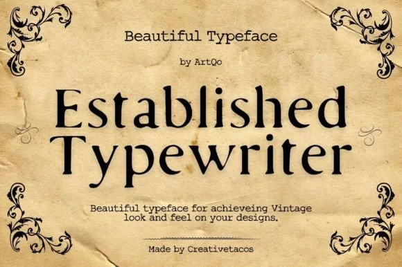
Refined old-style book & correspondence typewriter serif
Established Typewriter blends classical old-style book serif proportions with subtle ribbon-press warmth for heirloom stationery and labels.
Ideas for this font
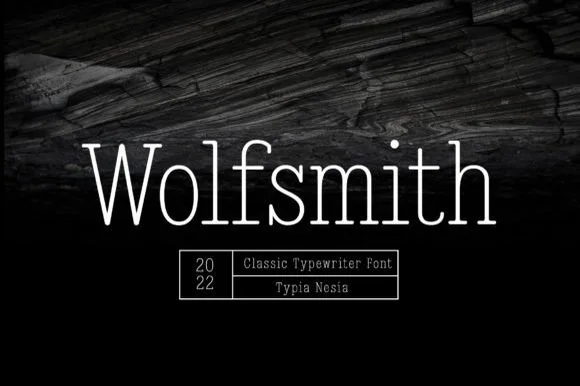
Light typewriter serif with wide spacing
Wolfsmith is a classic typewriter serif in white on dark wood: light even strokes, small slab serifs, a wide and open set, shown as one large line with a ruled box of small capitals beneath it.
Ideas for this font
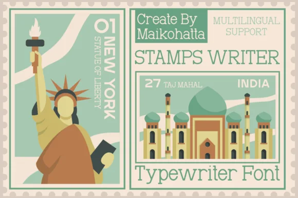
Clean travel-postage & passport monoline typewriter serif
Stamps Writer is a neat, slender monoline typewriter serif inspired by vintage postage cancels, travel passports, and archival index cards.
Ideas for this font
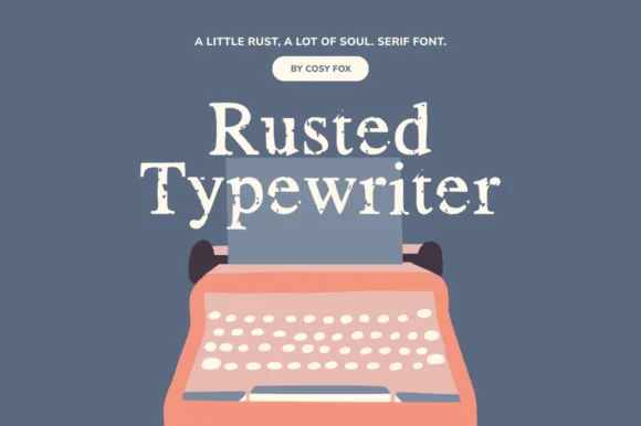
Eroded ink-ribbon vintage serif typewriter
Rusted Typewriter is a warm, medium-weight serif typewriter font with organic ink-bleed edges that mimic a heavily used cloth ribbon.
Ideas for this font
Same independent foundry
Allow optional Google Analytics to measure visits and catalogue actions. Your search words and notes are not included. Privacy & storage