Modern Grotesque Body

Inabitavek Typewriter + Montreal
Creates crisp high-hierarchy contrast beneath Inabitavek Typewriter headlines across menus, websites and labels.
Inspect Montreal specimenDisclosure: MakerFileHub may earn a commission from qualifying purchases via paid links on this page. How our links work.
Authentic carbon-ribbon 1910 mechanical typewriter serif
Inabitavek Typewriter ('Inabitavel Typewriter') is an authentic antique mechanical-ribbon font capturing true 1910s cloth-ink strike bleed.
Paid link
Get this fontProject & layout blueprintsAt-a-glance maker compatibility
Fine grain and micro-texture excel in 300 DPI print, sublimation, and screen print rather than small vinyl weeding.
Visual anatomy & craft review
Inabitavek Typewriter reproduces a 1910s mechanical typewriter strike, complete with cloth-ribbon feathering at the edges of each character, uneven ink density and tiny misalignments on the baseline. Because the irregularity is baked into every glyph, a page reads as a typed document rather than text with a texture applied. The weight is heavier than a modern typewriter revival, which helps at 10 to 12 pt and lets the face carry caption-length text on a prop. It is a period face, most convincing on off-white or buff paper, and it should never be set with justification.
Archive-ribbon · Mechanical-ink · Historical
Two-font hierarchy recipes
Tested contrast partners — pairing Inabitavek Typewriter with grounded secondary typography.
Inabitavek Typewriter + Montreal
Creates crisp high-hierarchy contrast beneath Inabitavek Typewriter headlines across menus, websites and labels.
Inspect Montreal specimen
Inabitavek Typewriter + Honey
Adds a warm human signature touch for 1-to-3-word callouts without competing against structured serif capitals.
Inspect Honey specimenPractical applications
Concrete hierarchy, scale and production guidance tailored to Inabitavek Typewriter’s stroke geometry.
Baked-in ribbon feathering gives a prop document the specific look of a typed page under a lamp, which texture overlays cannot fake convincingly at 10 pt. Slight baseline misalignment makes a short paragraph read as genuinely typed by a person.
Hierarchy & layout recipe
Dossier A4, 10.5/17 pt on a 90 mm measure, 25 mm margins, ragged right, page numbers 8 pt. Zine A5, 9.5/14 pt, 15 mm margins. Title card 1920 x 1080, text 40 px on a 60 px leading, safe margin 5 percent.
Pre-production check
Typewriter revivals are often set justified in props, which creates conspicuous rivers because the ribbon texture varies per glyph. Set ragged right with deliberate hyphenation off, and check the page at arm's length before filming.
A typed letter reads as evidence rather than decoration, which is exactly the tone an escape room needs for a clue. The heavy strike holds at 9 pt on a small poison label where a light period face would vanish.
Hierarchy & layout recipe
Letter A4 on 100 gsm buff, 11/16 pt, 30 mm margins, fold at 105 mm. Label 60 x 80 mm, product 8 mm, poison warning 6 pt, 5 mm margin. Envelope 110 x 220 mm, address 9 pt on a 6 mm baseline.
Pre-production check
A repeated clue letter is handled dozens of times a week and the fold line whitens. Print on 120 gsm with a score at the fold, laminate only the reverse if the paper must stay matt, and replace wear copies rather than reprinting the stock.
A typed note reads as effortful in a way a printed card is not, which is the point of thanking a supplier or a long-standing customer. Cloth-ribbon texture gives a short message weight on a 100 x 150 mm card.
Hierarchy & layout recipe
Note 105 x 148 mm, 10.5/16 pt, 18 mm margins, ragged right. Recipe card 105 x 148 mm, 9.5/13 pt, rule 0.5 pt at 8 mm from the head. Order slip 80 x 160 mm, 9/13 pt with a 4 mm tab for quantities.
Pre-production check
Cooking cards get splashed; a matt uncoated card marks immediately. Either print double-sided on a synthetic stock that keeps the matt look or supply the card as a laminated set, and note the difference in the listing.
Technical & licence verification
Confirm included OTF/TTF/WOFF formats, full glyph tables and licence coverage on the live store page before batch production.
Closest visual alternatives
Matched across letterform anatomy, stroke behaviour and craft applications.
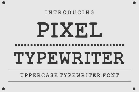
Classic ink-stamped vintage mechanical typewriter slab serif
Pixel Typewriter is actually a classic vintage mechanical typewriter slab serif (not a blocky 8-bit pixel font) with warm ink-ribbon edges!
Ideas for this font
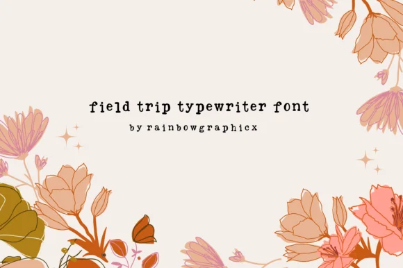
Playful uneven-baseline storybook typewriter serif
Field Trip Typewriter is a charming, slightly bouncy vintage typewriter serif mimicking sticky-key mechanical charm on nature notes and scrapbooks.
Ideas for this font
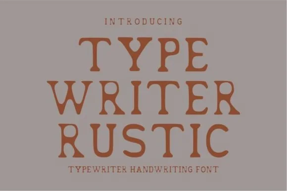
Warm hand-stamped terracotta rustic typewriter serif
Typewriter Rustic is a chunky, hand-stamped organic typewriter slab serif with soft ink-bleed curves built for cozy cottage and apothecary labels.
Ideas for this font
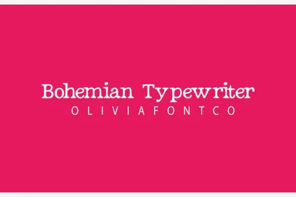
Romantic hand-drawn curly-terminal bohemian typewriter serif
Bohemian Typewriter is a romantic, hand-drawn typewriter serif softening classic monoline stems with delicate curled ball terminals.
Same independent foundry
Allow optional Google Analytics to measure visits and catalogue actions. Your search words and notes are not included. Privacy & storage