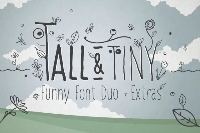
High-Contrast Display Serif

Enigma Typewriter Sans + Majestic Letters
Pairs sculptural editorial warmth with Enigma Typewriter Sans's clean modern geometry.
Inspect Majestic Letters specimenDisclosure: MakerFileHub may earn a commission from qualifying purchases via paid links on this page. How our links work.
Heavily ink-bled WWII cipher & dossier sans typewriter
Enigma Typewriter Sans is an authentic, heavily ink-bled sans-serif typewriter font modeled after wartime cipher machines and aged carbon copies.
Paid link
Get this fontProject & layout blueprintsAt-a-glance maker compatibility
Fine grain and micro-texture excel in 300 DPI print, sublimation, and screen print rather than small vinyl weeding.
Visual anatomy & craft review
Enigma Typewriter Sans is a cipher-and-dossier sans with heavy ink bleed: even strokes that swell where the type struck, blunted serifless feet, a drifting baseline and small ink blots where the ribbon was wet. The bleed is drawn into the contour, so a one-colour print keeps it, and the drifting baseline grows the word vertically. It needs roughly 22 mm for the bleed and the blot to read, and it is best in one heavy black or blue on a thin buff sheet, or a single stamp-pad colour on copy paper.
Archival · Ink-bled · Classified
Two-font hierarchy recipes
Tested contrast partners — pairing Enigma Typewriter Sans with grounded secondary typography.
Enigma Typewriter Sans + Majestic Letters
Pairs sculptural editorial warmth with Enigma Typewriter Sans's clean modern geometry.
Inspect Majestic Letters specimen
Enigma Typewriter Sans + Hello Honey
Introduces organic movement on pull-quotes, signatures and gift tags.
Inspect Hello Honey specimenPractical applications
Concrete hierarchy, scale and production guidance tailored to Enigma Typewriter Sans’s stroke geometry.
An ink-bled typewriter reads as a declassified file rather than a styled header, which is what an investigation feature wants at the top. The bleed holds at 24 pt, and one black pass prints the header and the redaction panels without a second plate.
Hierarchy & layout recipe
Header 24 pt with 6 mm clearance, body 9/13 pt in two columns of 82 mm, 18 mm margins. Redaction panel 40 x 8 mm per block, 6 mm apart. Caption 8/11 pt.
Pre-production check
At 8 pt the caption's ink blots merge into a grey smear and the line reads as a dirty rule. Set captions in a clean sans and keep the face at 20 pt and above, then proof one page at 1:1.
An ink-bled typewriter gives an archive or a research studio the look of a stamped dossier rather than a designed logo. The bleed holds at 18 mm on a folder, and one stamp-pad ink prints the folder, the card back and the box label in one pass.
Hierarchy & layout recipe
Folder 240 x 320 mm, word 40 mm with 8 mm bleed clearance, 20 mm margins. Card back 85 x 55 mm, word 16 mm, 5 mm margins. Box label 100 x 70 mm, word 22 mm, 6 mm margins.
Pre-production check
On an 85 x 55 mm card back the drifting baseline tilts the address half a millimetre and it reads as misaligned stamping. Keep the card at 18 mm and level the baselines, and check one impress before the order.
An ink-bled typewriter reads as a typed exhibition label rather than a printed advert, which is what a small museum wants in autumn. The blots hold at 80 mm on a poster, and one ink prints the poster, the label cards and the catalogue cover as one set.
Hierarchy & layout recipe
Poster A2, word 90 mm with 10 mm bleed clearance, details 30 mm, 20 mm margins. Label card 105 x 148 mm, header 18 pt, notes 9/12 pt. Catalogue cover 170 x 240 mm, title 40 pt, 15 mm margins.
Pre-production check
A 105 x 148 mm label card at 18 pt fills the counters and the title reads as a black bar over the notes. Raise the header to 24 pt or use the clean cut, and print one card before the run.
Technical & licence verification
Confirm included OTF/TTF/WOFF formats, full glyph tables and licence coverage on the live store page before batch production.
Closest visual alternatives
Matched across letterform anatomy, stroke behaviour and craft applications.
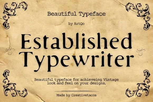
Refined old-style book & correspondence typewriter serif
Established Typewriter blends classical old-style book serif proportions with subtle ribbon-press warmth for heirloom stationery and labels.
Ideas for this font
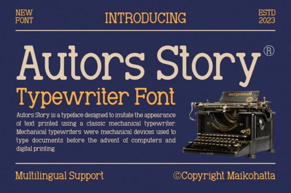
Clean classic mechanical display & text typewriter serif
Autors Story is a clean, high-legibility mechanical typewriter serif with generous x-height, curled ball terminals, and multilingual coverage.
Ideas for this font
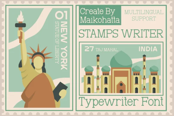
Clean travel-postage & passport monoline typewriter serif
Stamps Writer is a neat, slender monoline typewriter serif inspired by vintage postage cancels, travel passports, and archival index cards.
Ideas for this font
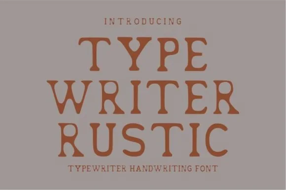
Warm hand-stamped terracotta rustic typewriter serif
Typewriter Rustic is a chunky, hand-stamped organic typewriter slab serif with soft ink-bleed curves built for cozy cottage and apothecary labels.
Ideas for this font
Same independent foundry
Allow optional Google Analytics to measure visits and catalogue actions. Your search words and notes are not included. Privacy & storage